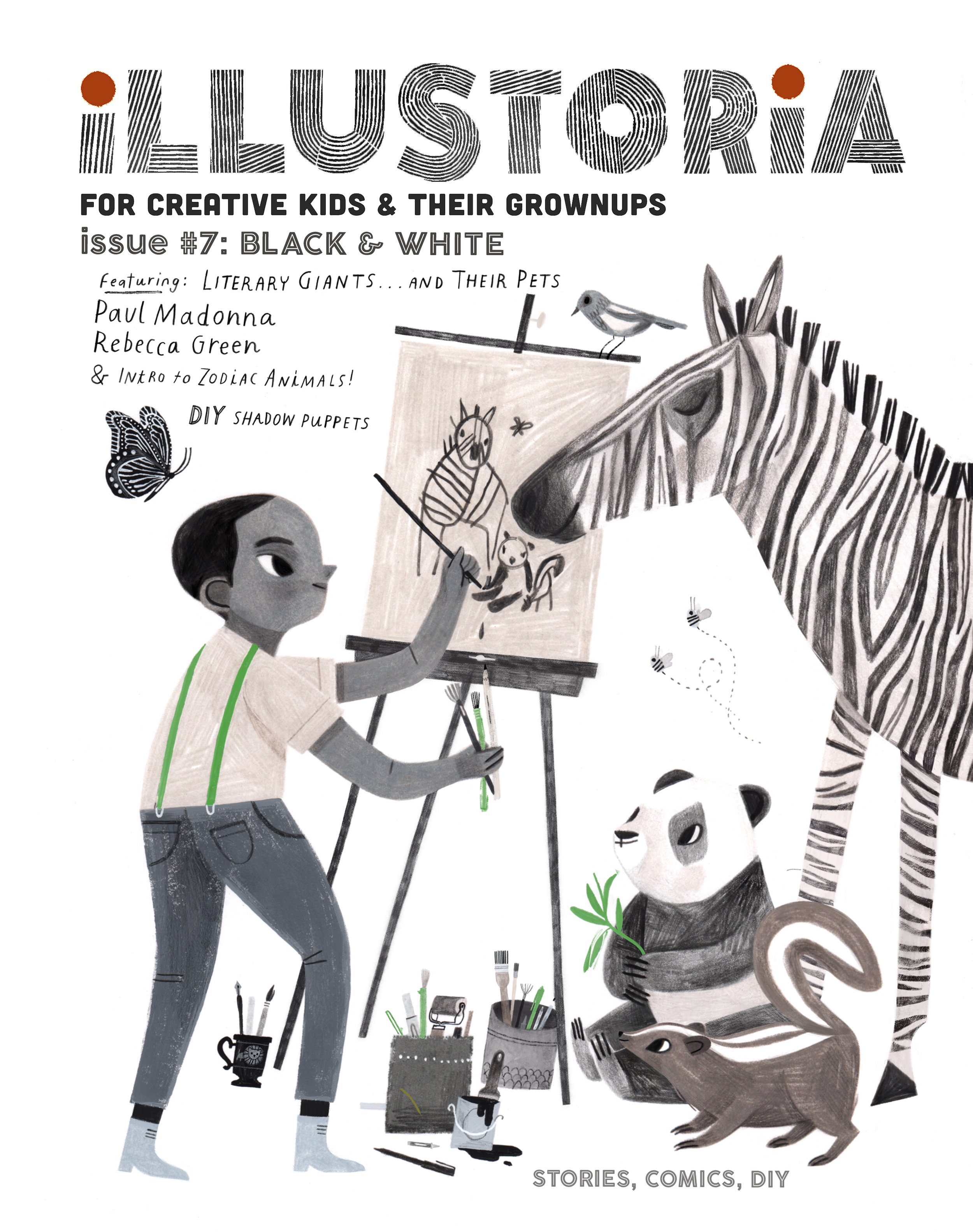
Food for Thought
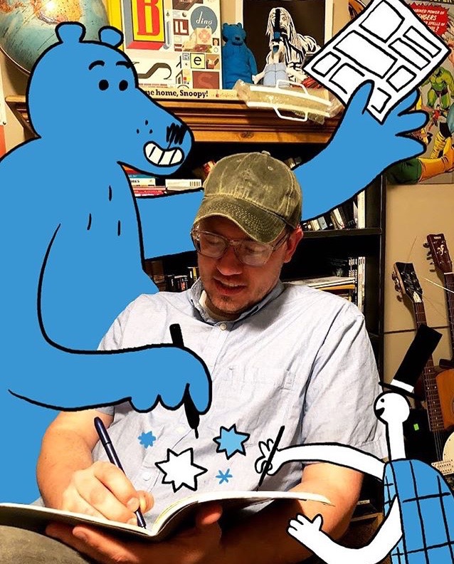
A guest post by Elizabeth Haidle, Illustoria’s art director.
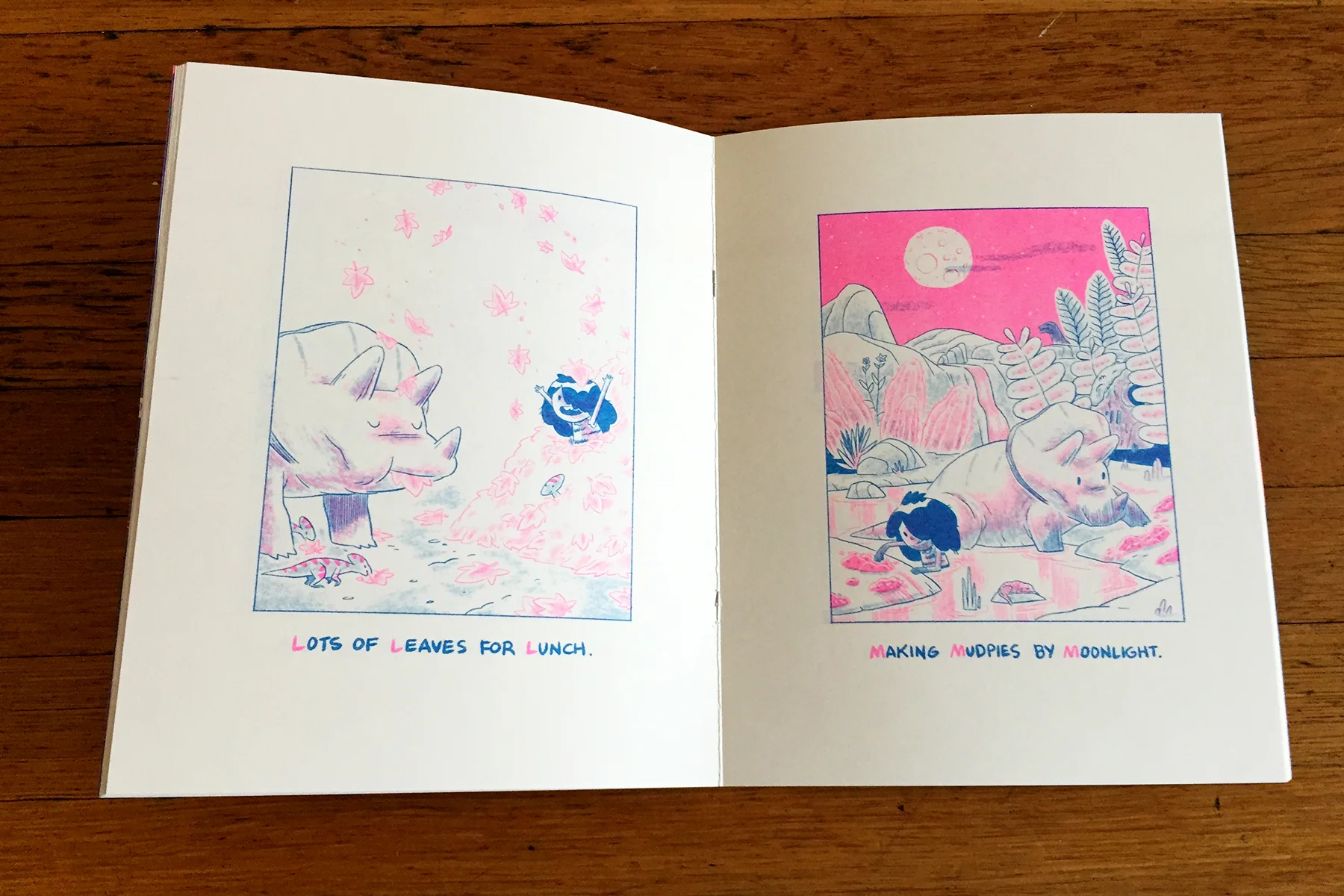
I was recently visiting the Kansas City Art Institute, as a guest artist this fall. I ran a special assignment, asking students to illustrate a topic related to food & to pair words with their images in any style of their choosing. I was pleased with their surprising variety of responses—family recipes, history of food, cultural traditions, comic journalism featuring food, and food-related ethical concerns. Some went the scientific route, with food diagrams and food traveling through the digestive tract. (Yuck, but fascinating!) Here are some of my favorites, with comments by the artists about their choice of imagery / subject matter:
————————

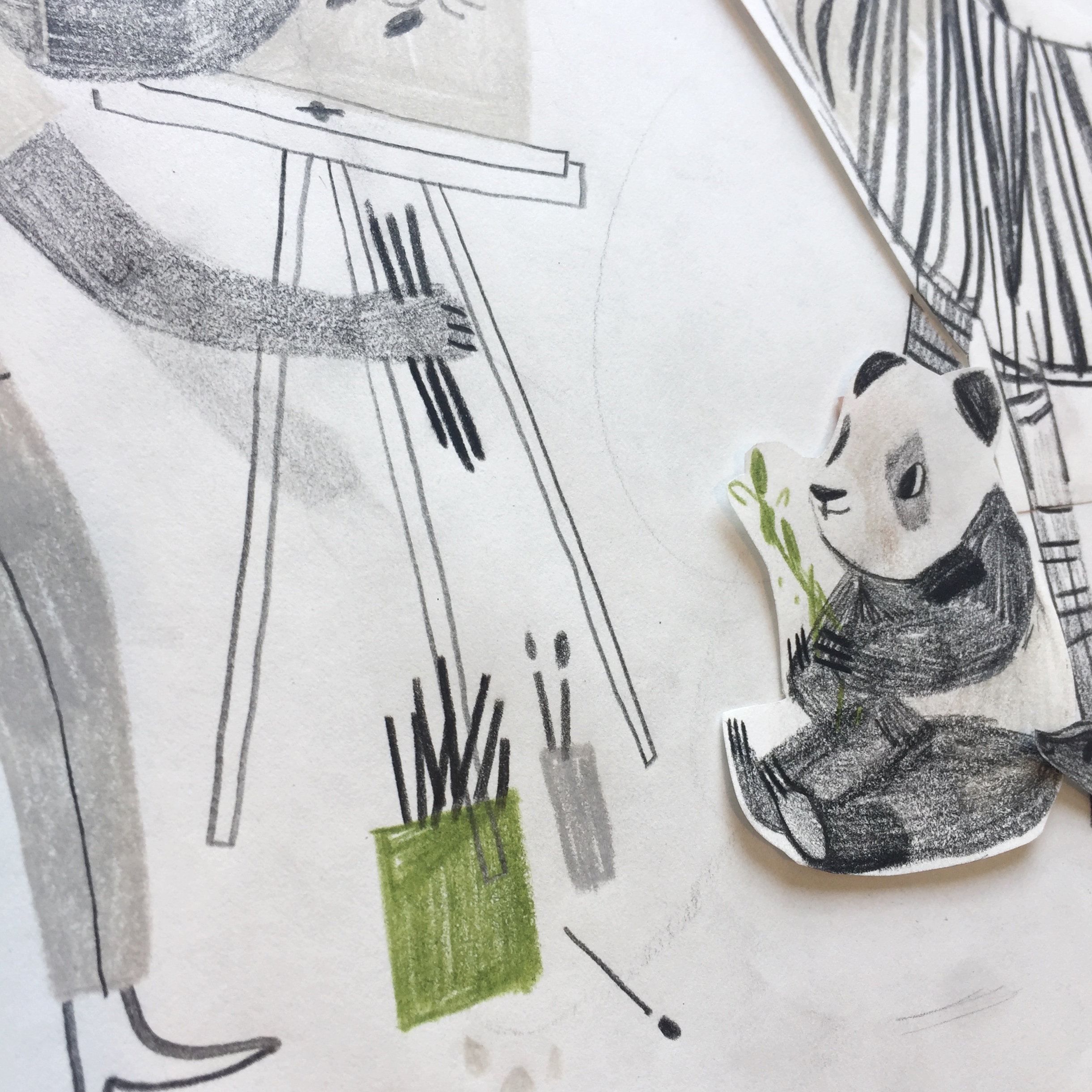
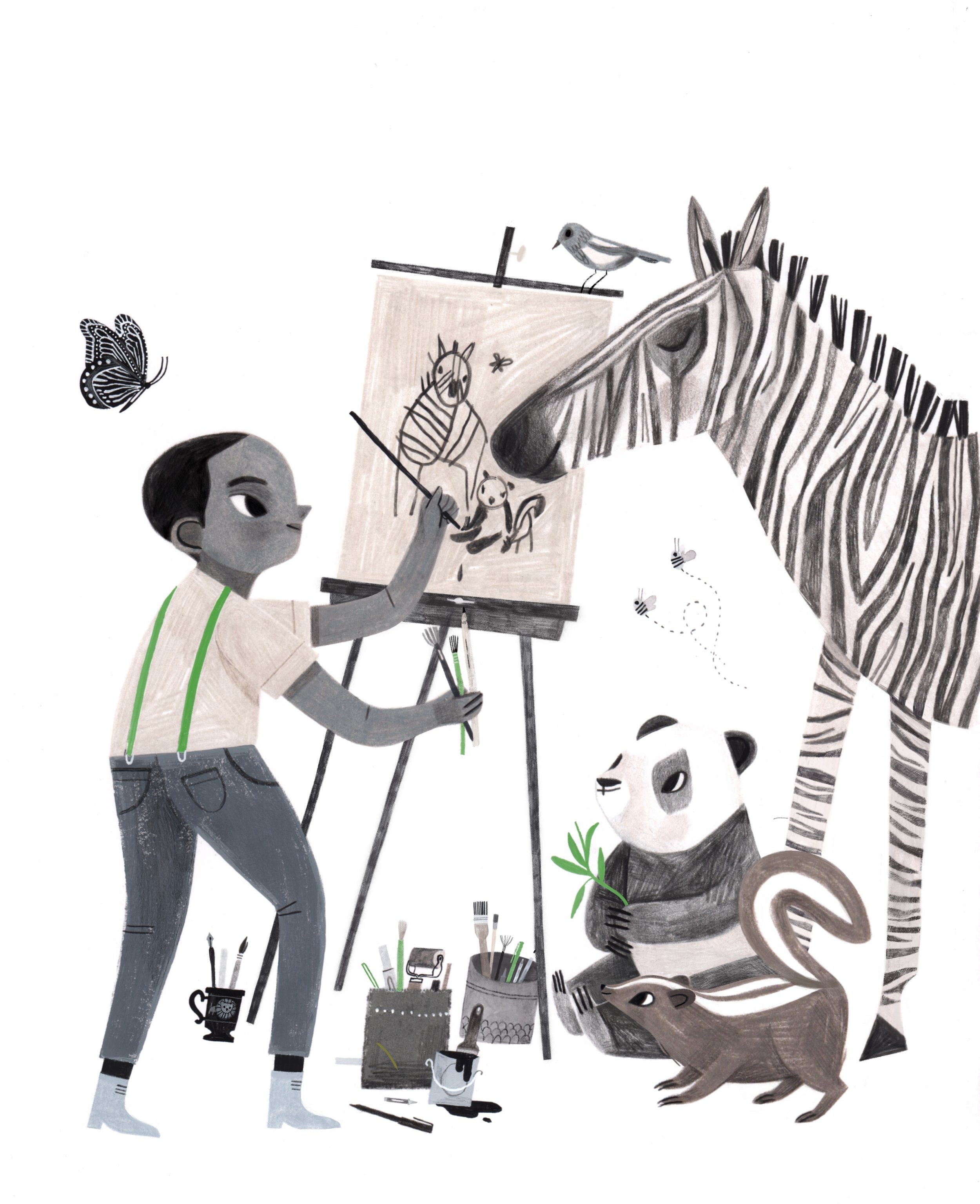
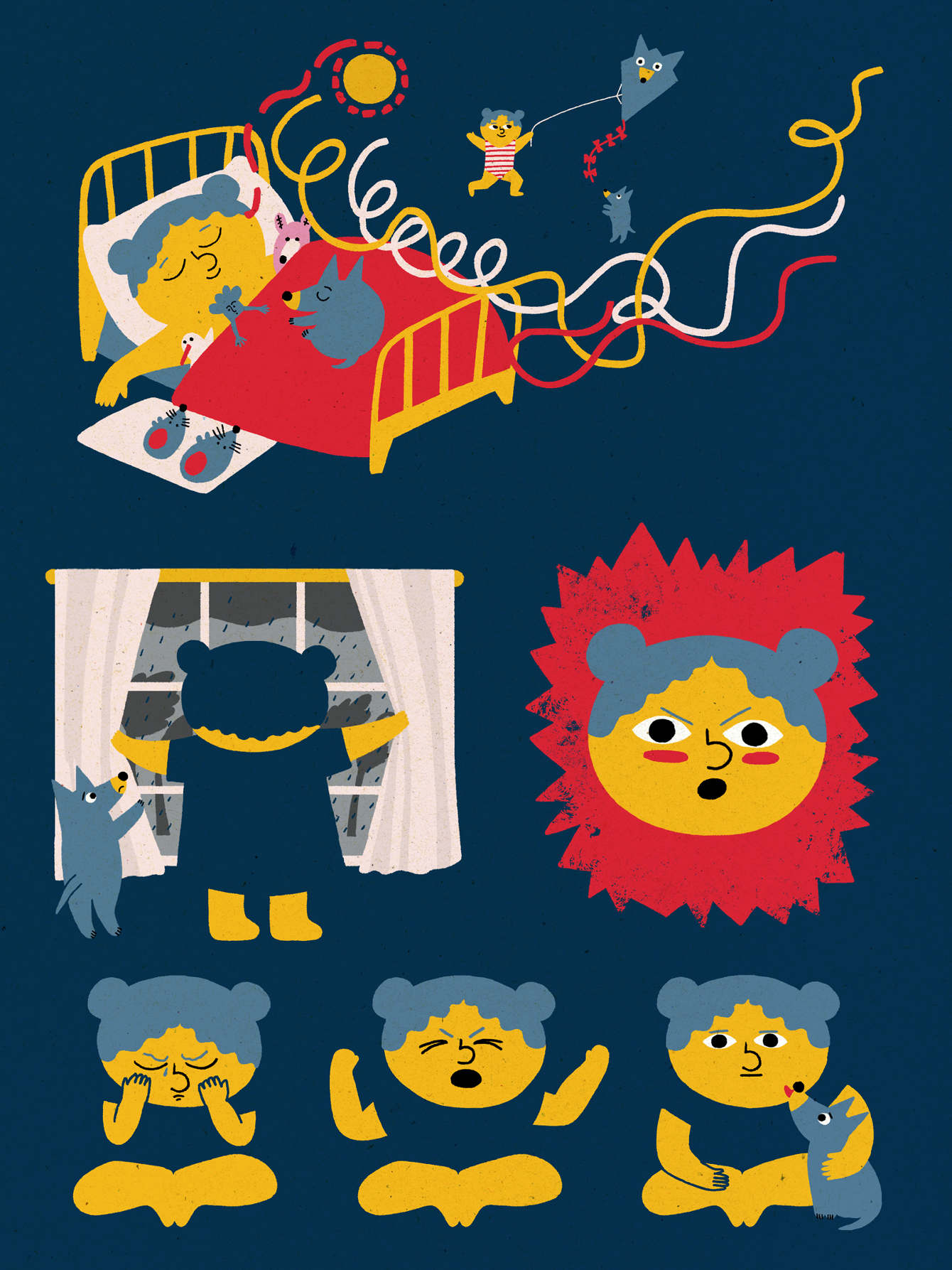
Art by Nicole Richardson
@crimsonrib

“With my piece, I wanted to illustrate some things you might find in your kitchen that you might not want to eat. I chose to do this in a style like a medieval herbal manuscript.” — Nina Gookin
@NinaGookin
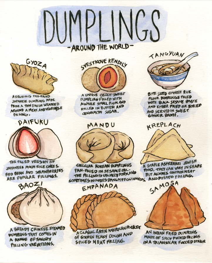
"This illustration was inspired by an emotional revelation i had late one night about how dumplings mirror the human experience. Despite the vast differences in food around the world, nearly every culture has some variation of the dumpling, as diverse in form as the cultures they come from, but all the same in their basic form. It is nice to remember that no matter where you come from or who you are that we all understand the universal comfort and appeal of a small packet of dough." — CJ Nelson
@crowclub
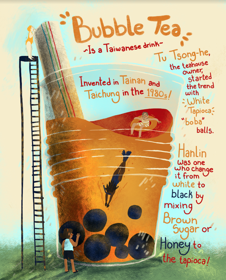
“For the Illustration, I was struggling to create a fun artwork for anyone to learn and appreciate. Then I got inspired by my nostalgia for bubble tea when my friends and I recalled our memories. I remembered that I almost always go to a Bubble Tea booth to get a tea with my friend weekly. It was one of my favorite memories. Yet that hangout time with my friend led me to a new drink that I grew very fond of. I realized that I barely know anything about my own favorite drink, thus the informative illustration!” —Lacey Vonderschmidt
@Impossibmax

“The recipe I chose to illustrate is a very important one. During the holidays my family and I always make this yummy tea together as a way to bond. We take turns juicing the fruit while mom gets the other ingredients ready. Its always a wonderful time and the house is always left smelling delicious!” —Lana Laughlin
@lanalaughlinillustration

“Because I'm originally from Oklahoma, I chose to bring up one of the wackiest facts I know about the state! Most people don't believe me when I tell them about my state vegetable, so I created a colorful comic about it!” — Parker
@Hardcoreparker

"When people think about the ethics of eating, they normally think about vegetarianism and animal abuse. I grew up knowing that my extended family were produce farmers that used migrant labor, grew up worrying about the human rights abuses that farm workers have suffered since the days of Cesar Chavez. The food industry is a huge, wasteful, looming titan that consumes workers and animals alike, and I wanted nothing more than to illustrate exactly why it took up so much space in my head." — Malachi Peters
@malachi_makes

“My interest in honey began with by my agricultural roots. My aunt and uncle are beekeepers. When I moved to the city, I was surprised to learn that some people don't know where food comes from. Migrant workers and small family farms perform the difficult labor that makes our food possible. I love honey in particular because it has beneficial medicinal properties and because beekeeping directly improves the health of the environment. We rely on farmers as much as farmers rely on bees!” —Casper Warren
@Holytheft
We at Illustoria are always so amazed to see how various artists and writers interpret a theme—often in ways that we would have never imagined ourselves, and certainly in styles and voices that are original and captivating. Thanks to Elizabeth and the students at the Kansas City Art Institute for sharing their beautiful, thoughtful, and inspired illustrations with us!