Process: Designing ILLUSTORIA's First Cover
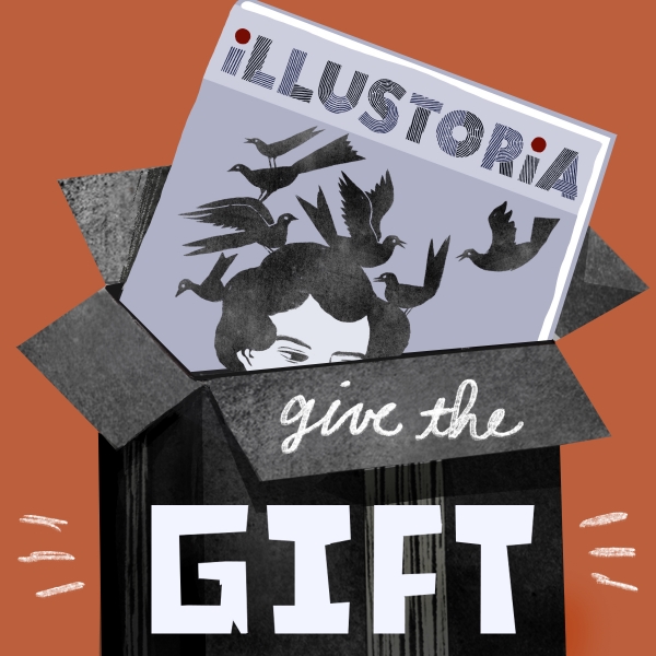
Introducing...our cover for the premiere issue of ILLUSTORIA!
After a long cover design process during which we conceptualized, developed, reiterated and debated for many months, we had that "A-ha!" moment when we saw this version. We think it's contemporary and fresh with a DIY feel that speaks to who we are: a totally new kind of magazine for kids & grownups.
As we worked on our cover, we asked ourselves: how do we spark the curiosity and interest of a 9-year-old and his or her parent? Will artists and writers find camaraderie? Will teachers and librarians see value? How do we stand out from the crowd with a single image and just a few words?
It was a real identity challenge and pushed us to make an authentic statement about who we are and what we value through pictures and words—which is what our magazine is all about, after all.
For those who want to get beneath the surface, here’s a behind-the-scenes look at the making of our very first cover.
Step 1: Settle on a logo!
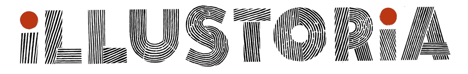
Our very first logo, which we still love and use sometimes.
This is the logo we were very happy with for quite some time. Interestingly, when we applied it to a mock-up cover we learned that what worked on stationary and business cards felt out of sync with our visual aesthetics, which had evolved over almost two years of incubation and development.
We wanted our logo to show off a DIY attitude and be, as one of our team members put it, “perfectly imperfect.” Our aim was to not stray too far off course from the original which, as mentioned, we were still smitten with.
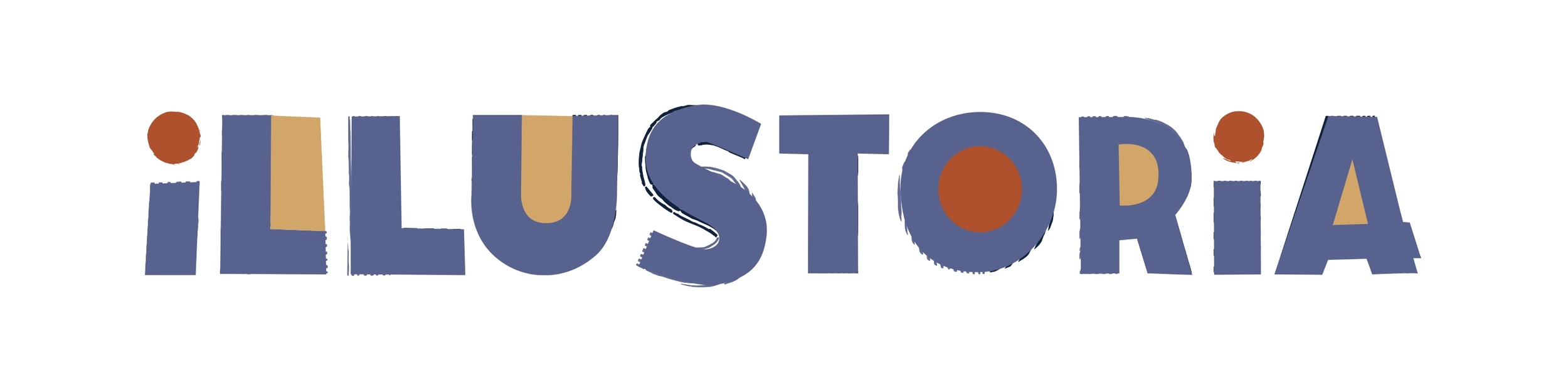
Logo variant #1

Logo variant #2
Logo variant #3...which we really liked.
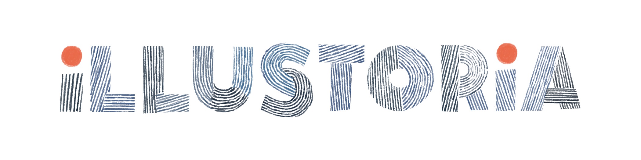
We finally settled on a design close to the more understated original but with a bit of an edge.

Final logo. We opted for the simplicity of b & w + red.
Step 2: Cover art!
We went through several really strong cover mockups that were quite beautiful. But beauty isn’t everything and we needed to make an instant connection on an emotional level too. That happens through tone, mood and an original voice which can be really hard to pinpoint. We wanted to say to our readers-to-be, “This is good stuff. We have something unique to offer you. Look and linger a while.” Even, “You and I—we’re gonna become quick friends, I can tell.”
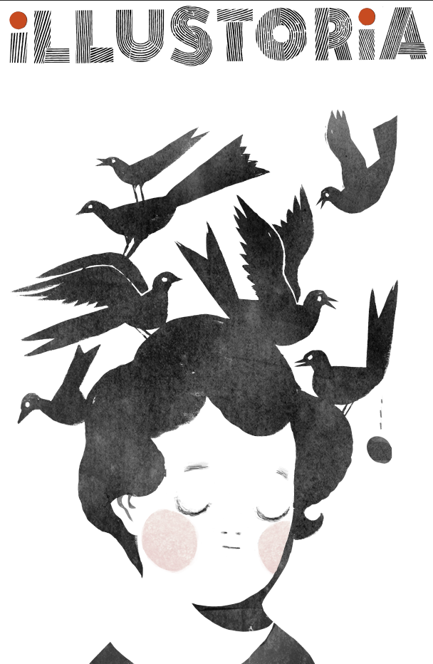
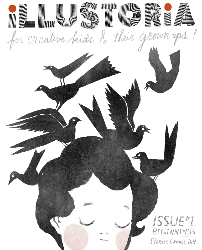
The experiment that inspired our cover art.
It's strange how you sometimes find inspiration--or rather, it jumps at you--when you least expect it to. Our creative director, Elizabeth Haidle, was working on an ILLUSTORIA gift card. Out of convenience she used an existing piece of art to create a placeholder fake cover, meaning to swap it out later. But seeing the image and the logo together…something immediately clicked for us. A happy, happy accident.
I asked Beth to illustrate a young reader in the same pose, perhaps with a book in her hands. Within a day she came back with several cover options that instantly said to us, “Watch out, world—there’s a new kid (err, magazine) in town!”
These were gorgeous though I'm sad to say we ended up nixing the egg being laid in midair!
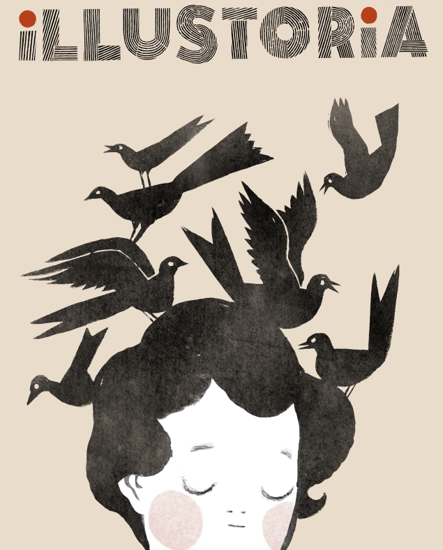
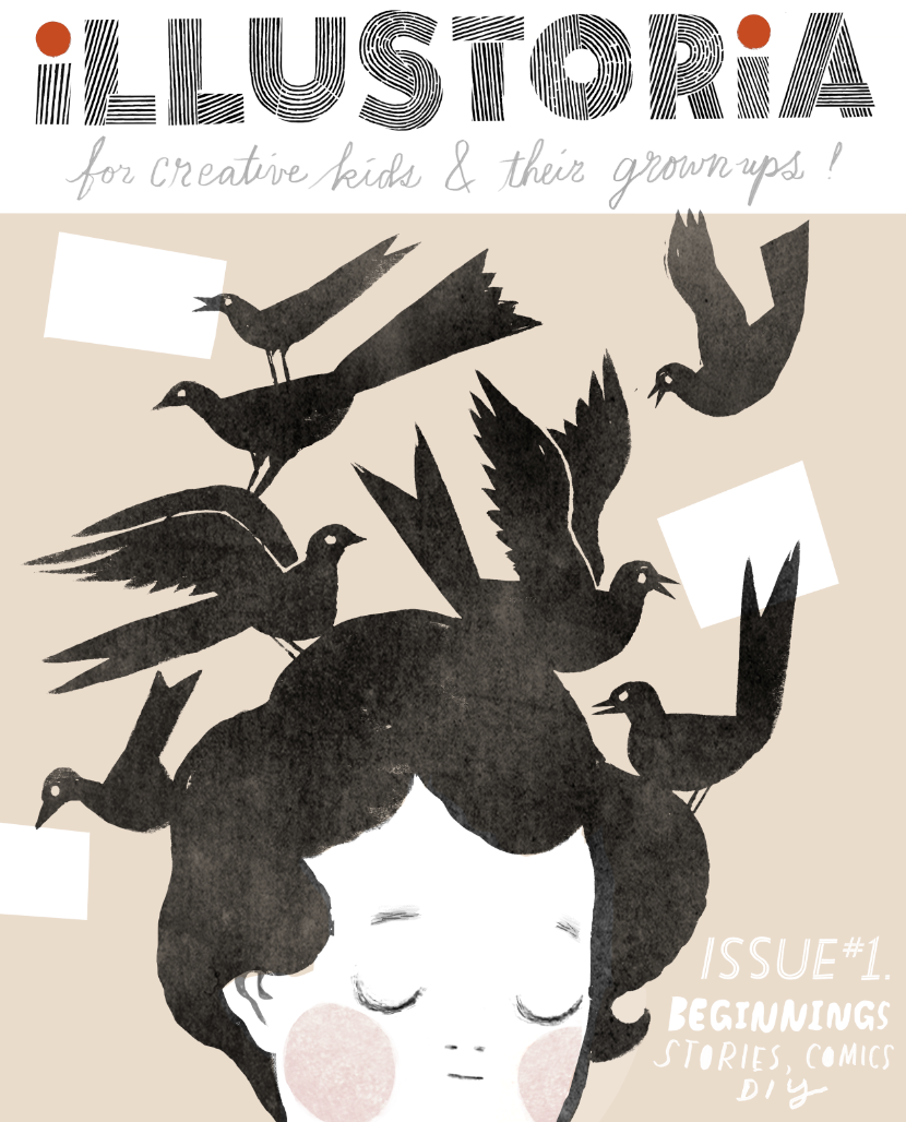
We experimented with a colored background and hand lettering. Along the way we corrected the trim size, which was off in the first iterations. See how minor details take time to finesse?!
Step 3: Integrating text and art
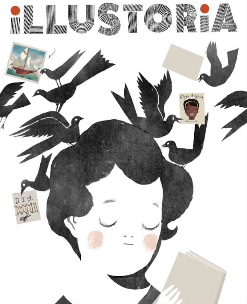
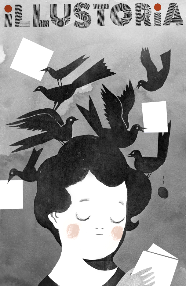
We experimented with showcasing our featured articles through words and pictures—sometimes only pictures. A high priority for us, as a magazine that celebrates visual storytelling, was to integrate the text callouts with the cover art in a way that worked together seamlessly. I didn’t want the text to feel secondary, and we certainly didn’t want the art to get cluttered by too much editorial content. It was important for the callouts to not be dry and overly informative. They needed to engage and appeal to both kids and grownups.
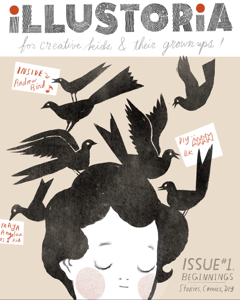
As much as we adored the thumbnail images, they distracted some from the simplicity and impact of our main illustration. It was a tough call, but ultimately the word balloons won out. We continued to futz around with the typefaces and hand lettering and even corrected a typo that had (admittedly) been overlooked for weeks, until we settled on...our winning cover!
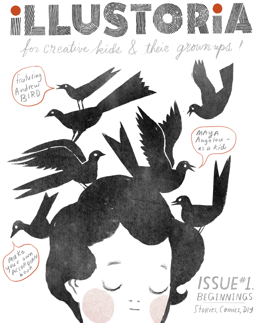
Step 4: Make it look effortless
Our final cover
So get to it and spread the word! Order and subscribe to ILLUSTORIA and ask your local bookstore or shop about stocking it. You won’t be disappointed by all the good stuff in the packed 64 pages of each issue. We're just scratching the surface of what may become a wonderful, lasting friendship with all of you: our coveted readers-to-be.