
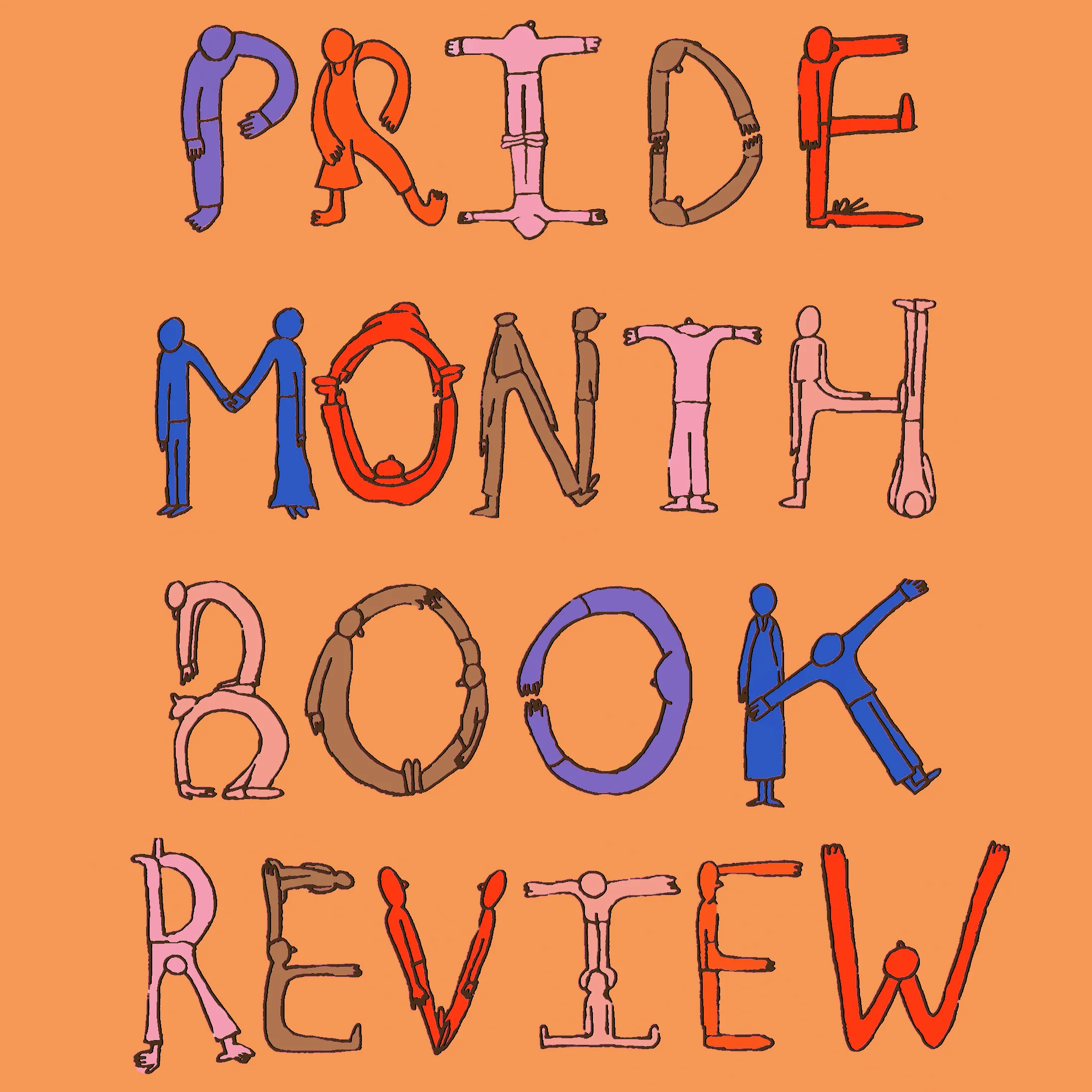
Pride Month Book Review

illustration by Claire Astrow
The summer equinox is here folks, and that’s pretty much the adult-version of throwing textbooks in the air and sprinting out of 7th period with “School's out for the Summer” by Alice Cooper blasting out of the school’s PA. In addition to being known as the beginning of summer, the time when dreams of pools and working AC machines flood our minds, June also importantly marks LGBTQ+ Pride Month and the anniversary of the Stonewall Rebellion.
During Pride, we take to the streets to honor our sisters and brothers of the not-so-far-away past who fought fiercely for the queer and trans community as well as those who continue to pave the way for a more inclusive future. When all the dust (and glitter) from Pride parades across the nation has settled, we remember June as a celebration of inclusion, diversity and love. With this short reading list, we hope to commemorate exemplary releases of kids' literature that embody the inclusion of Pride Month. The books featured were chosen for their representation of gender-nonconforming and/or queer characters as well as LGBTQ+ civil rights leaders.
Here at Illustoria, we’re still dreaming of an even more diverse children’s book world, where overlooked or ignored voices are embraced (anyone up for writing a picture book on Audre Lorde or Martha P Washington?). But in the meantime, we’re jumping for joy about these incredible releases. We hope you enjoy our list, and have a happy Pride Month!

George by Alex Gino
In a forward-thinking addition to the middle-grade genre, Alex Gino has penned a tender story of a fourth grader named George whose male body doesn’t fit her true identity. George longs to star as the female spider Charlotte in the school production of “Charlotte’s Web” rather than Wilbur, the male pig, but worries whether her family and community will understand. With a main character that is as eloquent as she is strong, George soars beyond the typical story of the challenges of being young and queer. Better yet, George offers much needed visibility to gender-nonconforming and transgender communities in children’s literature, and is a story of bravery that every middle grade student should read and re-read.
Reading Level: 3rd grade +
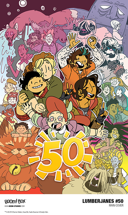
Lumberjanes 50 by authors Shannon Watters & Kat Leyh; illustrators Dozerdraws & Brooklyn Allen
Lumberjanes 50 by Shannon Watters & Kat Leyh, illustrated by Dozerdraws & Brooklyn Allen
Lumberjanes is a graphic novel series that is bursting at the seams with feminist joy. The story takes place at Miss Qiunzella Thiskwin Penniquiqul Thistle Crumpet's Camp for Hardcore Lady Types, and is attended by campers known as Lumberjane Scouts. Each book in the series brings readers on the adventures of a rough and tumble group of five best friends, each unique in their own right. The playful, beautifully colored illustrations are to die for, and the pop culture references couldn’t be cooler (catchy phrases used by the Lumberjane crew include, “What the Joan Jett?” and “Oh My Bessie Coleman”). Plus, each issue features a music playlist by one of the characters, inspiring fan art, and a rotating lineup of illustrators that keep the comic fresh and exciting. We love this series for its diverse representation of young queer characters and storylines, slapdash sense of humor and heartening stories of friendship. Lumberjanes is celebrating its 50th issue with an oversized anniversary edition which features the incredible editor Shannon Watters (co-creator of the series), acclaimed writer Kat Leyh (who has also written for Adventure Time, Bravest Warrior and Steven Universe), illustrator Dozerdraws and long time series illustrator Brooklyn Allen. Lumberjanes 50 is an absolute dream come true for seasoned fans of the series, but if you're a newbie we suggest beginning with the very first issue Lumberjanes Vol. 1: Beware The Kitten Holy.
Reading Level: 4th grade +

A Family is A Family is A Family by Sara O'Leary, illustrated by Qin Leng
This sweet-as-a-peach tale demonstrates just how diverse and beautiful a family can be. In it, a teacher asks a classroom to think of what makes their family special. The young narrator becomes worried, thinking “My family is not like everyone else’s.” But to her surprise, each student who shares a story about their family is more unique than the next. There are mix race families, adoptive families, gay and lesbian families, families led by grandparents and everything in-between. Soon, the narrator realizes that families comes in all shapes and sizes; what they have in common is the love that brings them together. With cheerful writing by Sara O’Leary and adorable (yet modern) watercolor illustrations by Qin Leng, A Family is A Family is A Family strikes the perfect match of showing appreciation for inclusion without being pedantic or corny.
Reading Audience: Preschool +
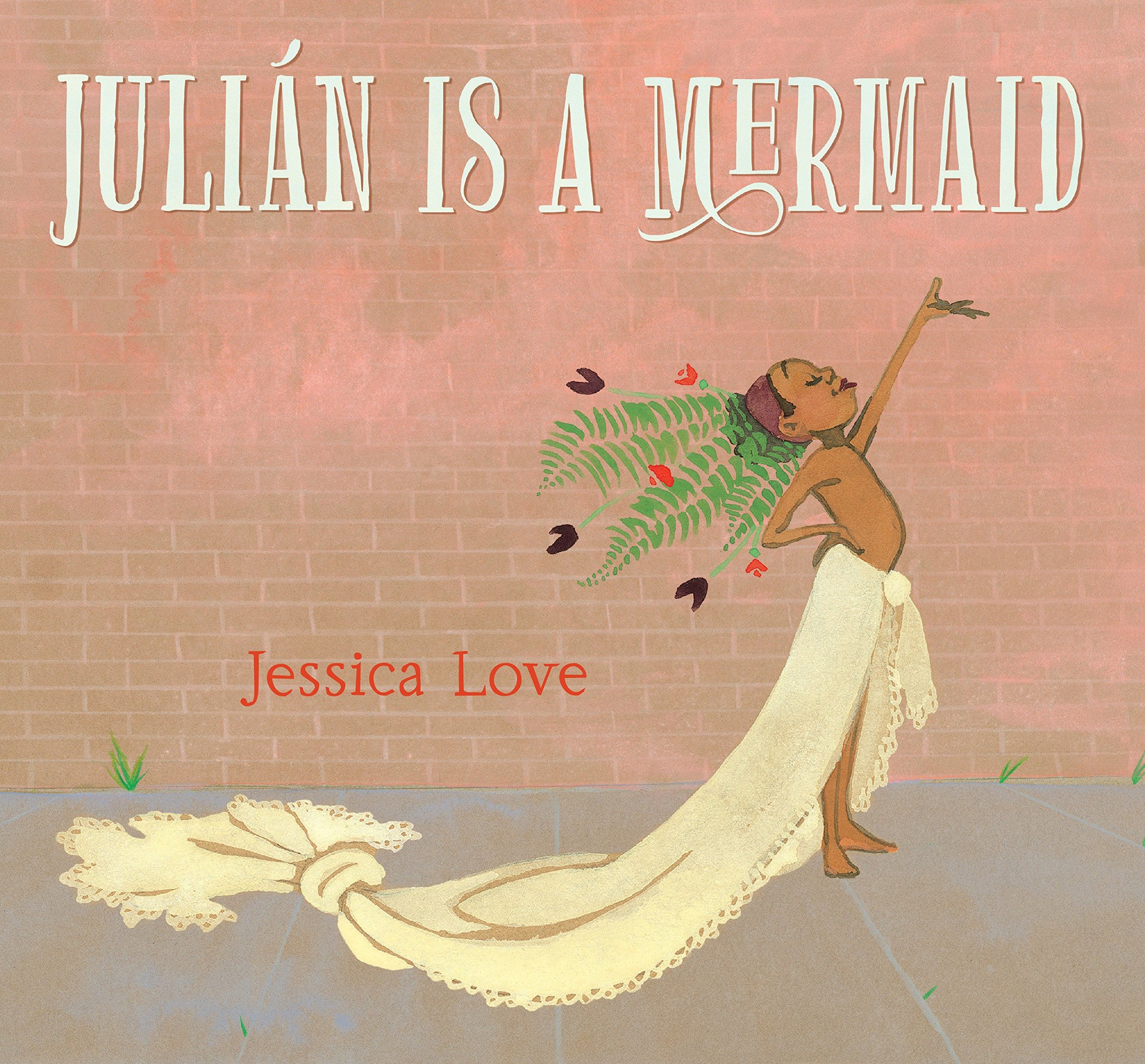
Julian is a Mermaid by Jessica Love
Two rounds of applause are deserved for the outstanding picture book Julian is a Mermaid. One is for Jessica Love, who has created what so many authors and illustrators aspire to: a book with a setting so vivid the reader becomes entranced, and a groundbreaking, socially conscious storyline that sets it apart from the rest. Another round of applause for the main character Julian, whose confidence and ingenuity will leave them starstruck.
In Love’s story, a little boy named Julian is riding the bus home with his abuela one day when he becomes captivated by three utterly gorgeous mermaids who step on board. They appear like something out of a dream, with long flowy hair and turquoise dresses. As soon as he gets home, Julian balls out in mermaid attire, fashioning for himself a plant headdress, billowing skirt made from a curtain and bright red lipstick. When his abuela finds him, there is a brief moment of fear --will Julian be reprimanded for breaking gender norms he doesn’t yet know exist? Readers hold their breath as the grandmother takes his hand and leads him on a mysterious route. Soon Julian, still in full princess garb, is surrounded by beautiful beings that look just like him. In the book's joyous ending, it becomes clear that his loving grandmother has brought him to the Coney Island Mermaid Parade, to be among the underwater gods and goddesses just like him.

excerpt from Julian is a Mermaid by Jessica Love
Julian is a Mermaid’s morale is as touching as it is richly layered. Readers may interpret the story as one of a young boy’s self discovery, a tale of the abundance of beauty and character found in brown and black communities (the book takes place in Brooklyn, New York), or a narrative about the loving bond between an abuela and her grandson. No matter how the story is interpreted, there is no doubt readers will pour over the details Love works into every nook and cranny of the book (check out the cool-as-can-be lemonade sippers or hip man walking his wiener dog). It’s this thoughtfulness towards character, setting and storyline that has us over the moon for this treasure, that we have our bets on becoming an award-winning picture book very soon.
Reading Audience: Preschool +


Wave a Flag for Harvey Milk Sing-along Coloring Book by Mr. Greg
At long last, a coloring book for a hero of San Francisco and the LGBTQ+ community at large, Harvey Milk. The artist behind this rad creation is Mr. Greg, a SF-based teacher and indie record label owner.
"Each year, my preschool class in San Francisco leads an assembly in honor of Harvey Milk. After searching fruitlessly for an age-appropriate book or song about Harvey Milk to share with my preschoolers, I decided to write and illustrate one myself. I wrote Wave a Flag for Harvey Milk as a way to introduce the preschoolers to the positive things that Harvey Milk did for San Franciscans in particular, and the LGBT community at large. The words of the book are the lyrics to an accompanying song that I sing with my students." Mr. Greg explains.
The coloring book features quirky illustrations as well as narration that doubles as an interactive sing-along. Click here (link provided in the coloring book) to hear the original song, which features indie musician legend Cass McCombs. The wholesome, catchy song is a work of art in its own right, and can be likened to the greatness of the School House Rock hits of the late genius Bob Dorough (known for writing and singing Three is the Magic Number and Conjunction Junction among many others).
The coloring book can be purchased here. If you’re a fan of the coloring book and music, be sure to check out the rest of the goodies put out by Mr. Greg’s record label Secret Seven Records. For another great children’s book read on Harvey Milk, read Pride: The Story of Harvey Milk and the Rainbow Flag.
Audience: Preschool +
We hope you greatly enjoyed our Pride Month Book Review! At ILLUSTORIA, it is our mission to publish stories that champion inclusion with a diverse lineup of illustrators and writers. Check out Issue 5: Motion for our interview with the dream team behind Rad Women A-Z, Rad Women Worldwide and Rad Girls Can author Kate Schatz and artist Miriam Klein Stahl who talk about their goals of prioritizing stories about women of color, becoming a part of the Bay Area's feminist punk scene, and the importance of getting readers of all ages and genders excited about social justice.
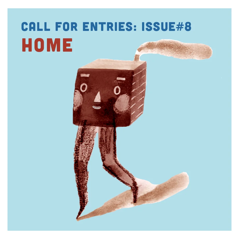
CALL FOR SUBMISSIONS! ISSUE 8: HOME

Illustration by Elizabeth Haidle
Are you an artist, writer, illustrator or maker who would love to contribute to ILLUSTORIA? Well, we'd love to hear from you! We're on the look out for work inspired by the theme "home" for Issue 8. We welcome submissions that interpret "home" in unique, unexpected ways. Think: sustainability, immigration, native lands, haunted houses, utopias and beyond.
In particular, we're interested in:
- a couple of 1- to 2-page comics or illustrated stories
-spot art or standalone illustrations + minimal text or poetry
-1–3 panel comic strips for our Comic Mixup feature
Guidelines:
1. Before submitting, familiarize yourself with ILLUSTORIA’s past issues.
2. If sending art, please send a small description of the article or story you have in mind. If the work is sport art / a standalone illustration please note it as such.
3. Please submit work as small, web friendly files. Please don’t use file-sharing services with links that might expire or that require us downloading your work in order to view it.
4. Include full contact information: phone, email, and mailing address, website and social media channels.
5. Fiction and nonfiction manuscripts should include an exact word count; poetry manuscripts should include an exact line count.
For more information on submissions, please look here.
Submission Deadline: July 10th, 2018
Email: submission@illustoria.com
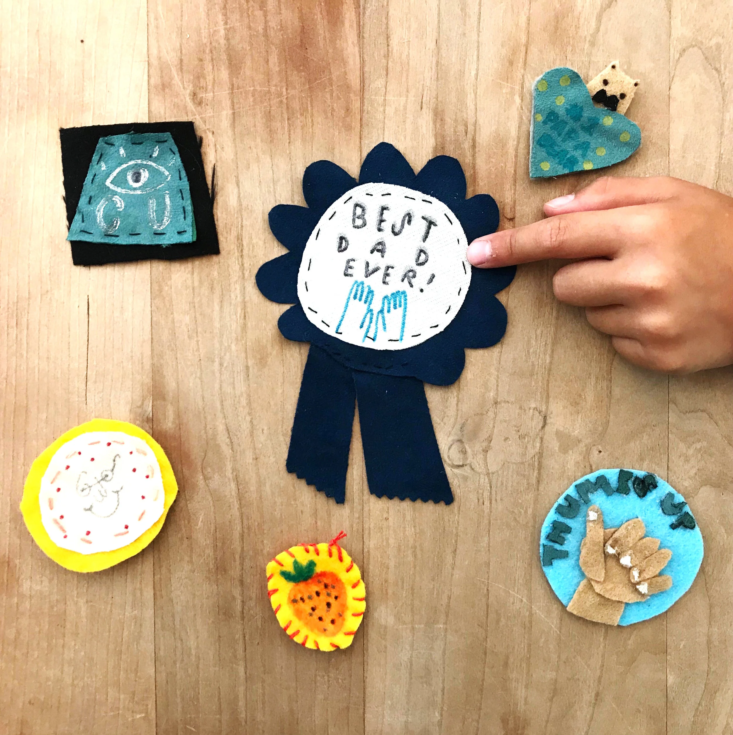
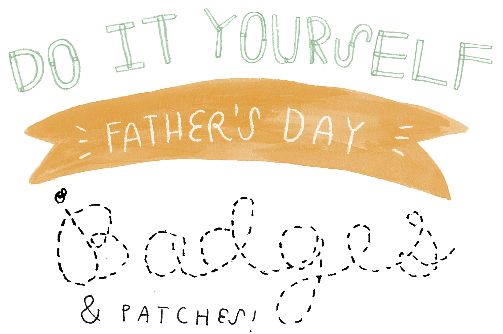
DIY: Father's Day Badges and Patches
© Paige Geimer 2018.
Happy Father's Day! Here is a special DIY just for the occasion.
Are you looking for something to give your dad, grandpa that shows him how rad he is? Need something new to add some pizzazz to your routine outfit?
Make these super easy and fun patches and badges to show off your creativity and throw something unique into your summer wardrobe. And the best part is, you can make them any color, size, and shape that you want!
This activity involves some sharp materials - always have an adult around to help out.
What you'll need:

© Paige Geimer 2018.
- fabric (felt and canvas scraps work!)
- permanent markers/fabric markers
- scissors
- needle & thread
- safety pin
How to do it:

© Paige Geimer 2018.
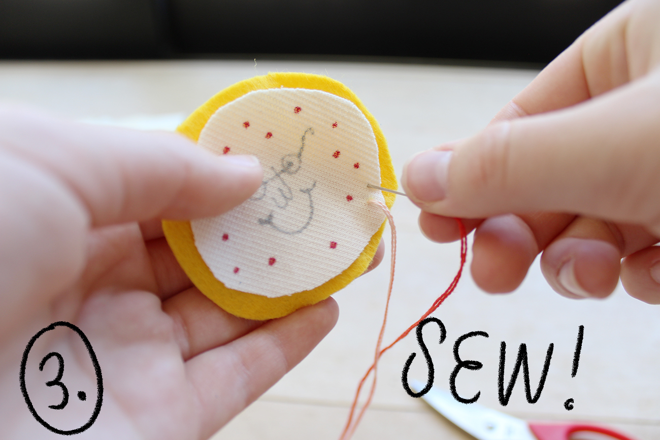
1. Draw your design on a piece of fabric - keep in mind how big you want your patch to be! If you are comfortable embroidering, you can do that too.

© Paige Geimer
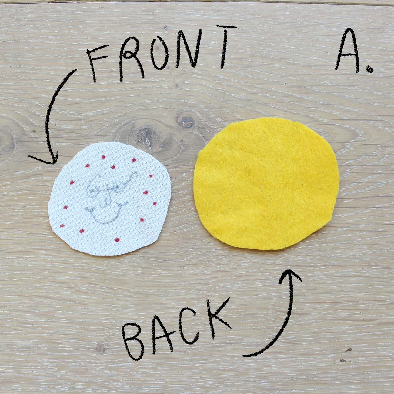
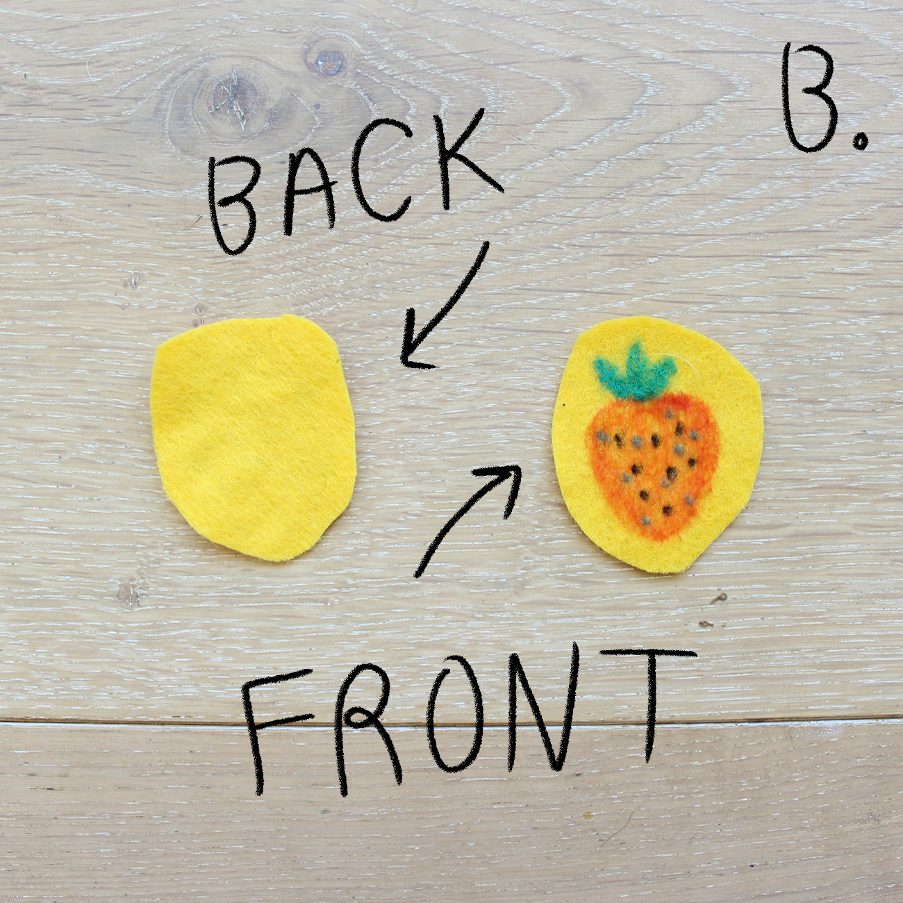
2. Cut the desired shape of your patch around your design. Next, cut the back piece of fabric**.
**If you want a simple patch, just cut another piece of fabric the same size or a little bit larger than your first piece (see squares A & B). If you want to make a badge, cut a larger piece and don’t forget the tails (see square C).
© Paige Geimer


© Paige Geimer
3. Using a fun colored piece of thread or embroidery floss, sew the two pieces together! An easy way to do this is to follow the shape of the top layer. Another option is to use a hot glue gun with an adult to glue the pieces together.
Don't forget to knot the thread in the back of the patch!

© Paige Geimer


© Paige Geimer 2018.
4. All done! To attach, put the safety pin through the back layer (so it does not poke through the top layer) and put on your shirt, backpack, or anything!

© Patches by Claire Astrow, Paige Geimer, and Alexandria Lai
Optional step: gift to your dad or best friend for a rad custom gift that they can show off!

© Paige Geimer 2018
Love this DIY project? Post your finished piece on Instagram with the #ILLUSTORIAinspires for a chance to have your work displayed on our blog! And stay tuned for more DIY projects on our blog and in the upcoming Issue 7: Black & White, set for shelves late July 2018.
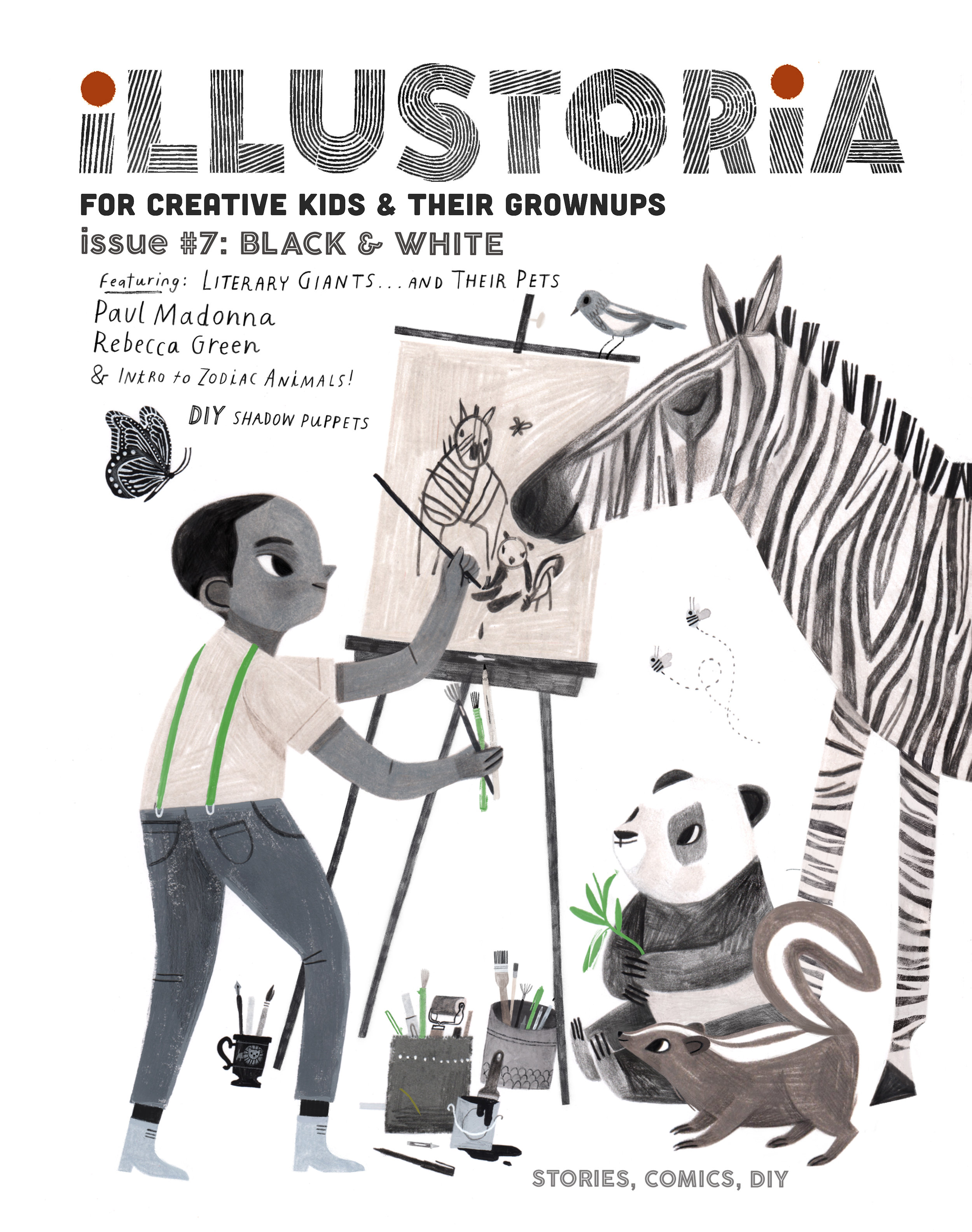
Creating Cover Art for #7: The Black & White Issue
Hi All!
Rebecca Green here (you can call me Becca!). I had the pleasure of creating the cover for Illustoria Issue #7, The Black and White Issue, and today we're going to walk through a bit of the creative process behind the illustration.

Illustration by © Rebecca Green
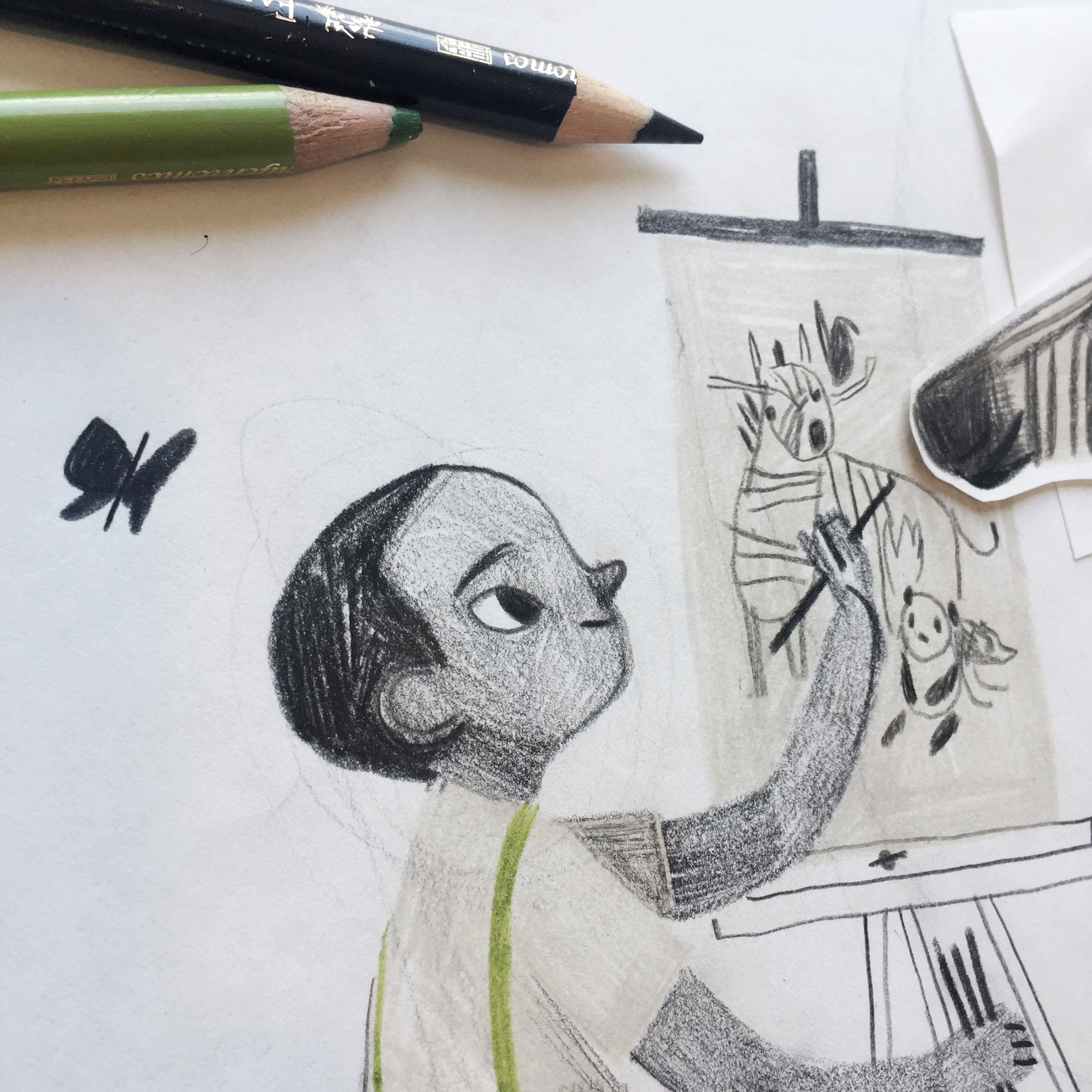
Besides sending along keywords, details about the features, and some of my previous art they were drawn to, Joanne and Beth of Illustoria gave me a lot of freedom to choose which direction I wanted to go with the artwork. Immediately, I knew I wanted to draw a little boy with black and white animals. I started with this simple sketch.

Illustration by © Rebecca Green
The drawing, I decided, needed something more. The boy would be...an artist! Complete with an easel and lots of brushes and markers. One thing I did like in the first drawing was the use of one simple color. Green felt right. (and not because it's my last name!) The sketch was drawn in colored pencil (I use Faber-Castell and Prismacolor).


Illustrations by © Rebecca Green
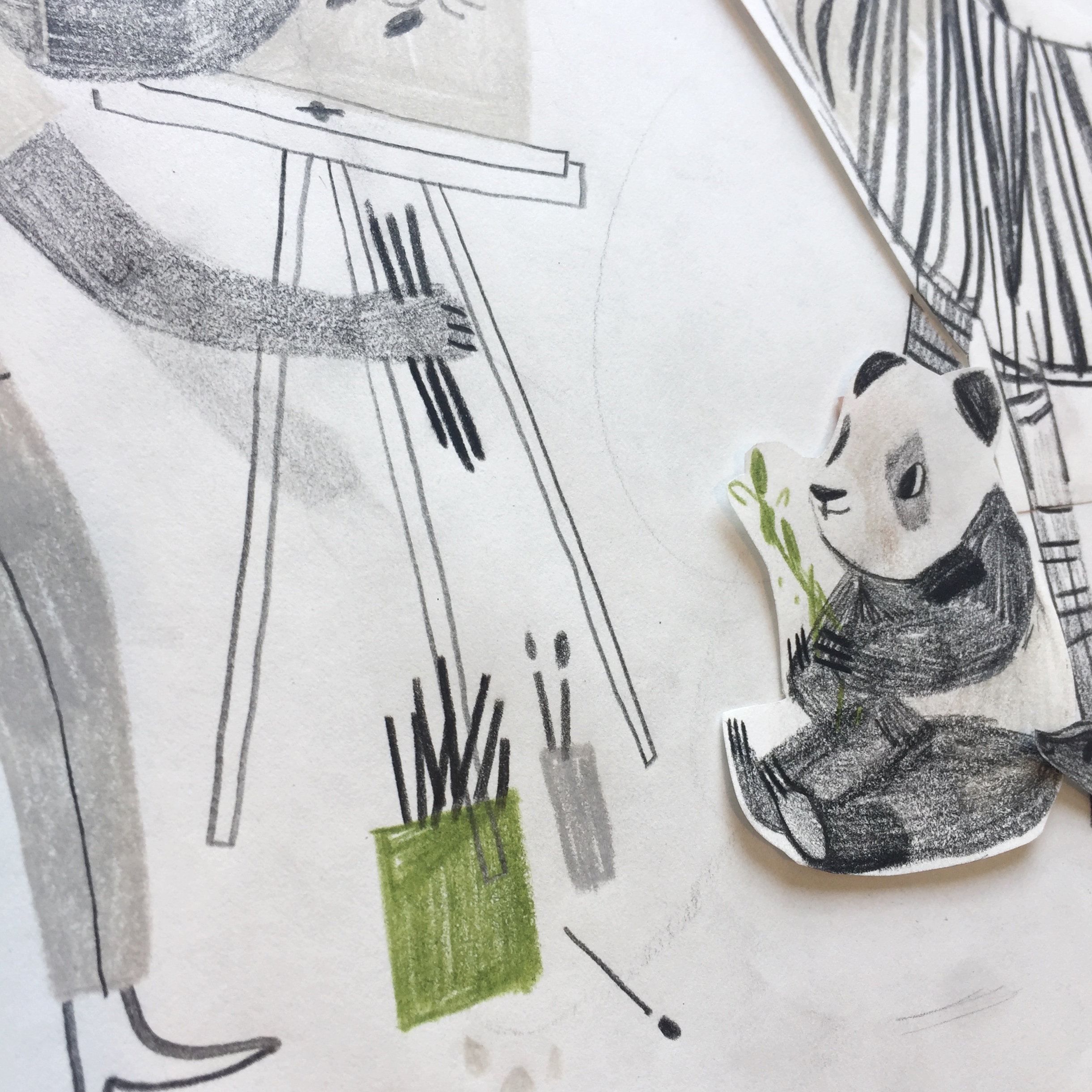
As you can see, I drew some of the elements on a separate piece of paper and cut them out so I could try out placing them in multiple places. One I had my complete sketch, I scanned it, cleaned it up a bit in Procreate (on my IPad), and send it in for approval.

Illustration by © Rebecca Green
Once the sketch was approved (this meant making the image a little bigger and enhancing the butterfly), I went to work on the final. I created the final illustration in gouache and colored pencil. Here are some peeks of the cover before it was edited!

Illustrations by © Rebecca Green


The final illustration was edited in Procreate and Photoshop, along with the hand-lettered text. When finished, it was sent to the kind folks at Illustoria and voilà! A cover was born!
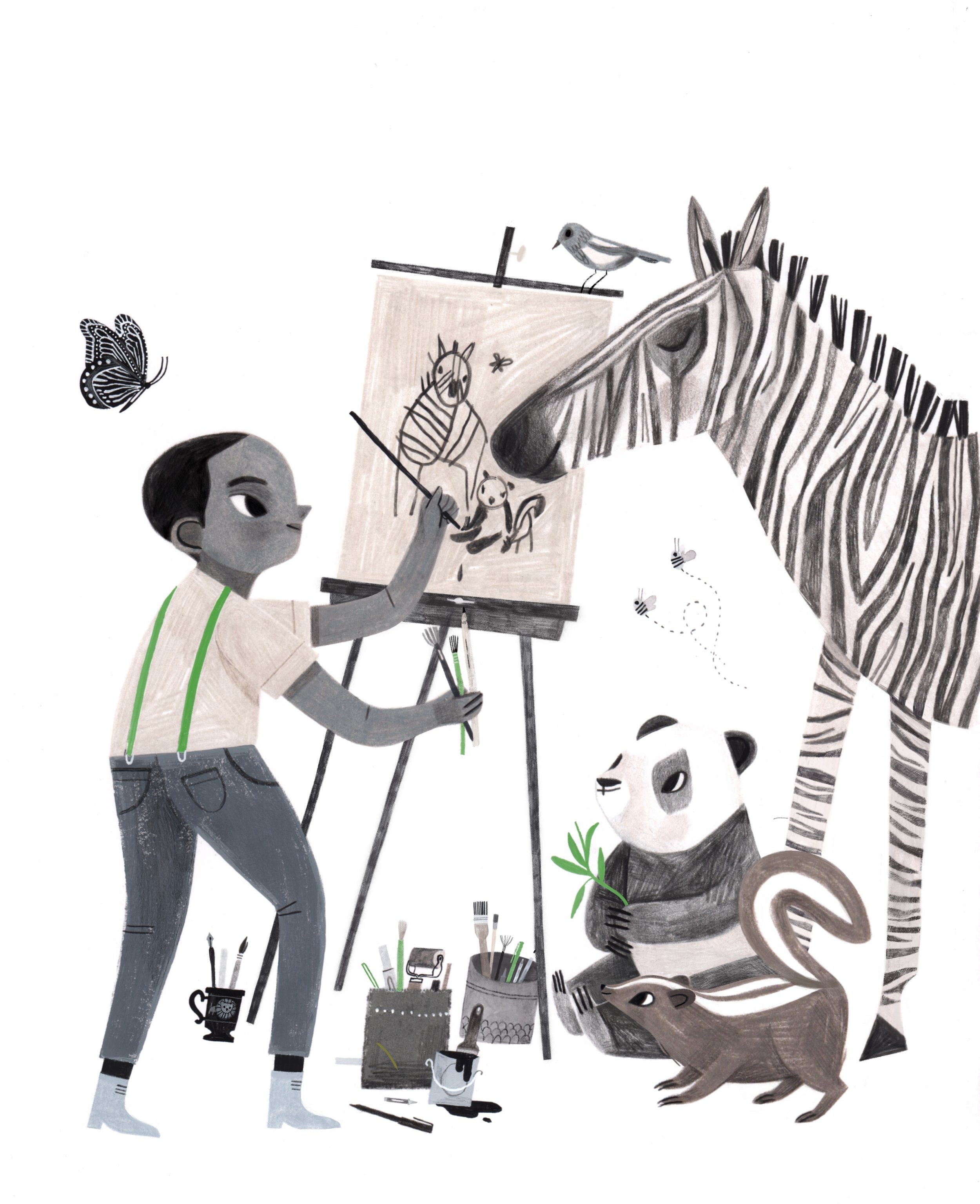
Illustration by © Rebecca Green
There you have it - a glimpse into the world of the cover creation. Hope you guys enjoy the issue, and thanks for letting me share a peek into my process. And thanks to Illustoria for having me!
DIY: Drawing in Reverse
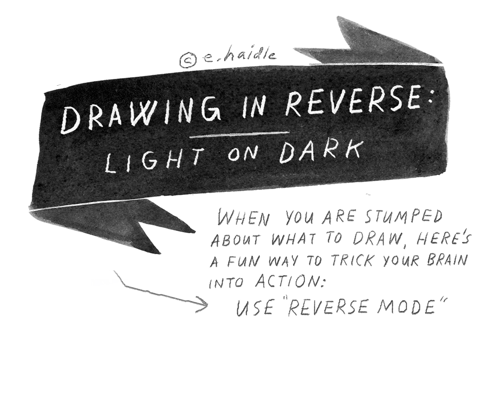
© Elizabeth Haidle 2018.
For days when you feel like you're in an art rut, simply out of ideas or just plain bored, here's a rad, instantly inspiring DIY drawing project to keep in your back pocket. Have you ever tried drawing.... in reverse? Sounds strange and even a little intimidating, but it's actually a fantastic way to spark your imagination without breaking a sweat. By using an eraser to draw instead of a pencil or pen, your page suddenly becomes a playground for zany, totally original ideas, doodles, and experimental drawings. Grab your eraser and get ready to look at the world in a whole new way!
What you need:
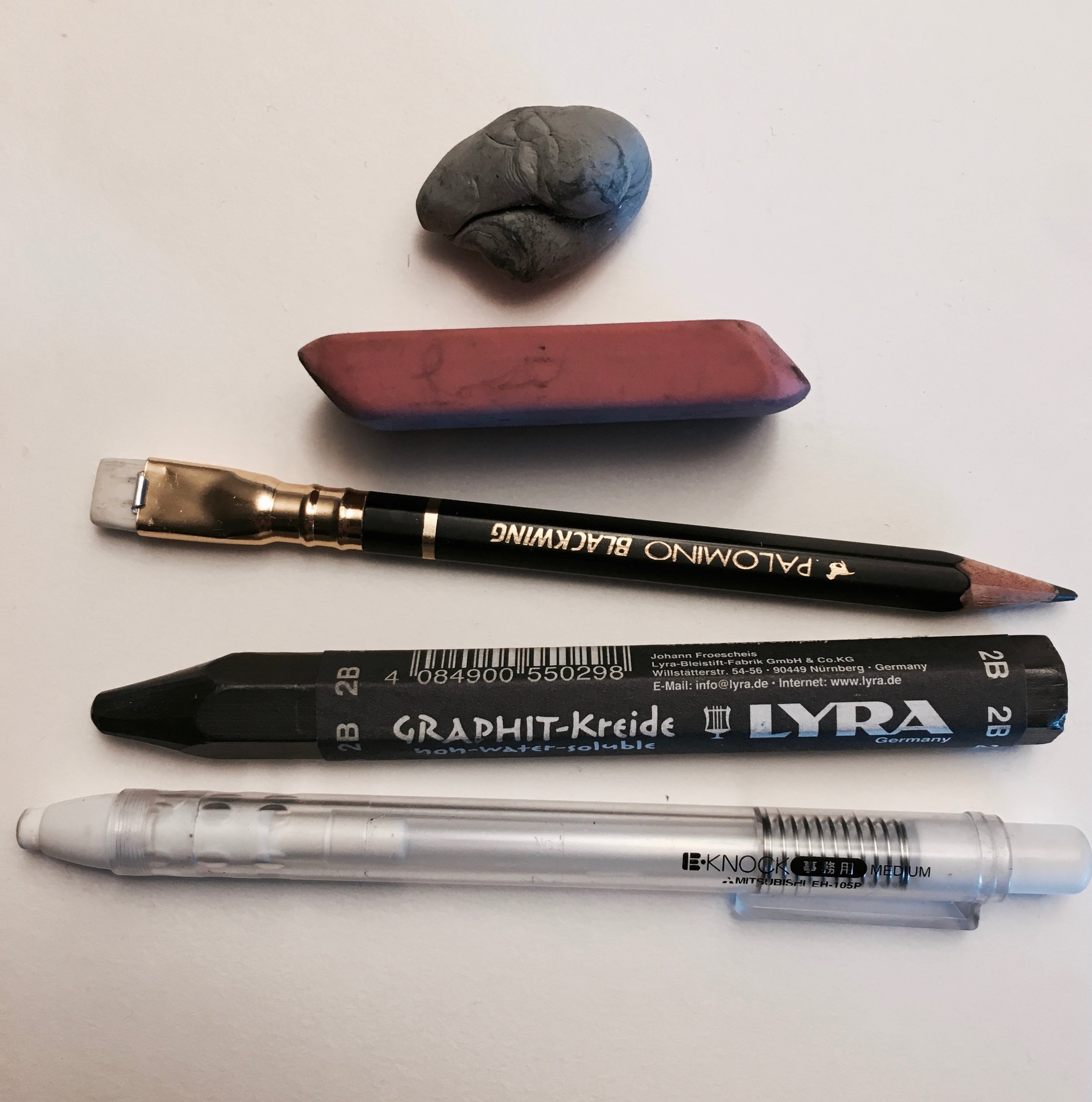
- Graphite Powder (get at an art supply store or online)
- Erasers - large, small, all shapes
- Paper - cardstock, watercolor or multi-media…anything thicker than printer paper
- Larger placemat, newspaper, or something under your project…it can be a tad messy!

© Elizabeth Haidle 2018.
STEPS:
1. Using a crumpled up paper towel or tissue, dip into the jar of graphite powder and coat one side, then rub in circular motions across your page until an even tone of grey appears. (Don’t be afraid to press down quite a bit!)
2. Lightly brush any excess powder away by whisking another tissue across the surface. The graphite should be kind of ‘scrubbed into’ the paper, like a stain.
3. With a pencil, sketch in a few lines to show which shapes you intend to make lighter (might be the area around a shape, as in this case!) Erase with a giant eraser or kneaded eraser (my fav)
4. When you have the shape you’d like, fill in details with a finer eraser, the end of a pencil, or one of those refillable cartridge erasers (these can apply a decent amount of pressure)
5. Now add finishing details in pencil or pen. You can even overlay thin watercolor washes on top of the erased spaces or the graphite-tone parts, just be aware that the moment you put water down, it’ll fix your image on the page in a permanent way—no longer erasable.
Here are other images made using this method:
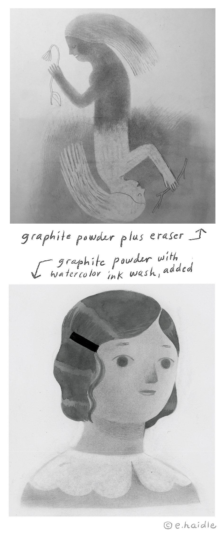
© Elizabeth Haidle 2018.
And a process vid, to see it in action:

© Elizabeth Haidle 2018.
Love this DIY project? Check out our Instagram Giveaway to win Elizabeth Haidle's completed piece from the DIY video (pictured above) ! More details on the giveaway can be found here. And stay tuned for more black-and-white themed DIY projects in our next ILLUSTORIA Issue #8: Black and White, coming oh-so-soon.
The Pipers Sneak Peek

Art from The Pipers by Paul du Coudray and Beth Haidle
Did you know that Illustoria's very own creative director/art wizard Elizabeth Haidle and our longtime contributor and friend Paul du Coudray are collaborating on a project of otherworldly dimensions?
Art from The Pipers by Paul du Coudray and Beth Haidle
We're excited to share a few sneak peek images from The Pipers, a graphic-novel adaptation of a P.K. Dick short story from the 1950’s. Sci-fi lovers rejoice. Get updates on their progress, gain early access to their work, plus member perks and prizes at Studio Mascot. Far out ❕ 〰️
Art from The Pipers by Paul du Coudray and Beth Haidle
And don't miss out on Beth and Paul's gorgeous contributions to Illustoria. We're so honored to have their awe-inspiring artwork and insightful visual storytelling gracing the pages of our mag.
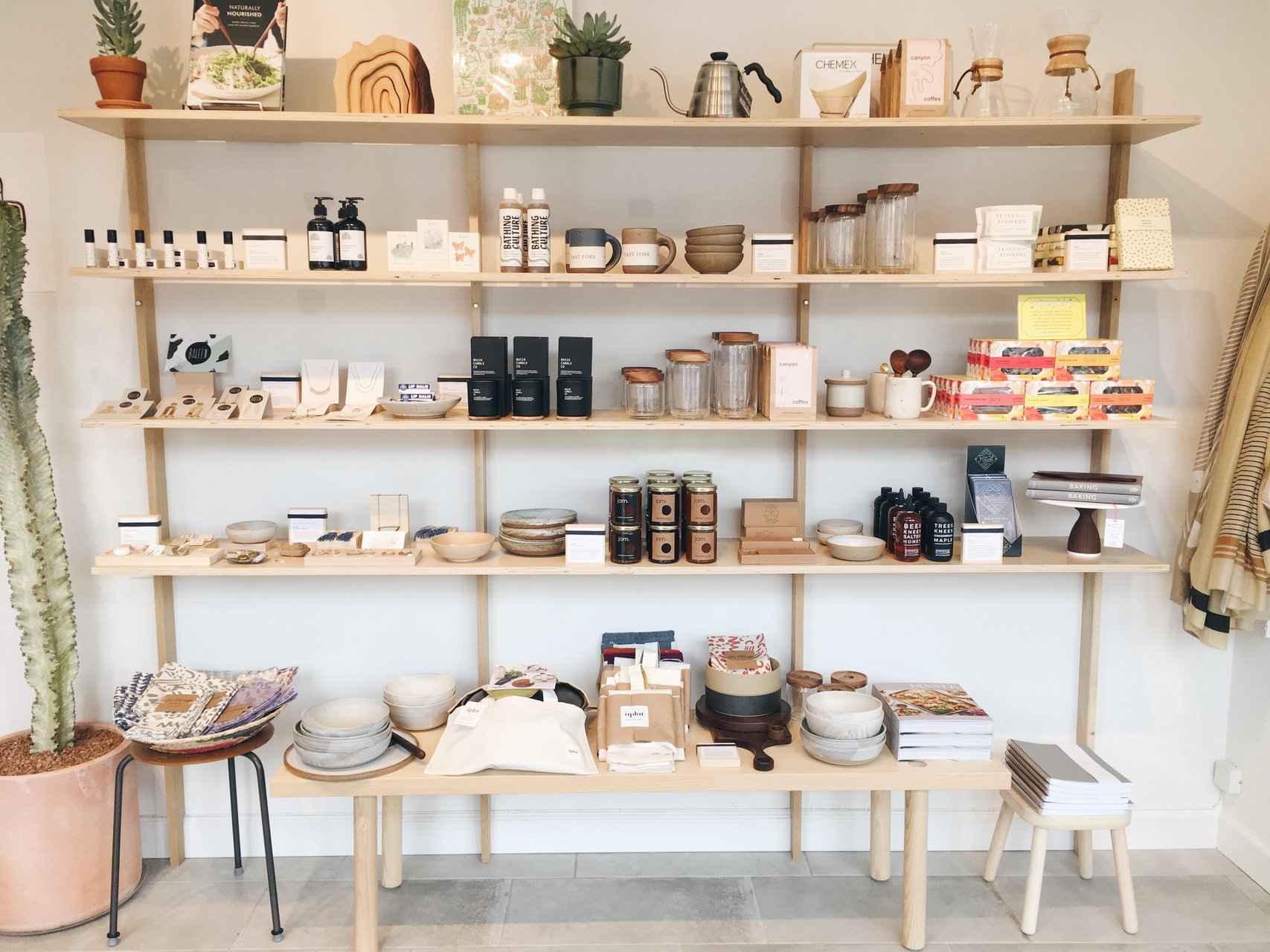
Stockist Showcase: Case for Making

art & photo by Alexandria Lai; a small rendition of Alexis in front of her shop ☻
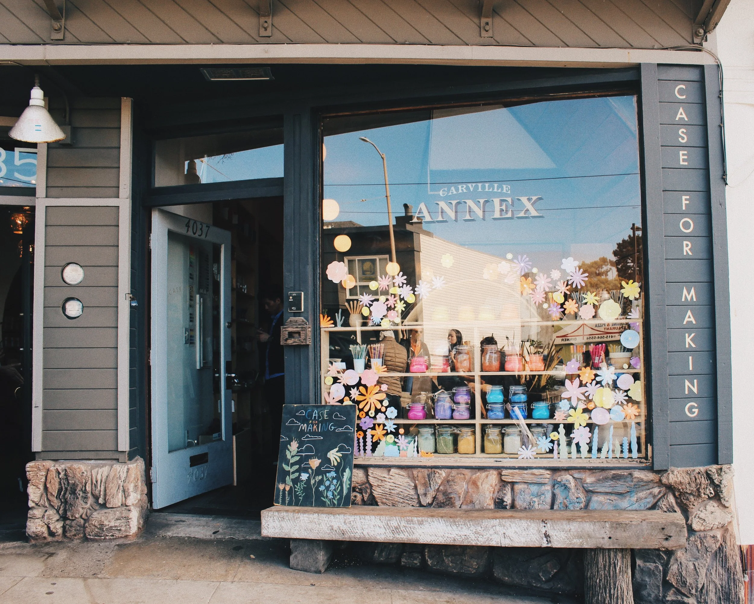
As part of our Stockist Showcase campaign, #ILLUSTORIAshopslocal, we’re interviewing the staff behind beloved shops that carry Illustoria, to spotlight the amazing people behind small businesses that make their neighborhoods so special. This week, we made a visit to Case For Making, the most dreamy studio supply shop located in the Outer Sunset district of San Francisco.
Enter through the doors of Case For Making, just a block away from windswept Ocean Beach, and you’re instantly transported into an artist’s wonderland. With a lush wooden interior and beautifully curated goods displayed in every corner, it’s easy to hole up in this cabin-esque shop for hours on end. For those who find themselves wandering in with nothing in mind, they, too will find it easy to roam through each nook and cranny.

Illustration excerpt from "A Brief History of Vermillion" written by Alexis Joseph & illustrated by Lindsay Stripling for ILLUSTORIA Issue 5: Motion
I had the opportunity to interview Alexis Joseph, one of the co-founders of Case for Making. Her interest in color is what initially brought her into the world of watercolor paint making. Each Case for Making watercolor is a handmade, labor of love with rocks sourced from across the United States and then processed into pigment by Alexis and her team. If you don’t see Alexis at the shop, she might be running to and from their other location, thinking up the next new color to produce with the managers, or writing her regular feature to Illustoria magazine, "The Brief History of Color." (Check out Issues 4 - 6 to read the incredible stories behind ultramarine blue, vermillion, and ochre, written by Alexis Joseph and illustrated by Lindsay Stripling; and find more episodes in the series in upcoming issues of Illustoria). Thankfully, she could squeeze out some time during her schedule to answer a few questions about Case for Making.
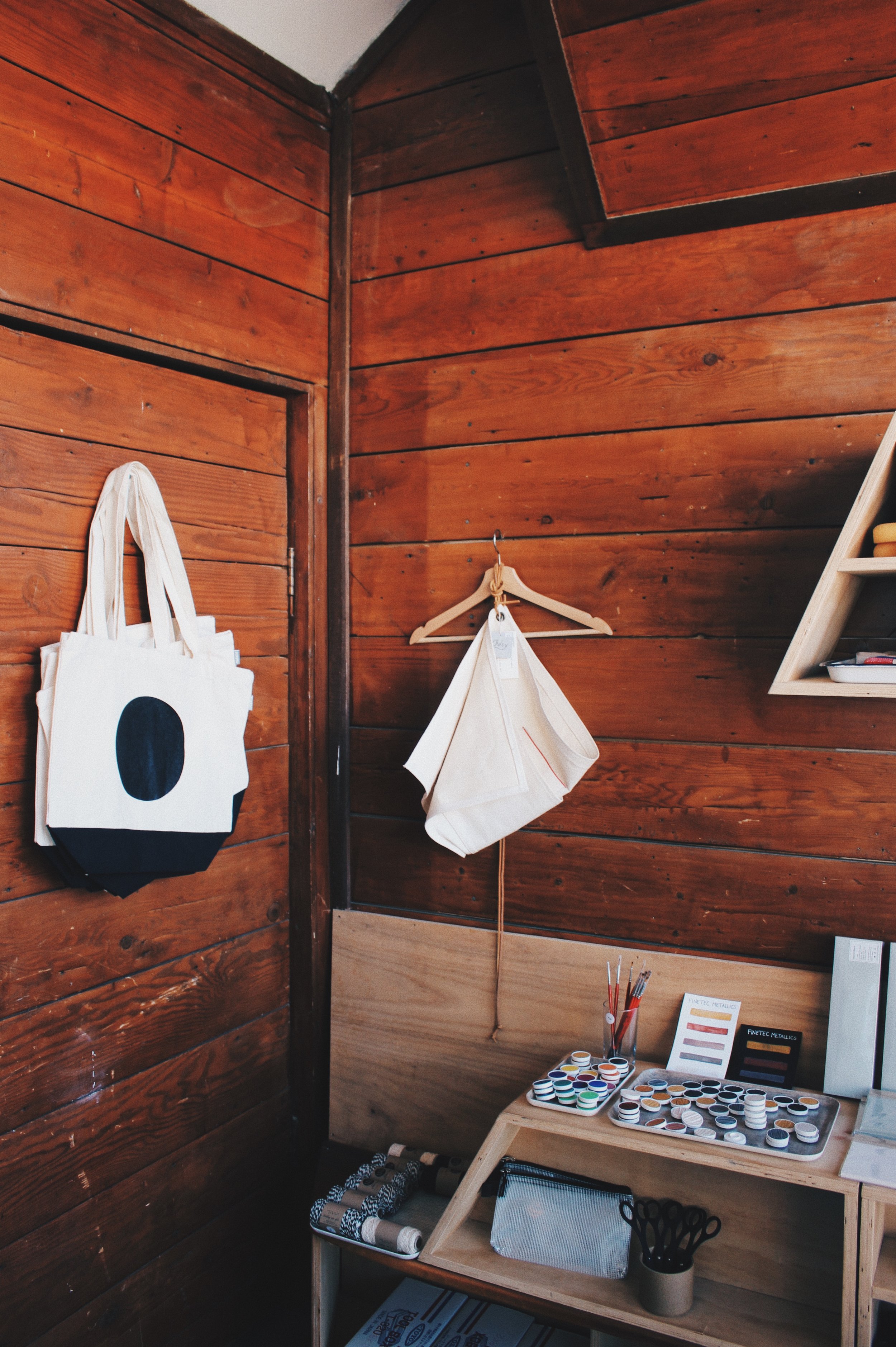
photo by Alexandria Lai
How does Case for Making find the artists and makers who also inhabit the space?
A lot of the original supplies I stocked the shop with were all my favorite supplies that I have used throughout a lifetime of drawing and painting as well as architecture and drafting supplies I used in undergraduate and graduate school! I quickly saw that the products that we were selling the most of were watercolors and watercolor supplies, which worked out because its always been my favorite medium. Other things we stock are made by friends, so it feels extra special to carry their work and support them in that way. Anything we couldn’t find or just wanted to see a certain way, we decided to make ourselves!

photo by Alexandria Lai
Do you have a current favorite product/book/magazine that can be found at your shop?
We really love all the Illustoria magazines!!! Other than that we just got in a line of pure pigment and all the supplies you need to make your own paint! We love being able to share and teach all aspects of what we do here with everyone who walks in or joins us for a class or finds us online or through Illustoria.
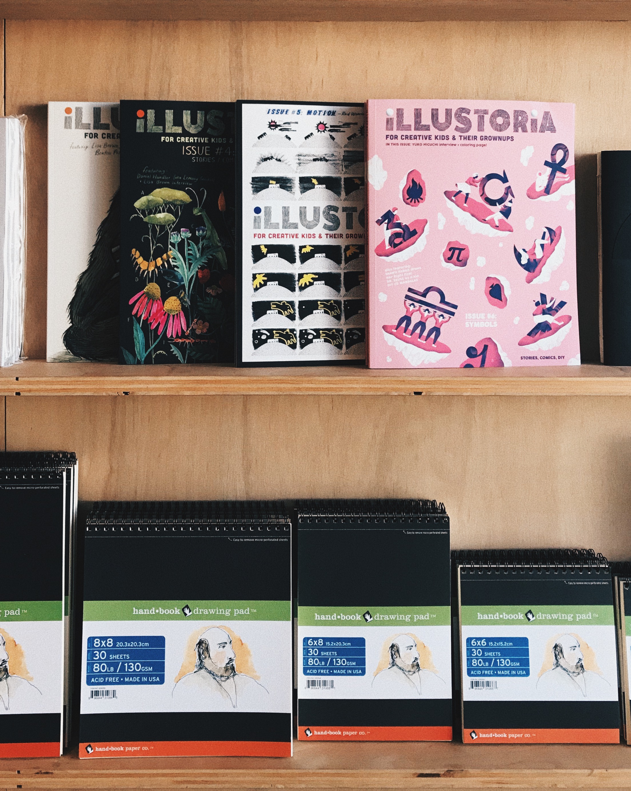
photo by Alexis Joseph
How did you overcome the obstacles you faced before launching Case for Making?
I started Case for Making while I still had a full-time job. It took me three years in order to get the business (and myself) to a place where I could work full time only for Case for Making. It all took time and hard work and trusting myself to make decisions quickly. All in all, I had to learn how to get good at seeing what was working, and letting go of the things that weren’t.
What is different about Case for Making?
Our paired down selection of drawing and watercolor supplies compliments our in-house handmade products and supplies. We have over 70 colors of watercolor paint that we make by hand in the shops made from pure pigments that we source from all over the world mixed with natural binders. It’s fun to see this process in action and I hope people feel the love and care that goes into our products when they use them! Both shops are also active workspaces so you might see us mixing up fresh batches of paint or collating and gluing up packs of our letterpress watercolor postcards!

photo by Alexandria Lai; Staff member MJ at the work station
Do you have any big dreams or goals for your business?
We want to continue to develop not only our handmade line of watercolors but also a range of paper and ceramic products; who knows what else we’ll dream up! We just love approaching a creative practice from a place of curiosity in terms of material and process. I’m also working on my own studio practice and am reminding myself to incorporate advice that I’ve been handing out over the years into my own process!
Can you describe some of your typical customers? What do you enjoy most about helping your customers find the perfect book/watercolors/art supply/gift, etc.?
We love all of our customers so much and we get all sorts of people visiting the shop! We have people who follow us on Instagram and plan to visit the shop while they are here on vacation and we have neighborhood artists who get all their supplies from us. We also have lots of people stumble in who’ve never heard of us and they’re excited to try out some pens and hang out for a bit! Everyone who walks in is generally pretty happy to be in an art store and we love talking to everyone about the products we make and how we produce our watercolors. We also yell at anyone who comes in and says that they wish they were artistic; we say, “EVERYONE IS ARTISTIC!” Can you make a mark on paper? Fine then, make that mark over and over on a piece of paper with a pen or a pencil or with a brush and watercolor and see what you can make just with that!

photo by Alexandria Lai
Any advice for aspiring small business owners?
Simplify your idea, hone it, and build it out from there. I didn’t think I’d have a watercolor paint making company when I started an art store 4 years ago! It was all a response to what was working and what people were interested in combined with my experience and interests! Stay flexible yet clear with yourself on what it is that you’re excited about and then clearly state that in every aspect of your business!
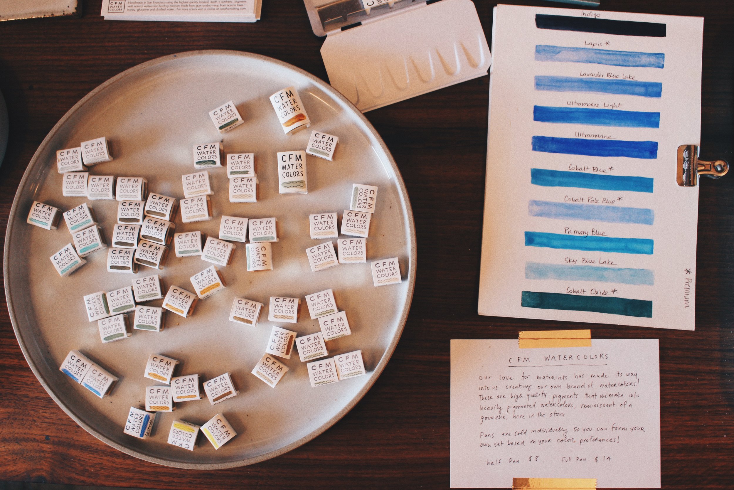
photo by Alexandria Lai
And as always, if Case for Making were an animal, which animal would it be?
Easy. We’d be an Octopus because they have pigment in their skin and can change color on demand all of which is based on their own process of trial and error! They also have 8 arms so they could draw and paint many things at once! They’re the coolest.

Octopus, painted in the Indigo and Titanium White handmade watercolors by Alexis Joseph
Thanks to Alexis for taking the time to chat about this amazing studio supply shop! Be sure to check out their Instagram caseformaking for regular updates and loads of paint making Instagram stories! Case for Making and Lindsay Stripling are also regular contributor's to Illustoria with their incredible feature "The Brief History of Colors". Check out Issues 4 - 7 to read the stories behind vermillion, orche and ultramarine blue.
Stay tuned for our next stockist showcase, and in the meantime be sure to check our stockist list to find the ILLUSTORIA seller nearest to you!
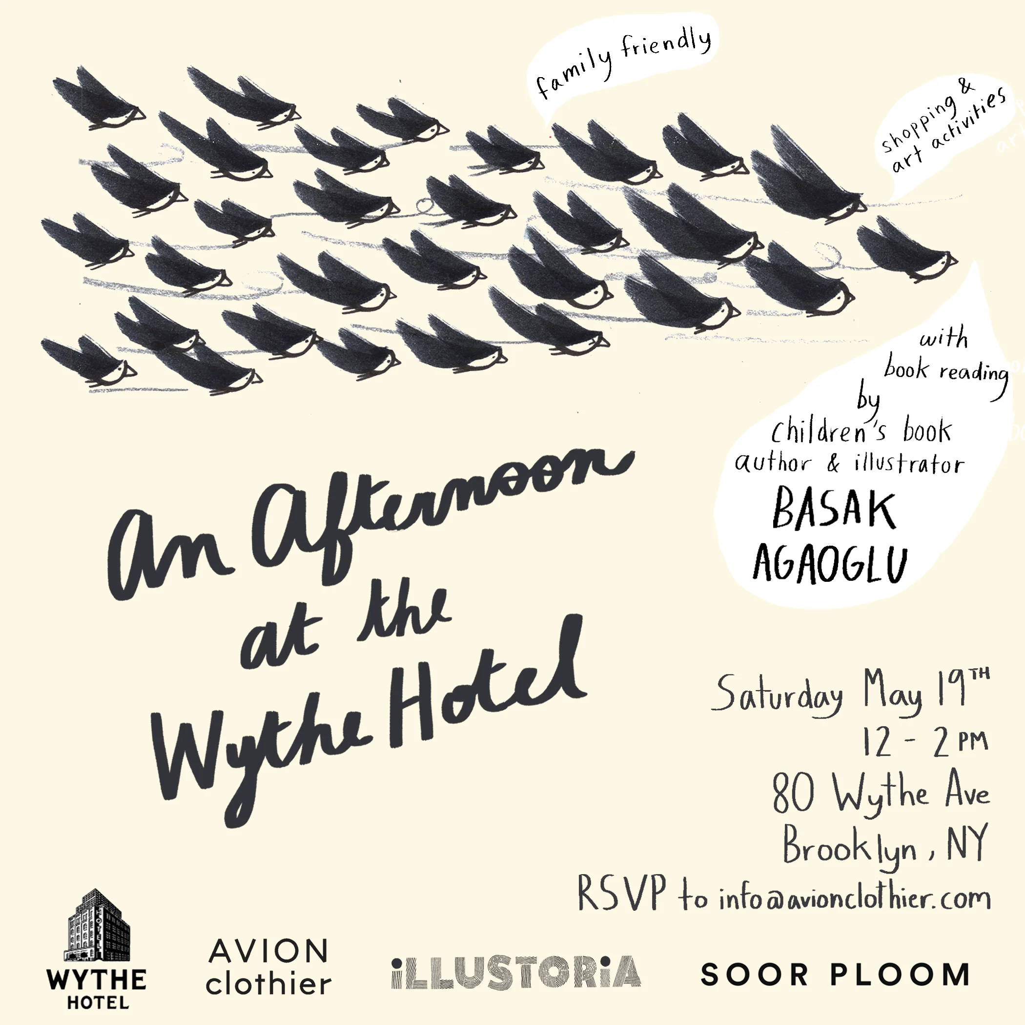
An Afternoon at the Wythe

Art by Basak Agaoglu
WHERE:
Wythe Hotel
80 Wythe Ave
Brooklyn, NY 11249
WHEN:
Saturday, May 19th
12:00–2:00 PM
WHY:
Join us for an afternoon of crafting, story time, shopping, and catching up with friends at the Wythe.
New Yorkers and Brooklynites! We are so thrilled to be making an appearance at the historic building of the Wythe Hotel. Come see us on Saturday, May 19th, from 12:00–2:00 PM, where we will be leading an adorable art-making activity perfect for all ages. Hosting this event is Avion Clothier, an LA & NY-based designer and store close to our hearts. Soor Ploom will also be on hand showing off their gorgeous line of children's clothes. Best of all, Basak Agaoglu, an acclaimed children's book illustrator and creator of The Almost Impossible Thing, will be reading from her book and talking about her craft and process as an artist to inspire your creative kiddos. Bring family and friends and join us for this perfect afternoon at the Wythe!
RSVP to info@avionclothier.com
Invite artwork by Basak Agaoglu; design by Claire Astrow

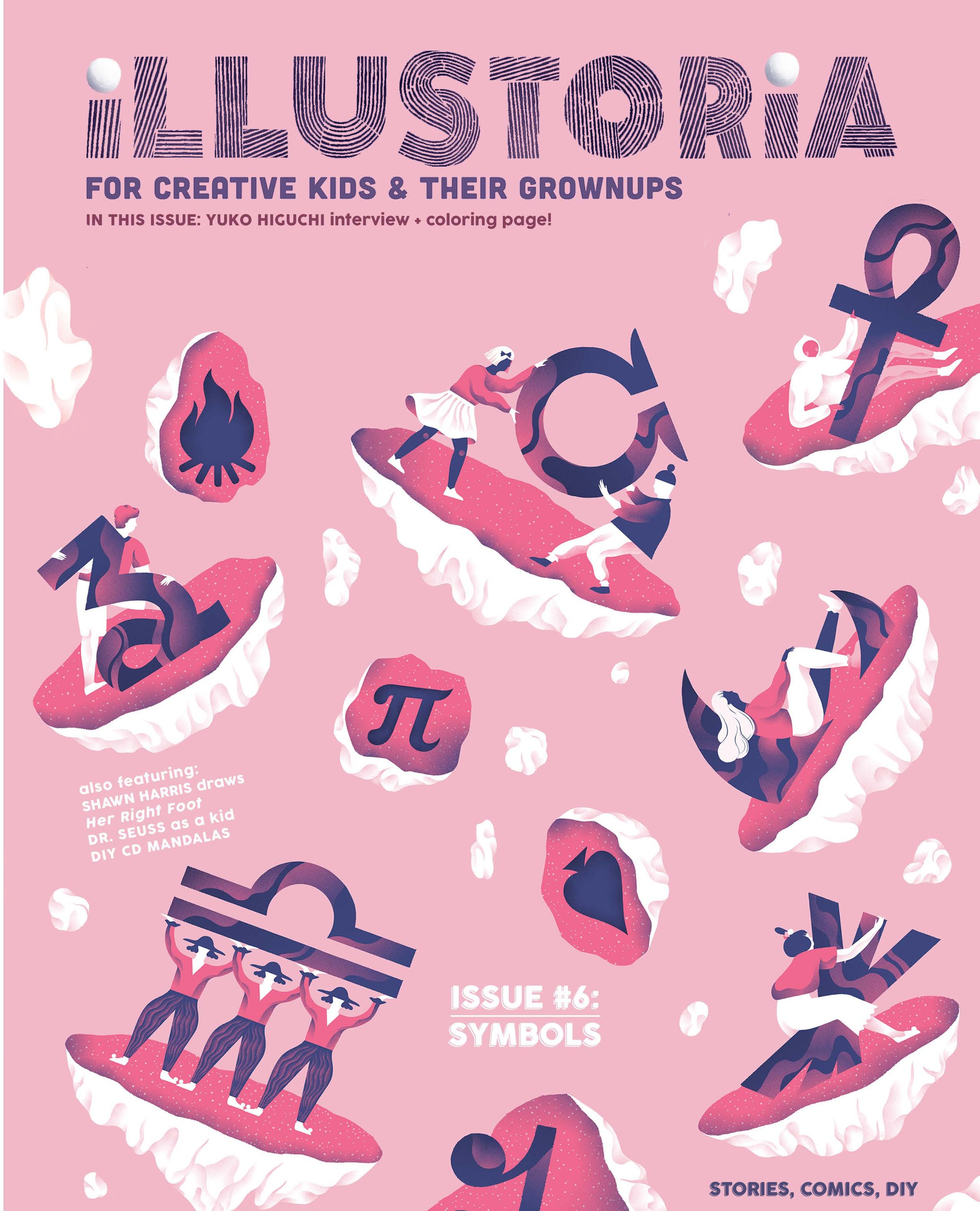
Playlist: Issue #6 Symbols
Symbols are everywhere, from the language we use to say "I love you" to the beat of a drum telling you to shake your hips. Take a trip with us to the dreamy world of shapes and sounds in the Issue 6: Symbols playlist! This mix features an eclectic melting pot of Zambian "Zam-rock", Turkish folk, and psychedelic electronica that make the perfect backdrop for art making, dancin' or just hanging out on a Thursday afternoon!
Hope you enjoy the tunes, and make sure to follow us on Spotify for groovy playlists of Issues 1 - 26!
Artwork by © Marina Muun for ILLUSTORIA #6: The Symbols Issue
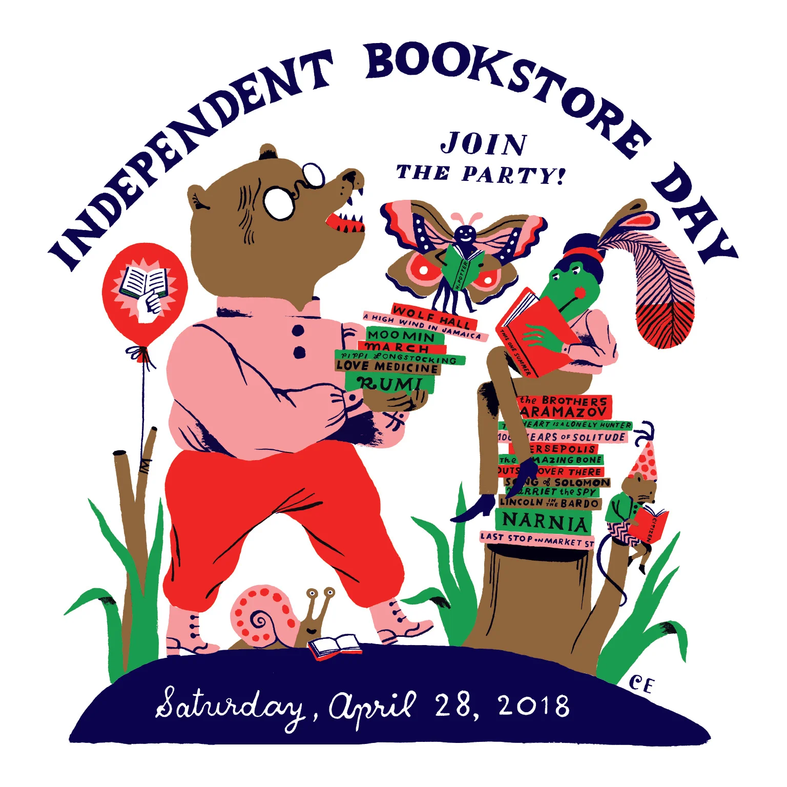
Indie Bookstore Day at East Bay Booksellers!

art by Carson Ellis
WHERE:
East Bay Booksellers (formerly known as Diesel!)
5433 College Ave
Oakland, CA 94618
WHEN:
Saturday, April 28th
11:00 AM–1:00 PM
WHY:
To celebrate Independent Bookstore Day, make awesome pop-up books and DIY bookmarks at our craft table, and stock up on ILLUSTORIA magazines plus grab some adorable free bookmarks and pins!
Here at ILLUSTORIA, we consider independent bookstores to be just about our favorite places in the world. Join us on Saturday, April 28th from 11:00 am–1:00 pm to celebrate Independent Bookstore Day at a shop very dear to our hearts, East Bay Booksellers. We'll be offering an adorable pop-up book activity perfect for all ages; giving away limited edition bookmarks, stickers, and enamel pins; and selling magazines, of course!

We believe in accessible crafts for all ages. Art by Alexandria Lai
Loyal supporters of our mag, East Bay Booksellers was one of the very first places to stock ILLUSTORIA. We love this shop for its brilliant book curation, super friendly staff and fireplace reading area so cozy we've often been tempted to camp out there and never return.
Make some pop-up book-art with us! Art by Claire Astrow
We're so excited to be a part of this special book-ish holiday with one of our favorite Bay Area independent bookstores, and hope you can join us to celebrate! Check out http://www.indiebookstoreday.com/ to learn more about Indie Bookstore Day festivities near you.
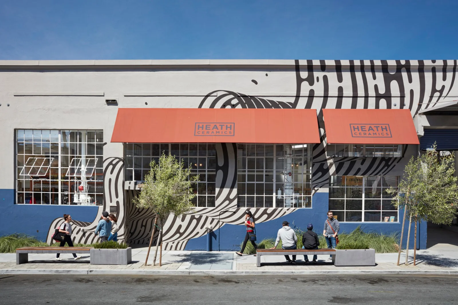
Mother's Day Card Making at Heath Newsstand

WHERE:
Heath Newsstand, located in Heath Ceramics
2900 18th Street
San Francisco, CA 94110
WHEN:
Saturday, May 12th
10:00 am - 12:00 pm
WHY:
Decorate loving, refrigerator-worthy Mother's Day cards at the SF-based wonderland that is Heath Newsstand, a gorgeous space dedicated to quality print publications from around the globe. We'll be on hand making pop-up cards, string-art cards with colorful embroidery floss, and good 'ol paper, markers, and scissors. Come craft with us and enjoy a beautiful afternoon at the lovely Heath Newsstand. PLUS! Receive a free gift of Sakura Gelly Roll White or Gelly Roll Metallic pen + Illustoria stickers and bookmarks with every Illustoria magazine purchase! (Good for the first 30 customers. Limit 2 per customer.)
No time for the kiddos (or you!) to make a Mother's Day card? No sweat, ILLUSTORIA's got your back. Join us May 12th at our happy place, Heath Newsstand, to make and customize a card or two or three. See you there!

Heath Ceramics has been a champion of quality dining and house wares in the Bay Area since 1948. The company was founded by Edith and Brian Heath in Sausalito, CA and today you can find the kiln fired pieces in museums and shops around the country. Not only are heath ceramics, tiling, and furniture made to last--they are art objects that push boundaries and embody the down-to-earth, California spirit. On an average weekend, you can find the ILLUSTORIA staff wandering the Heath Ceramic showroom or perusing their newly opened Newsstand. We're honored to be stocked at Heath, and hope you can join us on Saturday, May 12th, to celebrate the strongest women in our lives — our moms.

Art by Cynthia Alonso from ILLUSTORIA Issue 6: Symbols
On Letter Writing and Activism

This April, we're celebrating Letter Writing Month with Andrew Aydin, co-author, with John Lewis himself, of the graphic memoir series March, which details the civil rights journey of congressman and activist icon John Lewis. In his foreword to the newly released MARCH: 30 Postcards to Make Change and Good Trouble, Andrew Aydin offers a heartfelt ode to the importance and beauty of letter writing. We're honored to share an excerpt from his foreword with our readers, and hope that it inspires you to get writing--to your loved ones and friends, or to your congressperson or the president--before the month's end.
INTRODUCTION BY ANDREW AYDIN
From March: 30 Postcards to Make Change and Good Trouble by Andrew Aydin, John Lewis, and Nate Powell (Chronicle Books, 2018).
If you know about Congressman John Lewis, or if you have read March, you probably know that John Lewis first met Martin Luther King, Jr., by writing Dr. King a letter asking for his help in desegregating Troy State College, now known as Troy University, in Alabama. Dr. King wrote back and sent John Lewis a round-trip Greyhound bus ticket to visit him in Montgomery. That letter, and its response, set John Lewis on a path that helped reshape the moral landscape of our nation.

segment from March: Book One by Congressman John Lewis, Andrew Aydin, and Nate Powell
Perhaps then you can understand my own trepidation when I started my first job working for Congressman Lewis: answering his mail. Even after serving on his staff for more than ten years, making “Good Trouble” into #goodtrouble, and writing three graphic novels with him, I can still remember the intimidating awesomeness of the sight of so many bins, boxes, and stacks of unopened envelopes from those first days. You might think of it as starting in the mail room, except you would be overstating the available space for such a task if you believe there is a whole room in a congressional office available to devote to opening, sorting, and responding to the mail that has poured into his office nearly every day of his more than thirty years in the U.S. House of Representatives. No; it was simply a desk, where the office refrigerator once sat, among nearly a dozen other desks, tightly packed and partitioned, in a room built more than a century ago.
Epistles arrived at the office in droves, filled with all-too-human stories of tragedy, pleas for help, and beautifully plainspoken descriptions of how the policies debated in Washington should be viewed in a context far larger than merely numbers on a page or entries in a ledger. It took a little while to find my way, but eventually I realized I had been training for this nearly all of my life.
My training began with thank-you notes. I’ve been told this is a distinctly Southern experience. My mother’s rules were unequivocal: handwritten and prompt. She had me start writing them nearly as soon as I could write anything. Even today they are a beneficial habit, which I should be better about. It’s not that I don’t often write thank-you notes. I write quite a few. But the ones I do not write—that I know my mother would insist I should write—loom over me like a dark cloud until it’s been so long since they were “due” that I absolve myself of their necessity by rationalizing that it would seem strange and discourteous to send a thank-you note now, after such a long time.

segment from March: Book One by Congressman John Lewis, Andrew Aydin, and Nate Powell
As I got older and my penmanship improved, my Uncle Hi continued my epistolary learning by exchanging letters with me. His name is actually Hiram, but my Aunt Jody always told me to call him Hi. That’s what everybody called him. “Hi! . . . Hi” was how I clumsily began most of our conversations. I remember having a hard time picking up any sort of meaningful conversational thread after botching the salutation, and phone calls would be quite formal. But when we wrote letters, it was much simpler. “Dear Hi.” There was a degree of sanctuary to it, and our written conversations took on a more vivid life full of honest questions and advice. In some ways, those letters did more to teach me how to write than anything else did. We still write to each other even now. I’m pretty sure I owe him a letter.
Once, when I visited Hi and Jody in Ohio at their home, Hi pulled out a yellowing stack of handwritten letters marked by varying degrees of what can best be described as block letters, then primitive cursive, and, eventually, a bizarrely imitative version of my mother’s own handwriting. I was equal parts deeply touched that he had been saving my letters to him all these years and terribly embarrassed that an archive of (let’s just call them “early”) writings had been so neatly preserved. In that moment at Hi’s house, I felt a sudden flush of gratitude that my youth existed there, on paper, both tangible and private, as if I were the last of a dying tribe born with privacy, about to be overtaken by the perpetual and public preservation of youth by the new Internet generations.

segment from March: Book One by Congressman John Lewis, Andrew Aydin, and Nate Powell
Don’t get me wrong; I believe the Internet can be a force for good. It is perhaps the greatest potential tool for organizing sustained campaigns of nonviolent civil disobedience that the world has ever seen. I like to ask students, What would Dr. King have tweeted? Or, What would Gandhi have posted? How could SNCC (Student Nonviolent Coordinating Committee) have used the Internet? By the end of the discussion, the students often realize that they would be using these tools as a means to get people to physically show up. It would be like giving Bayard Rustin a super–Swiss Army Knife of organizing tools; but it would not have changed the need for people to show up to the 1963 March on Washington to push for civil rights legislation.

segment from March: Book One by Congressman John Lewis, Andrew Aydin, and Nate Powell
And that’s how I feel about mailing letters and postcards in the era of instant communication. Human beings are social animals. We need human interaction, and the further removed from the personal those interactions become, the less meaningful they are. If you’re trying to change someone’s mind, you need to be personal; you need to establish a connection to share your ideas. You need to make sure a very real part of you shows up to make sure your voice and your ideas are heard.
That’s why I believe you should regularly write to your congressperson, or state legislator, governor, or the president to express your views on policies, and you should probably write by hand. It is no doubt simpler to throw some words into a contact form and hit Send, but having spent a good amount of time on the receiving end, I can tell you that a handwritten note will go a lot further. Some part of it certainly has to do with the personal intimacy of reading another person’s handwriting. But I’m also sure that some of it has to do with the spectacle of seeing thousands of pieces of paper, all individually constructed but united in purpose, laid out in support of or opposition to a particular position.
.
.
.
So, what letter will you write? What words will you choose? Get started, because we need you now more than ever.
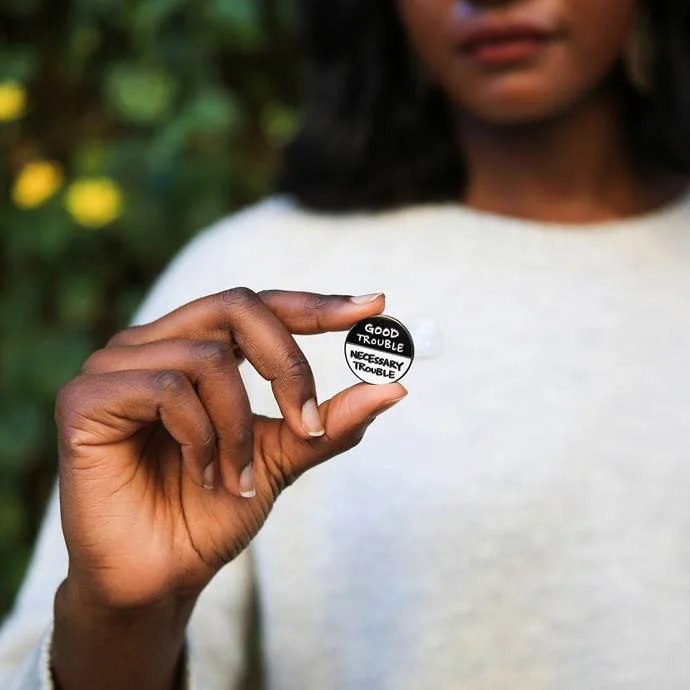
If you're an avid fan of March, or just learned about this incredible graphic novel series, be sure to check out our Instagram giveaway of newly released March: 30 Postcards to Make Change and Good Trouble, MARCH journal, and special edition Good Trouble / Necessary Trouble MARCH pins. Special thanks to Chronicle Books for partnering with us to make this giveaway possible!

MARCH pin, photograph taken by Chronicle Books
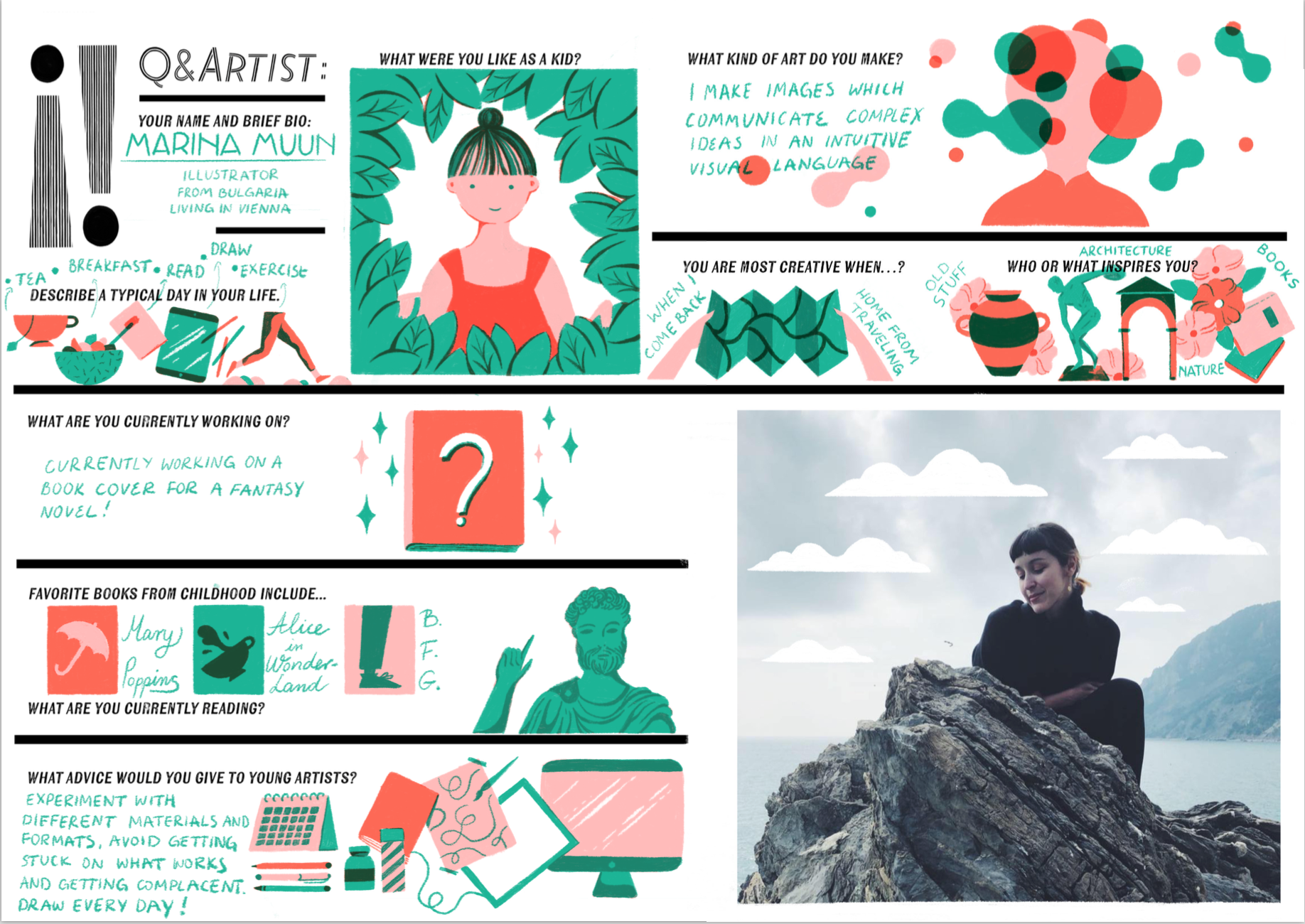
Q & Artist: Cover Artist Marina Muun

Illustrator Marina Muun
We are so thrilled to showcase Marina Muun, our cover artist for The Symbols Issue. Marina hails from Bulgaria and currently resides in Vienna, Austria. She has illustrated for The New York Times, Tate Publishing, Google, BuzzFeed, The New Yorker, Wrap Magazine, and many more esteemed publications. We fell head over heels in love with her beautiful, bold artwork for our latest cover:
Illustoria # 6: The Symbols Issue; Cover art by Marina Muun
Check out The Symbols Issue to see her beautiful illustrated comic, "The Rock Garden," which combines her fascination with modern architecture with her reverence for the antiquated.
Enjoy Marina's illustrated Q & Artist interview. We're pretty sure you will fall in love with her and her artwork as much as we have!
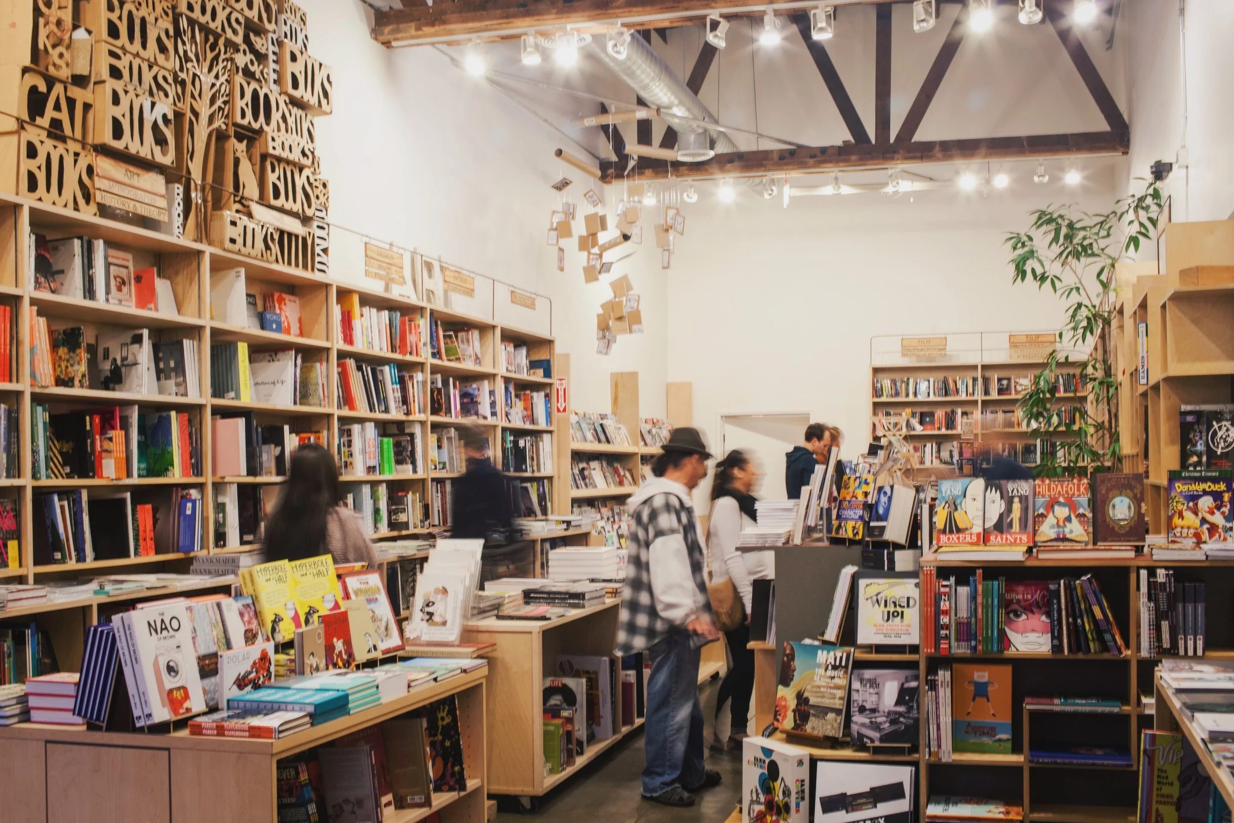
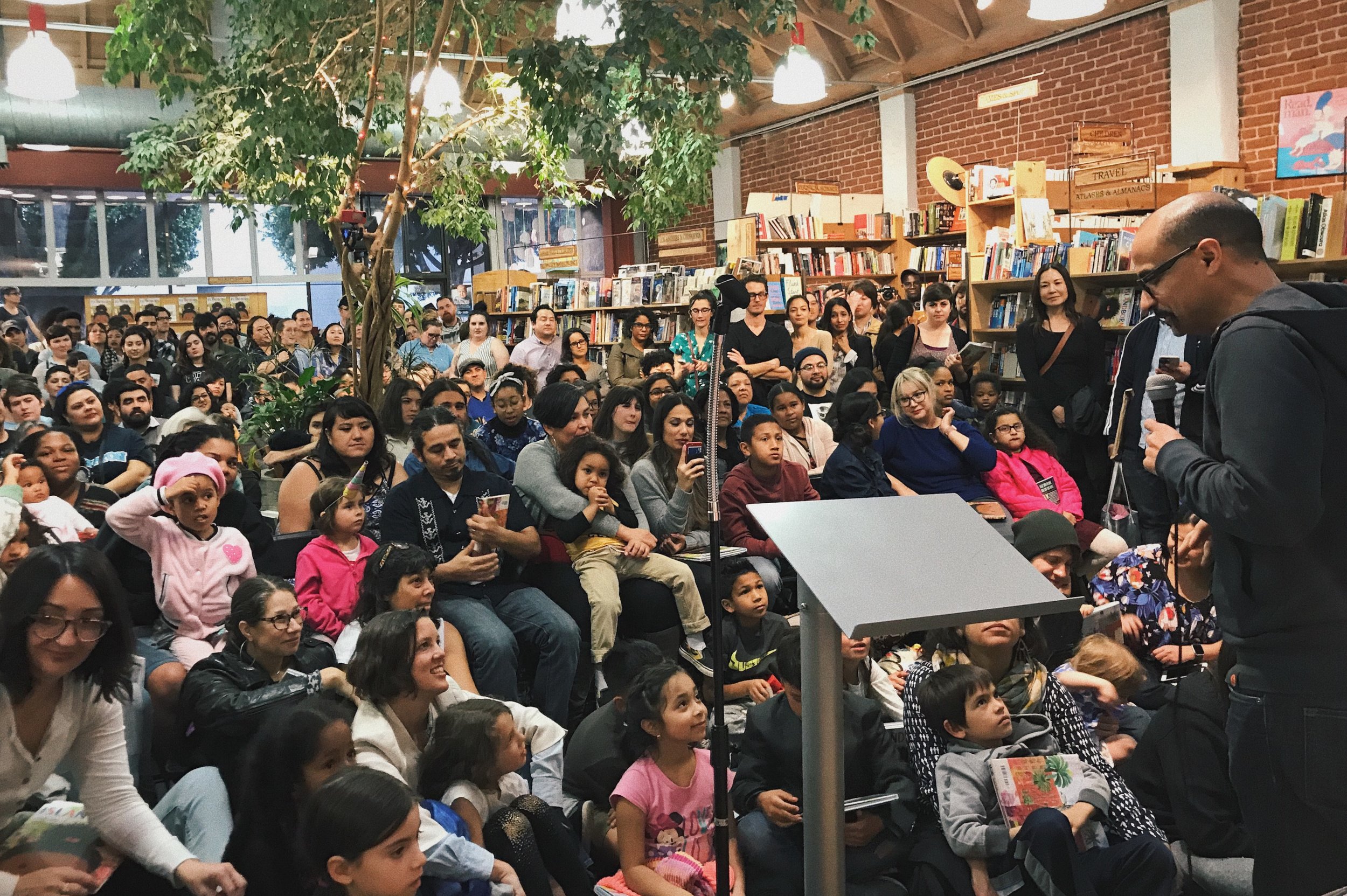
Stockist Showcase: Skylight Books

photo taken by © Kelly Brown
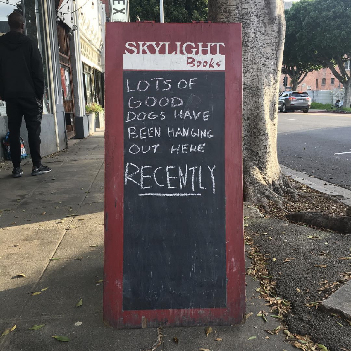
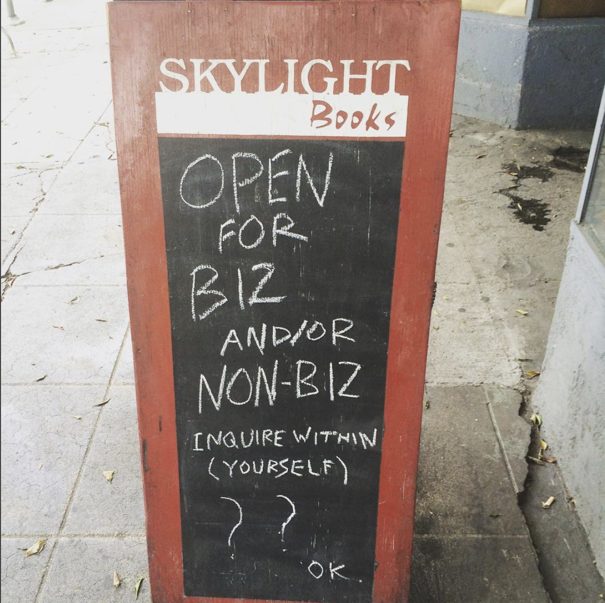
Skylight Books is the epitome of a bookstore that truly defines the neighborhood it resides in. This bustling bookstore was born in 1996, and since then, has become a home not only to those who have worked or shared their stories there, but also to travelers looking for respite on both bright and rainy (though rare!) days. If their large glass windows, which usually feature a themed display of some sort, do not stop you from wandering in, then the chalkboard sign full of amusing messages surely will.
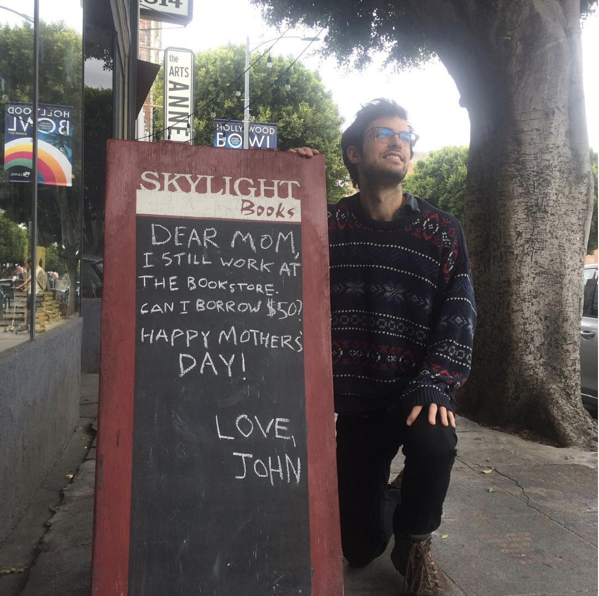

ILLUSTORIA's publishing assistant and LA native Claire Astrow considers Skylight Books a home away from home.
Follow @skylightbooks on Instagram for more fun posts!
In our new stockist showcase campaign, we're featuring some of our most beloved shops where you can find the magazine and introducing readers to the heroes running their most treasured neighborhood shops. This week, we're featuring our home-away-from-home @skylightbookstore located in Los Angeles. We had the opportunity to interview Steven Salardino, the manager of Skylight Books, on what this historic bookstore that stocks ILLUSTORIA is all about.
Please describe what a customer will experience when they walk into your bookstore.
Some notice the tree in the middle right away and some look up years later and wonder if it has been here the whole time. A lot of people don’t know that we have an Arts Annex next door even though it has held our selection of art books, music books, comics, architecture, film, and magazines for the last ten years. Still, others wonder if we are related to the “comic book store next door.” I think the combination of books, music, and staff work well with the space to create a feeling that is relaxed and makes one feel both “at home” and connected to something cultural and communal.

photo taken by © Lindsay George
Is there something unique about your bookstore that cannot be experienced anywhere else?
You know those words that can’t be translated into English? Like there is no direct translation (see: “wabi-sabi” or “saudade”)? That is sort of what you want your bookstore to have as an experience. There is a specific bookstore feeling that says, “This is what a bookstore should feel like,” and then there is, “This is what this bookstore should feel like.” On a good day, it feels “rènào* (热闹).”
*Rènào captures the feeling of a lively space bustling with noise and excitement—a fitting description of Skylight Books
...And we have a fifteen-foot cardboard sculpture with hidden messages.

photo by Steven Salardino himself!
There is no denying that the community behind Skylight Books is large and supportive, but like any independent bookstore, there were quite a few obstacles faced before establishing the business. When asked about the beginnings of Skylight Books and what they had to overcome, Steven told us this:
Bookstores in general have faced many challenges since we opened twenty-one years ago. The challenges of opening any business can be tough. We have had to face competition from discount and chain stores as well as online behemoths. Then, there was the presumed threat of electronic books to the bookstore world. Skylight Books has always tried to be positive. We have always loved books (and magazines and journals) and believed other people did too and would feel as we did – that books and bookstores were important and should be supported. I know that I often find myself buying books at other independent bookstores on my day off!
If Skylight Books were an animal, which animal would it be?
I would like us to be one of those Dr. Seuss creatures…like four animals grafted into one, brightly colored, and with a silly smile.

Illustration by Skylight Books staff, Alex Hemming
Thanks to Steven and all the folks at Skylight Books for taking the time to chat about your awesome bookstore! Stay tuned for our next stockist showcase, and in the meantime be sure to check our stockist list to find the ILLUSTORIA seller nearest to you!
Everyday, there are endless tasks to complete, patrons to help, and emails to answer. But whether the staff are busy tidying up the bookstore, feeding their resident cat Franny, or posting about upcoming book releases and author readings, they will never be too busy to share their love for the community of booksellers, artists, zinesters, and readers that inhabit their space! So don’t be afraid to ask any of the staff you get to meet what their current favorite read is. With any luck, maybe they’ll be able to convince you to take it home too.
Steven’s current favorite book is: Monograph by Chris Ware. Though it has already been a year since its release, Steven still can’t get over how huge, beautiful, and detailed this graphic novel is, noting that Ware is one of the most important artists and storytellers of our time. If this has enticed you, don't hesitate to swing by Skylight Books to purchase your very own copy of it.
Be sure to check out Skylight Books for upcoming events, programs, and more!
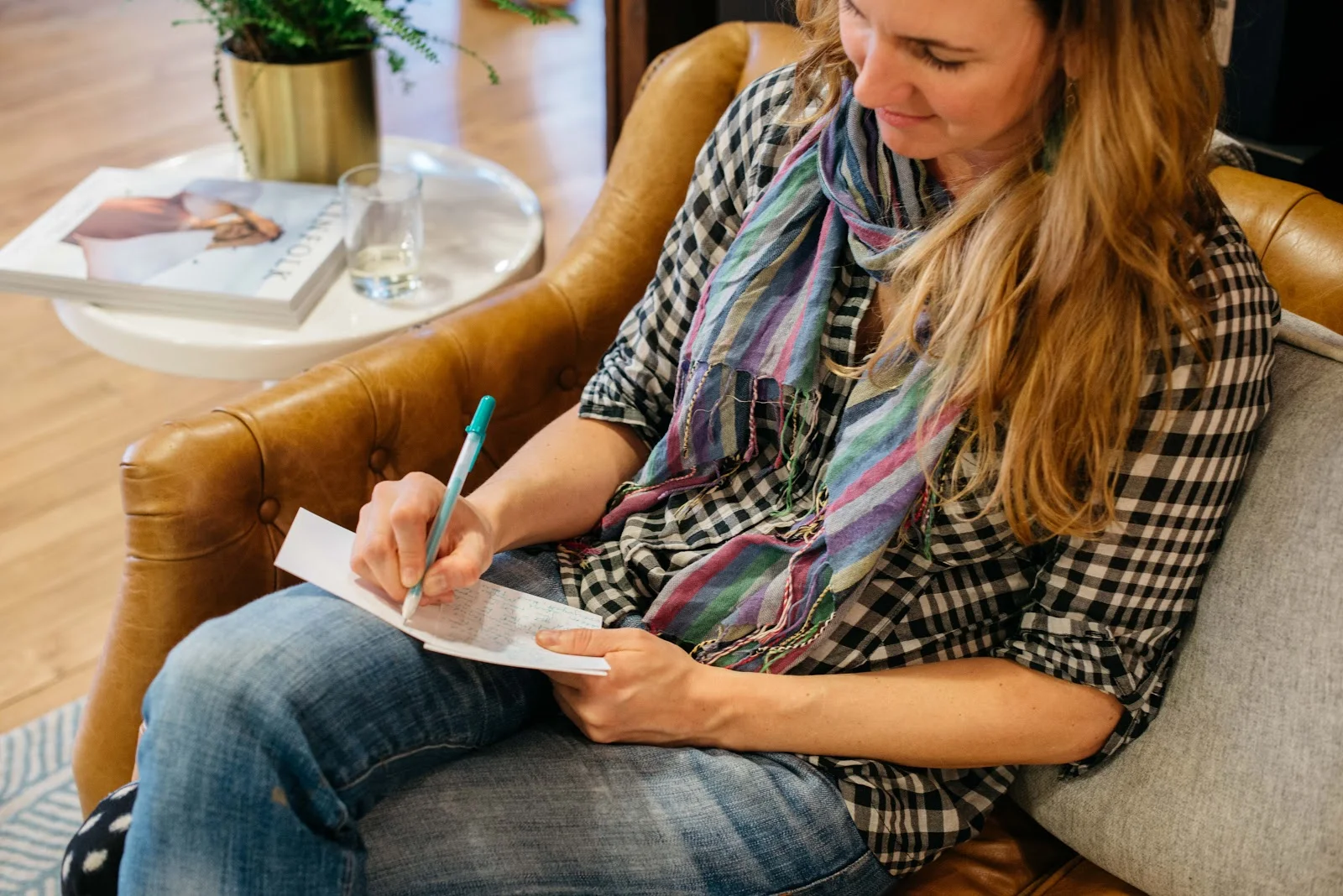
Why You Ought to Join the Write_On Challenge
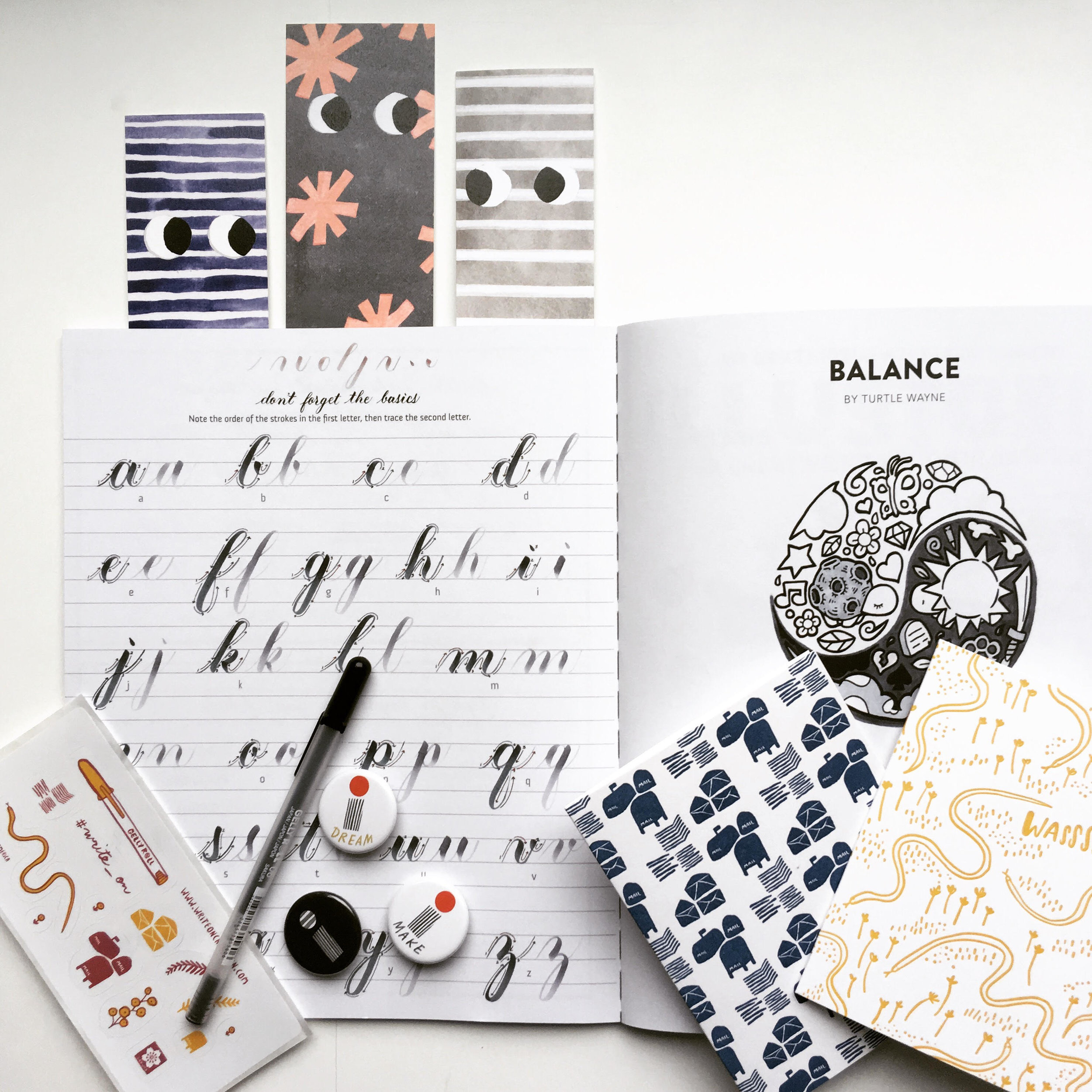
This week, we're offering a special giveaway in partnership with the #Write_On challenge, taking place throughout the month of April, which is National Letter Writing Month. The challenge is lead by Egg Press, a greeting card company, design studio and letterpress print shop based in Portland, Oregon. Founded in 1999, they’re pioneers in the resurgence of letterpress printing and are often noted for their sophisticated color palette, hand drawn illustrations, all-over textile inspired patterns, and sense of humor.
For our giveaway, we're setting up one lucky winner with supplies to practice their hand at calligraphy! The prize includes a copy of our Issue #6: Symbols, which features a guide to hand lettering by Michaela Yee, three collectable ILLUSTORIA pins and bookmarks, a Sakura Gelly Roll pen, very adorable Write_On stickers, and a stash of Write_On cards by Egg Press and Hello Lucky Cards. Check our Instagram post for entry guidelines! One winner will be picked at random on March 27th.

Photo by Christa Fowles
When was the last time you took time to write a handwritten letter? In today’s fast-paced, media-saturated world, letter writing offers a path for slowing down and engaging with others in a meaningful way, expressing ourselves, and noticing and savoring the present moment.
Write_On began when Egg Press Founder Tess Darrow realized that, despite having a studio full of beautiful greeting cards, she wasn’t devoting as much time as she’d like to correspondence. In 2014, she challenged to herself to write 30 letters in 30 days, about the amount of time it takes to develop a lasting habit. Tess invited the entire Egg Press staff as well as the co-founders of Hello!Lucky, Eunice and Sabrina Moyle, to join the fun. They all agreed that connecting with loved ones through a strong letter-writing practice was a great way to affirm their founding principles. What started as a humble effort has grown into a global movement!
Are you up for the challenge?
All you have to do is write 30 letters in 30 days, or as many as you can. Keep a log of your letters, and join the movement online by sharing your progress using #Write_On. Not sure what to write about? Here are some reasons to write to help get you started:
- Write to thank a friend for seeing you for who you are
- Write to tell someone that you just heard a song that reminded you of them
- Write to ask an older relative to record a memory
- Write to send a letter from your pet to a friend's pet
- Write to a company that makes a product you like
The possibilities for your letters are endless. For more inspiration, visit the resources page of the Write_On website here.
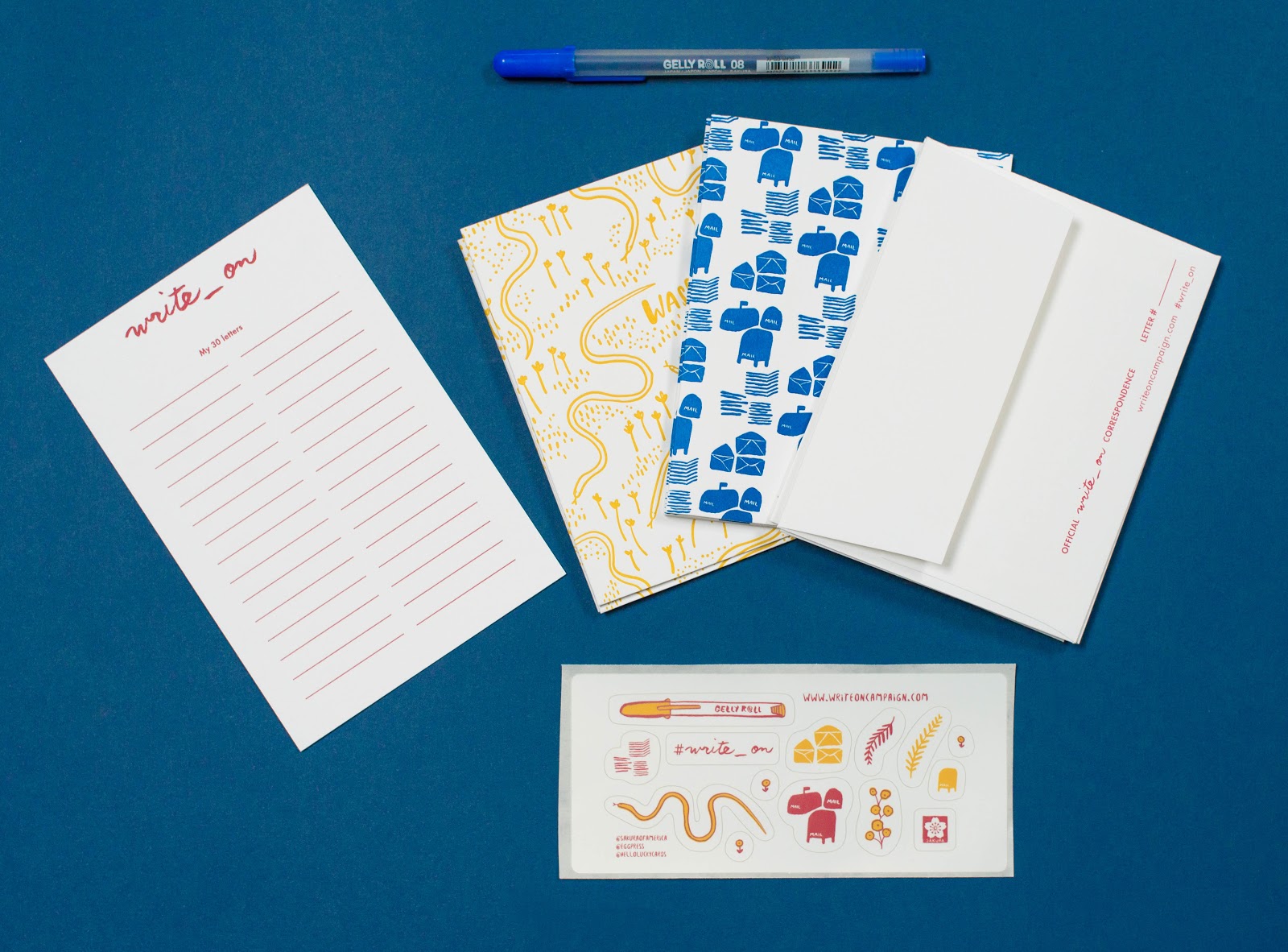
Photo by Christa Fowles
Stock up before April 1st!
With the help of our Write_On partners Hello!Lucky, Sakura of America, and Mohawk papers, we’ve got a collection of writing prompts, tips, and resources available at writeoncampaign.com as well as a shop full of custom designed and printed goodies to make participation in the challenge easy and fun. We're also offering two different Party Pack variations, packed with everything you need to host a letter-writing shindig for 10 to kick off the Write_On Challenge. For every purchase of a Letter-Writing Kit, we’re able to donate a kit to someone in need, including educational and under-resourced community programs across the country. Visit the Write_On shop and stock up before we sell out!
Let’s stay in touch!
We welcome your correspondence and creative mail all year round. Your suggestions and feedback help inform the direction of the Write_On Challenge each April, so please, be in touch!
Write_On
℅: Egg Press
2181 NW Nicolai Street, 3rd Floor
Portland Oregon 97210
write_on@eggpress.com
For more details on the campaign, visit the Write_On website at writeoncampaign.com.

Creator Crush: Kickliy
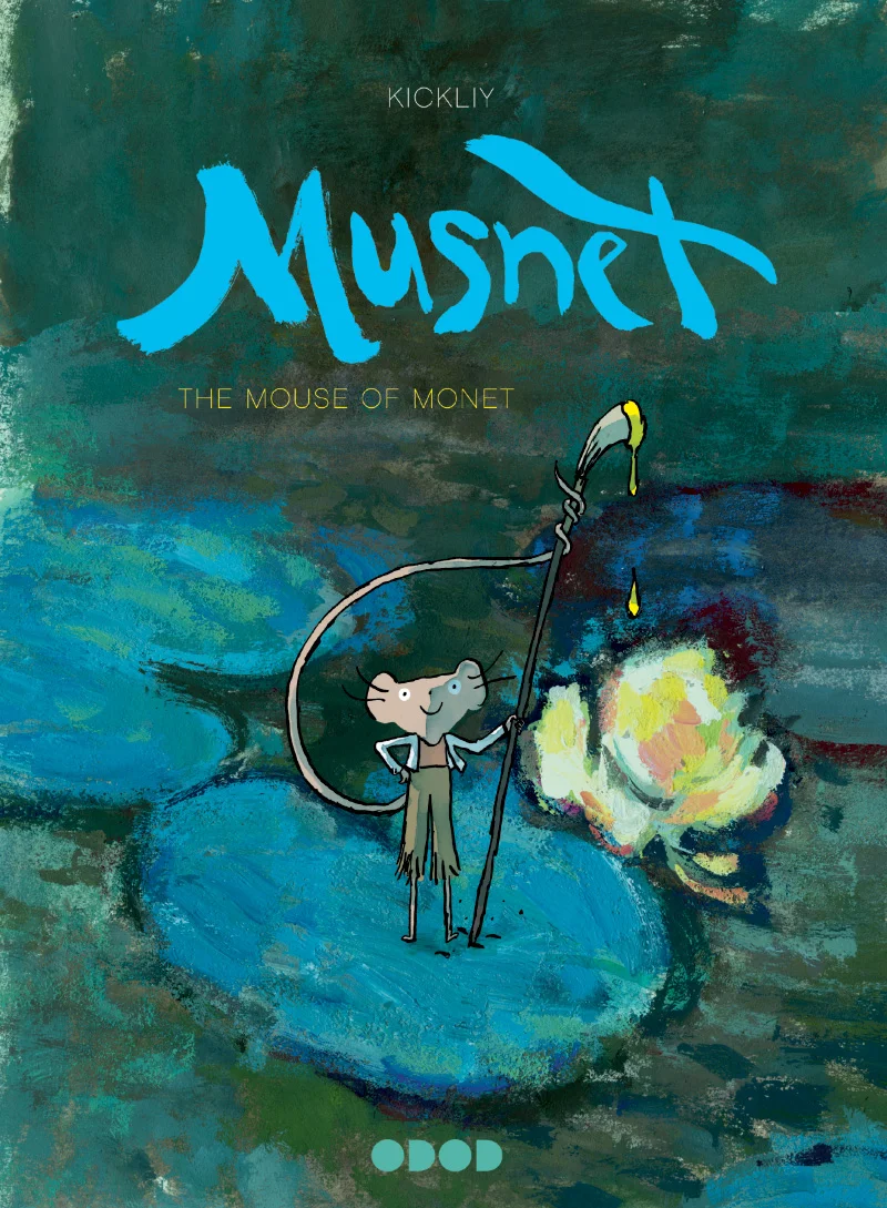
Cover art for Musnet; The Mouse of Monet by © Kickliy
Kickliy is a French storyteller, esteemed oil painter, and creator of the award-winning graphic novel series Musnet. This tale, recently translated from French to English by Uncivilized Books, is set in 19th century France and stars a nameless mouse who happens upon Monet's garden in Giverny. He soon becomes enchanted by Monet's work and resolves to become a master artist himself. This sensational, darling book will have young readers absorbed with the story of an artist's self discovery, as told through beautiful watercolor, ink, and oil illustrations. This week, Kickliy joins Illustoria to share drawing tips for budding artists, and offers a sneak peak inside his sketchbook and studio.
-----------
DRAWING IS SEEING

Illustration by © Kickliy
They say that Monet had the BEST EYES. They say that he saw EVERYTHING.
Drawing is the foundation of the arts. When you put pencil to paper, the drawing will show you what you understand and what you do not. If you want to get good at drawing, it is easy- You just have to be very dedicated and draw every day.

Page from Musnet; The Mouse of Monet by © Kickliy
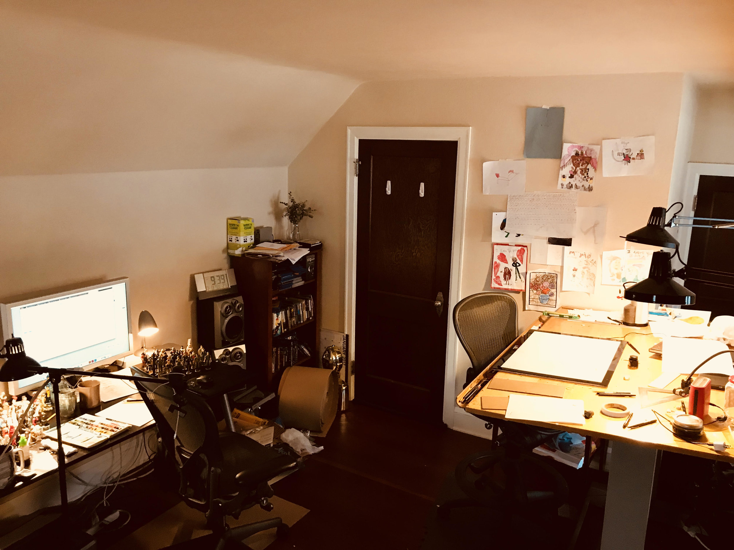
"This is my studio. Where I write, draw, paint, make comics, draw toys, drink tea, and day dream. It is kind of messy, but that's what happens when you make art. Luckily my mom and dad aren't here to yell at me to clean it up. " — Kickliy
I carry a small sketchbook with me wherever I go. I stop whenever I see something interesting. I have even learned how to walk and draw at the same time. I look for light and dark areas- Those are the best places to find good drawings. I watch how people sit, stand, and move. Those make good drawings too. I draw plants, toys, cars, hair, whatever. I even make drawings up, like a mouse that can paint.

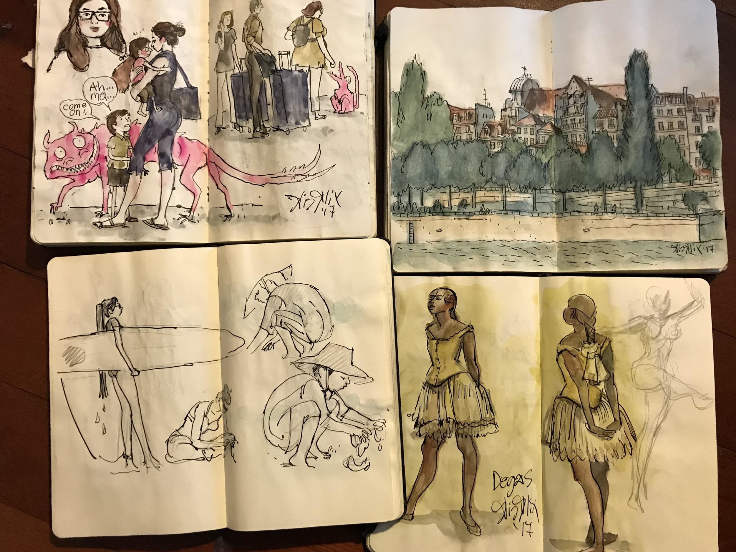
"These are my sketch books. They are all filled up with drawings for "the field." (That's a cool way to say that you draw on the location of the drawing.) " — Kickliy
The only wrong way to draw is to not draw at all.
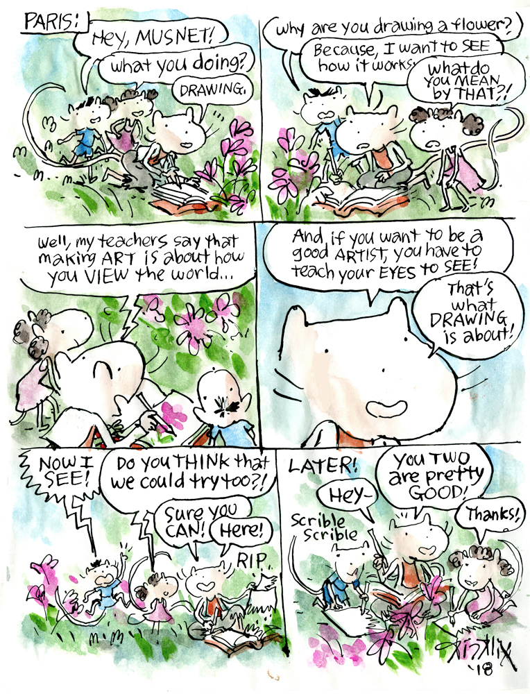
comic by © Kickliy
-----------
Feeling inspired? Head to your local library or bookstore and check out the whole Musnet series 1-4! And be sure to enter our Instagram giveaway to win all four of Kickliy's head-over-heels charming books from Uncivilized Books plus a copy of Illustoria Issue 6 Symbols! To see more of Kickliy's work, follow him on Twitter at @kickily.
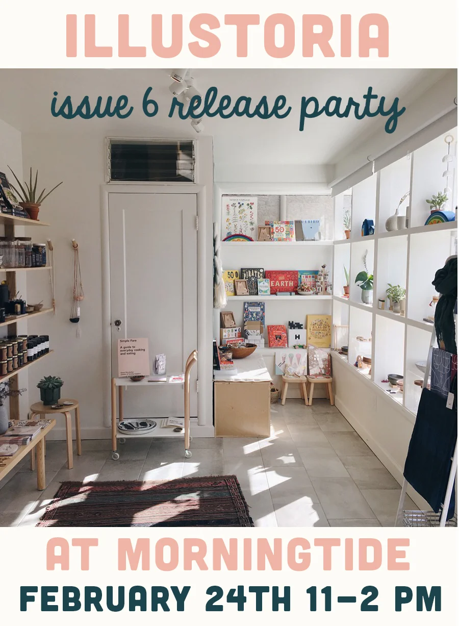
Illustoria Issue 6 Release Party

WHERE:
Morningtide Shop
847 Cornell Avenue
Albany, CA
WHEN:
Saturday, February 24th, 11am – 2pm
WHY:
Celebrate the release of our latest issue, meet friends, shop local, color and craft, get swag and discounts!
Grab your friends and come party with us Saturday, February 24th, 11–2 PM at Morningtide, our favorite little shop in Albany to celebrate the release of the oh-so-beautiful Issue #6: The Symbols Issue!! There will be CD Mandala crafting, an exclusive DIY project from Issue #6, as well as a big coloring table for all you drawing wizards. Come ready to snack because Good Eggs, the absurdly fresh grocery delivery service, will be providing delightful treats! And if tasty snacks weren't enough to solidify your Saturday plans, our amazing sponsor Sakura will be giving out free pen/marker set for every ILLUSTORIA magazine purchase.

Issue #6: The Symbols Issue Cover Art by Marina Munn.
There could be no better place to share The Symbols Issue with you than Morningtide. This exquisitely curated boutique shop was founded by friends Lisa Fontaine and Lisa Wong Jackson, who share a love for objects that bring happiness and offer a sense of well-being.

We hope you can join us to craft, snack, and most of all get inspired by all of the amazing content to be found in Issue #6. Get your hands on our interview with the brilliant cult artist Yuko Higuchi, an exclusive look at the making of Her Right Foot written by Dave Eggers and illustrated by Shawn Harris, a stunning comic by cover artist Marina Munn, the latest edition of Literary Giants as Kids featuring Dr.Seuss by Elizabeth Haidle, and so much more. See you there!
photograph by Morningtide

Creator Crush: Teresa Sdralevich

photo by ©Saskia Vanderstichelen
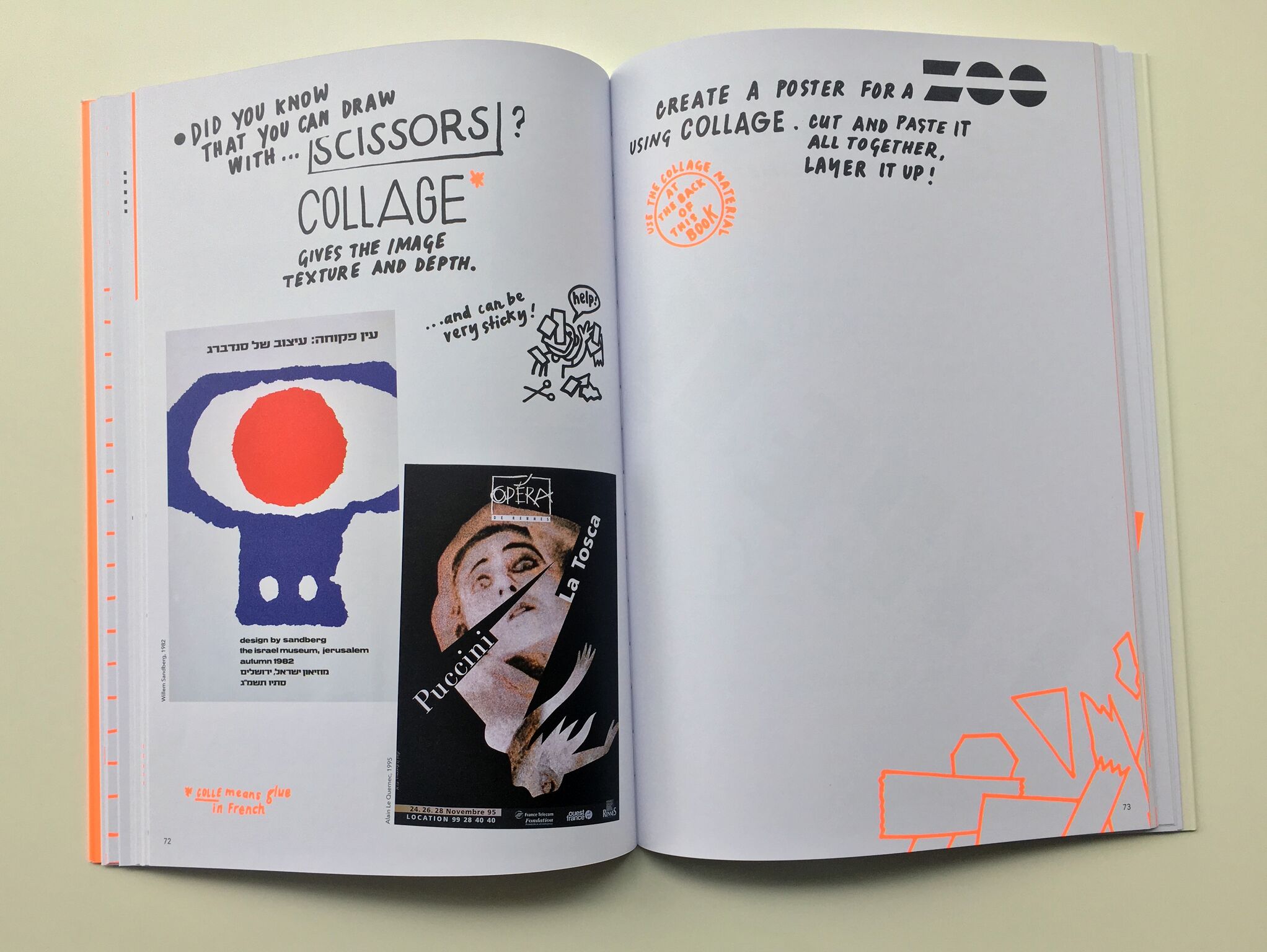
You will have no trouble finding Poster Power! on the shelf at your local bookstore. Nor will you have any issues describing it to your friendly bookseller to make sure it's in stock (which it definitely should be!), your best friend, your kids, kid's teacher, monthly bookclub, or absolutely whoever for the very reason that this glorious guide to poster design and history by Teresa Sdralevich stands out like a bright sunbeam in the middle of a grey winter. This is not only because of Poster Power!'s unmissable huge neon orange cover that basically shouts, "OPEN ME, I AM EYE CANDY!" but because it's contents are masterfully designed, written and curated by Sdralevich to create the ultimate joyful reading experience.

Poster Power! book cover by Teresa Sdralevich.
Each page is handwritten by Sdralevich in eclectic, dazzling fonts composed on the page like a visual poem or lovingly doodled notes passed back and forth in class. With wit and hilarity, Teresa breaks down graphic design into delicious bite size chunks and washes it all down with striking examples of posters from all over the world. Best of all, Teresa invites readers to practice their poster-making skills right on the pages on the book with inviting prompts and interesting questions.

Poster Power! by Teresa Sdralevich
Poster Power! leaves no stone unturned, covering all matters of importance from typography, color interaction, and composition to design technique, printing methods and poster making history. You and your young readers will finish this book, published by the ever-brilliant Cicada Books, feeling inspired and invigorated to become poster-making power-houses. However, it is very likely that like us, you'll be dying for more. And lucky for you, there is! Check out our Q&Artist with the mastermind herself Teresa Sdralevich on the making of Poster Power!, her life as a butt-kicking freelance designer, and who makes her top list of every designer a 12 year old should know. You can also find more of Sdralevich's work on her website, at http://www.teresasdralevich.net/. Happy reading!

photograph courtesy of Cicada Books
The collection of posters featured in Poster Power! are absolutely stunning. What was your process for finding them all?
With a few exceptions, I know these posters inside out, they really shaped my way of seeing. The collection reflects my main influences, Polish and modernist posters. There are also works by designers whom I personally know and who had an important role in my life.

photo courtesy of Teresa Sdralevich
What’s the hardest part about being a freelance designer? The best?
I think I skipped the worst part, which is earning enough money to survive at the beginning of your career. Taking all the decisions can be very tiring, but for advice there are friends, my partner and my mother – she throws her sharp eye from Italy if necessary.
The rest is the best part: working without steady hours (which means, at least before having a family, almost all the time), working alone, skipping meetings and all the "workplace" literature, which I abhor.

Teresa Sdralevich's printmaking studio in Brussels.
What was your favorite part about growing up in Milan?
Probably our independence, at respectively age 6/7/8 myself, my brother and sister, we would go alone to school or to the park (which was gloomy and not at all children-friendly!). Like all middle-class families we escaped every week-end to Varese, an extraordinarily green city: we had our caravan parked in the huge park of of an uncle's villa, that was our kingdom, our paradise...

Poster Power by Teresa Sdralevich
Poster Power by Teresa Sdralevich
You interned for designer Jean-Christophe Geluck in 1996. What was that like?
My internship lasted one month, then I became part of the studio; I learned almost everything from Jean-Christophe and his colleague, Thierry Suykens. Actually you may say that a huge part of the book content comes from my experience there. It was then a small studio that mainly produced posters (notably a yearly series of unconventional accident prevention posters) and book covers; right from the start it was a very balanced relationship, because they needed me as much as I needed them, and we spoke the same language except that I still had to learn it. We had a lot of work but I managed from the beginning to illustrate young readers' books for two Italian publishing houses, and to build my own list of clients or do pro bono actions. I had security and liberty at the same time.

Teresa Sdralevich's printmaking studio in Brussels.
It’s incredible that 99.9% of Poster Power! is handwritten. What inspired that decision? How long did it take to create all of the text?
A couple of years ago I had an exhibition of my posters in a cultural center in Belgium; I knew that many classes of children from 6 to 15 would visit it so I thought that it would be nice to write a guide to give them a key for looking. I don't have a laptop, I was running late and had to work while at my parents' so I simply decided to begin writing: I drew this booklet in a few days, with no plan, and gave in the pile of paper directly for photocopying. That was the first draft of the book to come. I don't want to think how long did it take, certainly an incredible amount of hours, hours of pure pleasure! Generally speaking, the less I sit in front of a computer, the happier I am, even if it's an awfully useful engine.

Poster Power by Teresa Sdralevich

Poster Power by Teresa Sdralevich
What was the biggest challenge of creating Poster Power!?
I was really afraid to end up with some boring pedagogical book that would miss the humor and taste for nonsense that came out naturally in the first version; but the publisher, Ziggy Hanaor, edited the text with an incredible respect for my personal tone and at the same time an eye for structure and detail, the two things that make a book run smoothly.
What are your top 3 favorite fonts?
For years, my favorite font has been Akzidenz Grotesk, the font that the only graphic design teacher I ever had, Patrice Junius, always used. I also love Futura, especially Bold, because it's so impossible to manage, it inevitably sets the viewer in the 1930's, in the Bauhaus spirit. It's so beautiful and difficult to draw.

Bronx Shaded Font, photo by Teresa Sdralevich
Then I would mention Bronx Shaded (see above) is a beautiful and bizarre alphabet that in a way stands for all the bizarre alphabets I can use and copy because I own a lot of old letter transfer sheets, or Letraset.

Letraset pages are a great (and vintage!) lettering tool for any graphic design project.
What were your favorite children’s books growing up?
Although our house was filled with books, there were very few books intended for children; the one that's really engraved in my memory is Sembra Questo Sembra Quello (in English, It Looks Like This, Looks Like That), a beautifully crafted, simple book by Enrica Maria Agostinelli. I have been reading it to my daughters and it never wears out, the images and the rhythm are just perfect. We had also the "Little Bear" series, illustrated by Sendak, those are books thet still move me, even if I see many poor editions around –– poor in terms of printing quality and paper. We also read the Moomin cartoons and Richard Scarry, an underestimated gentle giant, was also present on our shelves.
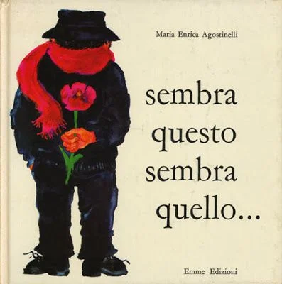
Sembra Questo Sembra Quello by Enrica Maria Agostinelli

Sembra Questo Sembra Quello by Enrica Maria Agostinelli. Translation: It Just Looks Like A Yellow Flower....

Sembra Questo Sembra Quello by Enrica Maria Agostinelli. Translation: ......No, it's the beak of the parrot
Who are the graphic designers you wish every kid (or grownup!) knew about?
This is a difficult and tricky question! In the book there already a few good names, so I will not mention them, the majority being of course poster designers – but if I have to I throw an alternative list of classics it would include: Dick Bruna (before Miffy), Robert Massin, Alvin Lustig, Tibor Kalman, Ed Fella, Bruno Munari, Charles and Ray Eames, Sister Corita Kent – whom I would not call a designer, but she's certainly worth knowing because she was so much more. This is a different list than the one I would write tomorrow, but I think what's important is to get to know someone's work deeply, in the frame of his or her time, which is the opposite of the Pinterest approach.
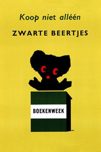
Dick Bruna, Koop niet alléén
zwarte beertjes
(Buy not only black bear-books)
poster to promote
Zwarte Beertjes books
A.W Bruna & Zoon. Utrecht
1961

Sister Corita Kent in her silkscreening workshop at Immaculate Heart College in Los Angeles, CA.

La Cantatrice Chauve by Ionesco. Design by Robert Massin, 1964.

A Season In Hell by Arthur Rimbaud, Cover Design by Alvin Lustig.
Where is your favorite unusual place to hang a poster?
The most unusual place I ever hanged a poster is... the wrong country! For the Europalia Italia Festival I had almost 800 posters displayed on the walls of Brussels; nice posters altogether, but announcing cultural events that were taking place at that very moment in Italy. It was surreal and I like to think that it puzzled people. On a smaller scale, I did the same with British posters for the opening of the British Council.

MSF Belgique: Brochure FR/NL, 2017 by Teresa Sdralevich ©
What project are you currently working on?
I continue my collaboration with MSF (Doctors Without Borders), I continue making three drawings every week for an Italian magazine, I prepare two workshops that I will lead in the next couple of months, I answer interviews... and somewhere in the back of my mind I think about a book for small children, a sort of sequel of My Family is a Zoo (published by Minibombo) that I made a couple of years ago. It will deal with those typical phrases you hear a lot in family gatherings (especially in Italy) like "She looks like her late grand-grand-mother!" or "He has his uncle's ears". But then I might work on a totally different kind of book!

Stop Cyberbullying: PAGE magazine by Teresa Sdralevich ©

by Teresa Sdralevich ©

Tribute to Rene Wanner: Bienal del Cartel - Bolivia 2013 by Teresa Sdralevich ©
Do you have a favorite type of pen, or brush, or paper for drawing with?
I drew Poster Power exclusively with Artline 70 black markers, and I used Staedler very fine markers for retouches. For years I worked with the Pentel brush, that enables you to trace either perfect lines or messy strokes. As for paper, I only pay attention to it when I am printing in silkscreen – my favorite is Steinbach – but usually I work on the most common office 90g A4. I waste an incredible amount of A4s.
Poster Power is filled to the brim with top-notch advice. But if you had to boil down your words of wisdom into one statement of advice for young aspiring graphic designers, what would it be?
Oh... I hate giving advice, did I really do that in the book? Probably I would say: look, draw, have fun while working, look, draw.

Conference in Spain: silkscreen, A2 by Teresa Sdralevich ©
Posterzegel march 2014: Family, don't feel like it by Teresa Sdralevich ©

La Donna Scimmia: poster remake for an exhibition by Teresa Sdralevich ©
We are thrilled to have partnered with Cicada Books to make this blog post possible. Be sure to check out their excellent selection of stunningly illustrated books, and participate in our giveaway of Poster Power on Instagram on January 21st, 2018!
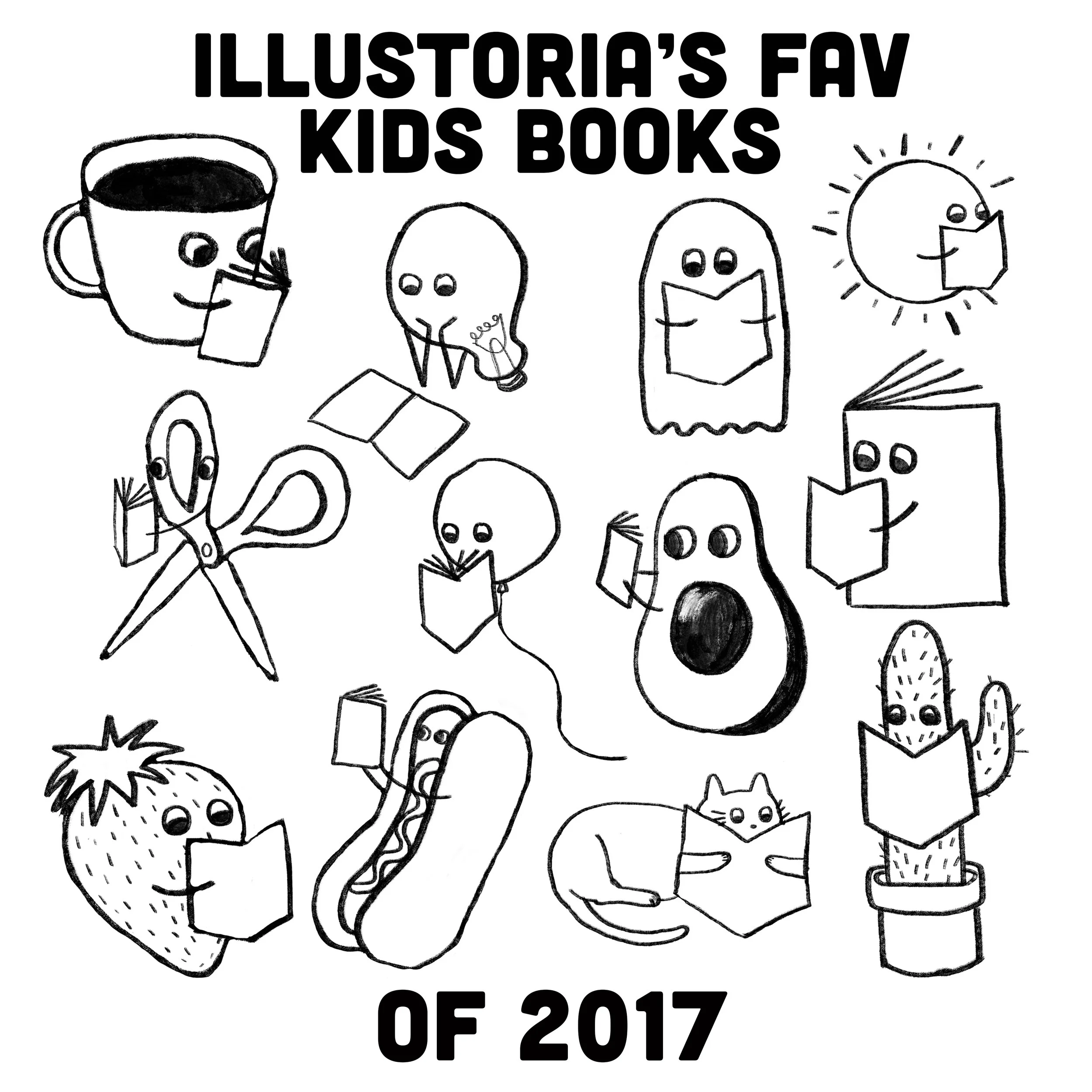
Illustoria's Fav Kids' Books of 2017

2017 is coming to a close folks, and you know what that means! Time to look back at all of the books this year that have provoked, charmed, inspired and anchored us. This year more than ever before, we've sought to celebrate the qualities that bring our friends and neighbors together while simultaneously honoring what makes our communities unique. In times of uncertainty, books such as Her Right Foot by Dave Eggers and Shawn Harris, Ghost by Jason Reynolds and This Is How We Do It by Matt Lamothe have guided difficult but fruitful conversations with our families and illuminated the beauty and strength that exists in complex, richly diverse spaces. This list wouldn't have been possible without the thoughtful recommendations of our dear friends at Mr. Mopps' Books, our favorite little bookstore in Berkeley, California. We hope some of your own favorites are on this list, and that you discover some new treasures to check out in the new year.
Her Right Foot by Dave Eggers, illustrated by Shawn Harris

Her Right Foot by Dave Eggers, illustrated by Shawn Harris

Her Right Foot by Dave Eggers, illustrated by Shawn Harris
As if Dave Eggers, founder of the literary journal McSweeny's, co-founder of 826 Valencia, and author of This Bridge Will Not Be Grey (among many other adult novels, such as What is What), could be any more genius or cool, his newest children's book Her Right Foot knocked us right out of the park. This timely story explains the significance and history of the Statue of Liberty, a topic that is especially poignant in a year when immigration and citizenship in the United States made headlines day after day. The illustrations by Shawn Harris are deceptively simple, but don't be fooled. Each page was a pain-staking labor of love by Harris, who drew sketches, then cut, edited, and arranged each detail of the illustrations in paper. Check out his website to see how several of the pages came together, from beginning to end.
Nina; Jazz Legend & Civil-Rights Activist Nina Simone by Alice Brière-Haquet and illustrated by Bruno Liance
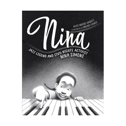
Nina; Jazz Legend and Civil-Rights Activist Nina Simone by Alice Brière-Haquet and illustrated by Bruno Liance

Nina; Jazz Legend and Civil-Rights Activist Nina Simone by Alice Brière-Haquet and illustrated by Bruno Liance

Nina; Jazz Legend and Civil-Rights Activist Nina Simone by Alice Brière-Haquet and illustrated by Bruno Liance
This book takes on two equally difficult challenges, first, of honoring the life and legacy of Nina Simone, and second, of explaining racial inequality to young readers. Unlike the many children’s books that water down challenging topics or simply avoid them all together, Alice Briere-Haquet and Bruno Liance do immense justice to their subject matter, taking both Nina Simone’s life as a civil-rights activist and their audience seriously. Bruno Liance’s quietly gorgeous charcoal illustrations will take your breath away and Alice Briere-Haquet’s poetic narration will empower and strengthen. Thanks to this great book, and Nina Simone’s recent induction to the Rock and Roll Hall of Fame, we have lots to celebrate.
This is How We Do It by Matt Lamothe

This is How We Do It by Matt Lamothe

This is How We Do It by Matt Lamothe
This is How We Do It by Matt Lamothe
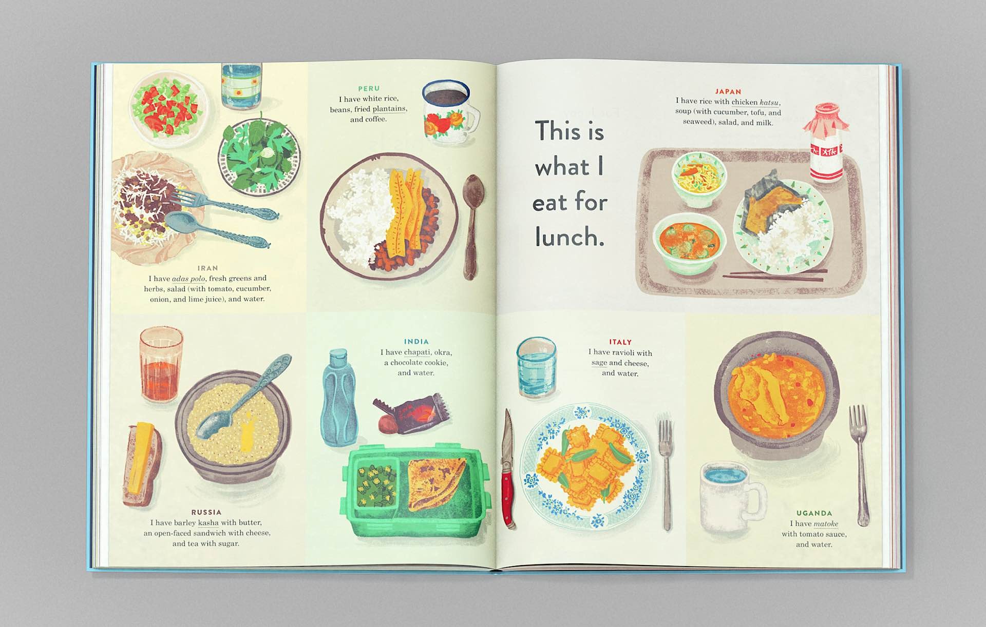
Who needs all the packing and potential nausea of world travel when you can just pick up This is How We Do It; One Day in the Lives of Seven Kids from Around the World? This masterpiece of a book will introduce you to the customs, food, favorite after school activities homes and adorable quirks of kids from Uganda to Russia. By teaching us the commonalities that exist among such different lives, This is How We Do It wins Illustoria’s award for The-Book-We-Really-Needed-In-2017. So pack your imaginary bags (no 8 oz bottles necessary!) and good luck not falling in love with all of the families you meet on the way.
Yak and Dove by Kyo Maclear and illustrated by Esmé Shapiro

Yak and Dove, by Kyo Maclear and illustrated by Esmé Shapiro
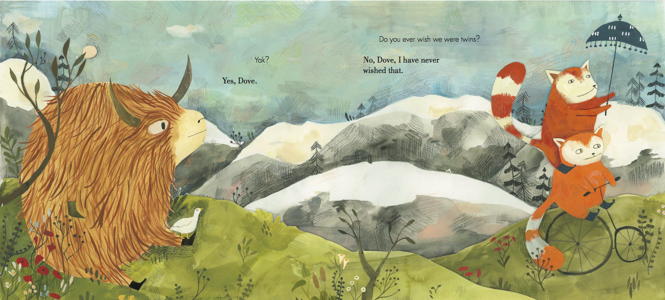
Yak and Dove, by Kyo Maclear and illustrated by Esmé Shapiro
This book is an example of picture-book magic: when words marry illustrations to create a rich world that you'll want to visit over and over again. Shapiro’s artistry is rich with details and a warmth that invite you into the world of Yak and Dove—you’ll never want to leave! Yak and Dove is a story about friendship and celebrating differences but also so much more. Parents may see themselves and their kids in these characters. A takeaway: there is profound joy to be had in simply being present and appreciating those we love for who they are.
Lines by Suzy Lee

Lines by Suzy Lee

Lines by Suzy Lee
We can’t get enough of the uber-talented Suzy Lee. The creator of Wave, Shadow, and Open This Little Book brings her deceptively simple, majestic storytelling to her latest masterpiece: Lines, where the graceful lines created by the blade of a skate on a frozen pond by a young skater interweave with the storytellling lines made by an artist with the tip of her pencil. The youngest readers will enjoy every turn of the page, which progresses cleverly with each spread. There’s a heartwarming message about perseverance, artistry, and letting go of perfection that will resonate with all ages. Older readers will appreciate the subtle shift from black lines on a white page to the inverse. Every element of Lee’s quietly powerful storytelling is like poetry, a meditation on creative expression in its purist form.
The Wolf, The Duck & The Mouse by Mac Barnett and illustrated by Jon Klassen

The Wolf, the Duck & The Mouse by Mac Barnett and illustrated by Jon Klassen

The Wolf, the Duck & The Mouse by Mac Barnett and illustrated by Jon Klassen

The Wolf, the Duck & The Mouse by Mac Barnett and illustrated by Jon Klassen
Oh woe. Oh me! The Wolf, The Duck & The Mouse is a picture book to die for. Mac Barnett and Jon Klassen, the power duo behind Triangle and Sam and Dave Dig a Hole out-do themselves in their latest Kafka-esque tale of a duck and mouse that get swallowed by a wolf and decide to call it home. If you're a fan of stormy woodland Eastern Europe children's tales such as Hedgehog in the Fog (a classic 1975 film by Yuriy Norshteyn later published as a children's book in 2006) or the fantastically dark tales of Roald Dahl, you'll love this delightful tale.
Meet the Artist: David Hockney by Rose Blake


The first thing that popped into our heads when we saw Meet the Artist: David Hockney by Rose Blake was " So. Jealous." So jealous of the kiddos that can enjoy this extremely cool activity book (on one of the coolest artists of all time, no less) which is filled to the brim with innovative projects, hip Hockney-inspired doodles, and introductions to the artist's life and work. In a world filled with artist bios for kids that feel outdated and stale, Blake's activity book sets the bar high. Celebrate the art legend's 80th birthday (born July 9, 1937!) with this book, and if you're lucky enough, the amazing Hockney retrospective on view at The Met until February 25, 2018.
Nightlights by Lorena Alvarez

Nighlights by Lorena Alvarez
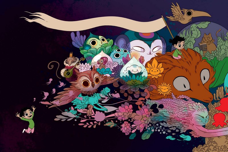
Nighlights by Lorena Alvarez

Nighlights by Lorena Alvarez
If you or your kiddo is a fan of gorgeous day-glo illustrations and seriously creepy storylines, Nighlights by Lorena Alvarez is the book to fawn over. This short story graphic novel stars Sandy, a talented and ever distracted artist who would rather doodle all day than pay attention to the drone of her school teachers. Sandy's troubles catch up her though when a supernatural creature named Morphie tries to convince her to use her drawing skills for evil. This book is perfect for anyone that is currently obsessed with the Hilda series by Luke Pearson and is ready to turn the scary dial up a couple notches. All who enter the surreal, sinister world of Nightlights beware: the cliff-hanger ending will have you praying that a prequel is in the works for 2018...
Orphan Island by Laurel Snyder

Orphan Island by Laurel Snyder
It's no secret that here at Illustoria HQ, we can never have enough Laurel Snyder, author of award-winning books Swan, Charlie and Mouse, and The Forever Garden. She's also graced the pages of the mag in Issue 1: Beginnings with her Dusty Bookshelf recommendation and in Issue 2: Canvas with Martha Graham in Motion, Her latest middle-grade novel Orphan Island made this year's National Book Award Longlist and is a masterpiece that will have you reading way, way past bedtime. The book takes place on a mysterious island inhabited by nine children and haunted by recurring tragedy. Every year, a boat appears on the island to take the eldest of the group and replace them with a new child. This eerie and thought provoking tale is a contemplation of childhood in all of it's beauty and terror.
Wishtree by Katherine Applegate
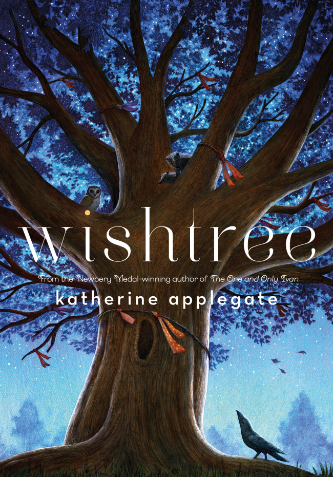
Wishtree by Katherine Applegate
Why do books where trees take center stage pull at our heart strings so? First The Giving Tree by Shel Silverstein, then A House on Mango Street by Sandra Cisneros and now: Wishtree, a 2017 bestseller by Katherine Applegate. In Applegate's heart-felt tale, Red is a 216-year-old oak tree who must make a change when a new family moves into the neighborhood. While the perspective of a stationary tree may first have readers scratching their heads, this pun-ny oak will open readers' hearts, and remind all why love, inclusion and diversity are the core of any strong community.
Creator Crush: Willie Real

artwork by © Willie Real
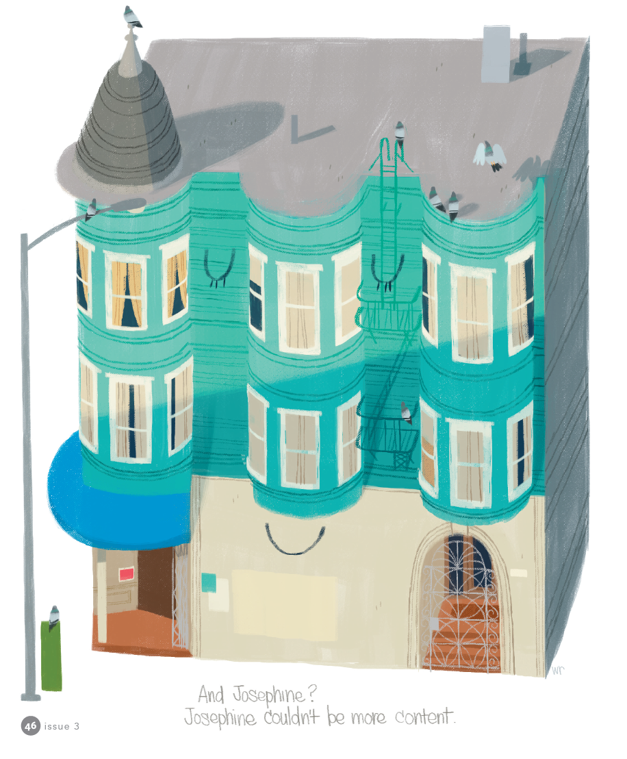
Encapsulating the eclectic spirit, rich diversity and historical gravitas of San Francisco is no easy task. But the ultra nostalgic and mischievously charming illustrations by local Bay Area artist Willie Real make capturing the uniqueness of the 510 area code look effortless. With street scenes of anonymous pedestrians waiting for the bus and gorgeously detailed drawings of the Victorian structures distinct to California, Real's illustrations pull on the heart strings of anyone who aches for the foggy hilltops of SF. However, you don't have to know anything about the Bay to dig Real's illustrations. The satisfying geometric simplicity and bold sensibility in his work recalls the style of Mid-Century Modern children's book illustrations (think Miroslav Sasek and Bernice Myers) that are universally heart warming. Real's style veers from the trendiness of this mold with a distinctly urban coolness seen through his earthy color palette and edgy characters that are reminiscent of Bay Area street art legend Barry McGee.

artwork by © Willie Real
artwork by © Willie Real
We were lucky enough for Willie to grace the pages of Illustoria in our Issue #3: Outside-In, which featured his imaginative 263 Josephine, a story of a Victorian apartment complex with a heart of its own. Since then, we had the chance to pick Real's brain for a bit and get an inside scoop on his process, inspiration and fond memories as a kid growing up in SF. Check out more of Real's work on his website and Instagram!
artwork by © Willie Real
Hi Willie, tell us a little about yourself!
Hi, my name is Willie Real and I'm a freelance character designer and illustrator from San Francisco. When I'm not working or dabbling on my own projects I go outside and play in Golden Gate Park or along the Pacific Ocean.
What are you currently working on?
I just finished designing characters for an animated movie with a friend! It's a good time when you get to work with people you're close to. I'm doing visual development sketches for another animated project so it's been busy for me which is great. I still manage to get out for some personal sketching though.
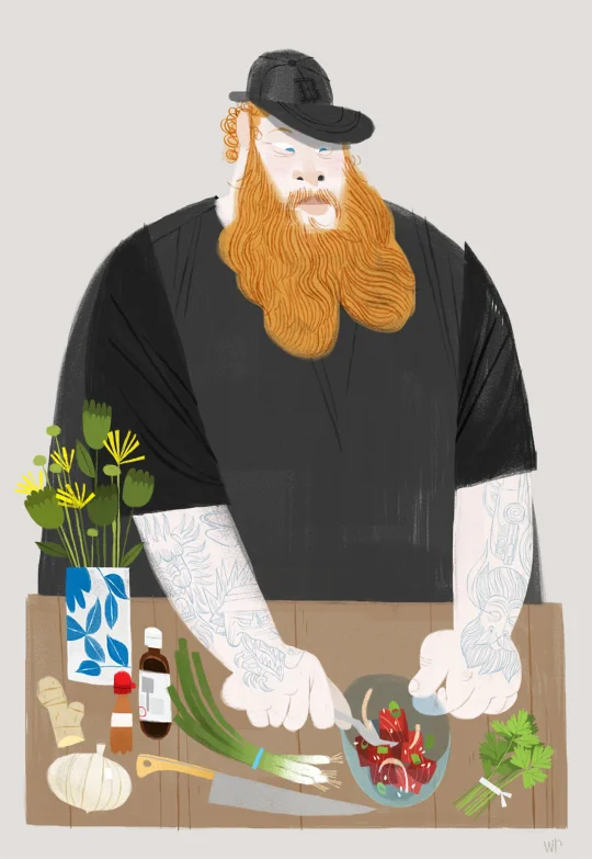
Can you talk about your process of creating a work/project/book/zine/product from start to finish, and share some process pics with us?
This is an illustration or a portrait if you will, of a victorian home.
1. This is my favorite part... I go sketch homes outside, all day! I pick the sketch I like and it's ok if it's not perfect, I'll tweak it to my liking later.

2. I scan it in and twek away... finalizing my sketch. I print it out at the final size I want and tape the pieces together.

3. I trace/transfer the sketch onto bristol board using a light box.

4. Once the drawing is complete I'm ready to paint with acrylics and gouache. I establish my colors and values on my palette and paint away. I kept this one simple... yellow for the building, grey for the roof and a few accent colors for the door and the chimney. I start with lighter colors first, filling in all the shapes and colors and build up to the darks. Once the paint dries I add the drawing and details with prismacolor pencils.

5. I scan it back in, make any final adjustments I want and that's it!

artwork by © Willie Real
Where did you grow up? Where do you live now?
I gre up in SF till I was 12 and moved to a small town in Sonoma County where I went to high school and later a Junior College. I live in SF now... the Lower Haight!
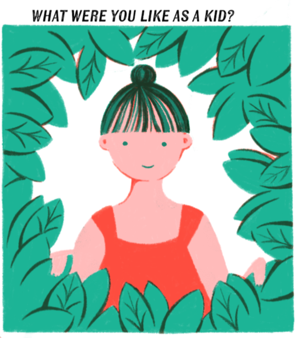
What were you like as a kid?
Active. I loved playing outside with friends from the block in the Excelsior, playing tag, baseball and going to the deli on the corner. They gave us salami ends! When I wasn't outside I was conducting these elaborate scenarios in my imagination with my toys... that or always drawing away.

artwork by © Willie Real
What were your favorite childhood books?
I remember the Highlights magazines from the doctor's office! Those were fun.
Did you have a favorite subject in school? A least favorite subject?
From 1st grade all the way into High School I loved art classes. All of them! Painting, Drawing, Cursive Writing, Woodshop, Computer Graphics, Pottery... they all scratched the creative itch. Math was always tough for me... too many numbers!
artwork by © Willie Real
Can you describe your first childhood memory?
Can't say this is the first but one of my earliest memories is when our parents would take us to La Taqueria in the Mission. I remember the smell, the mural and there were these wooden stools with leather weaving that looked like they were hand made a hundred years ago. They're still there today! The blue and red tiles along the sidewalks in the Mission are also a fond, early memory.

artwork by © Willie Real
When did you know you wanted to be an artist and writer?
In high school my English teacher (Mrs. Wolf) pointed me in the right direction and told me that I had a passion I should pursue...and that illustration was an actual profession! I'm eternally grateful to her.
Who or what inspires you?
Oh man, so many things...family, food, walking around the city, art museums, nature...I get so much out of 'the little things' in life.
What is the most challenging part about being an artist/writer/maker?
I get nervous when showing personal work I've created. I think making art is a very personal, honest and intimate practice... an extension of yourself. You're putting yourself out there with your work which can be very scary and empowering as well.
artwork by © Willie Real
Do you have a favorite project that you worked on?
Earlier this year I made a poster for the women's day march that took me a couple of hours.. short but very sweet. My sign was a portrait of my mom and it said 'Marching for my Momma'. She approved :)

artwork by © Willie Real
When do you feel your most creative?
Right after I've seen a great movie or an art show. It's very inspiring to see other makers and creatives succeed at their craft. It's a contagious feeling! I want to rush home and get my ideas down.
artwork by © Willie Real
Do you have a favorite tool (type of pen, or brush, or paper, etc. --- related to your work)?
Grey Tombo markers and black prismacolor pencils. I keep it simple. It's a quick an easy way to get line variation, you can fill in shapes super quick and you get all three values with black (the pencil), grey (the marker) and white (the paper).
What advice would you share with young aspiring artists?
Dedicate time to your work and your craft. Don't be afraid of getting lost or not knowing what to do. Getting lost is an adventure, go on it, explore, experiment, and most of all have fun with it. Soon you'll find what you're looking for and it'll show in your art. And don't forget to go outside!

artwork by © Willie Real
To see more of Real's work check out his website http://www.williereal.org/. Thanks Willie, and Happy Holidays from ILLUSTORIA to all you readers out there!