

Creator Crush: Kickliy
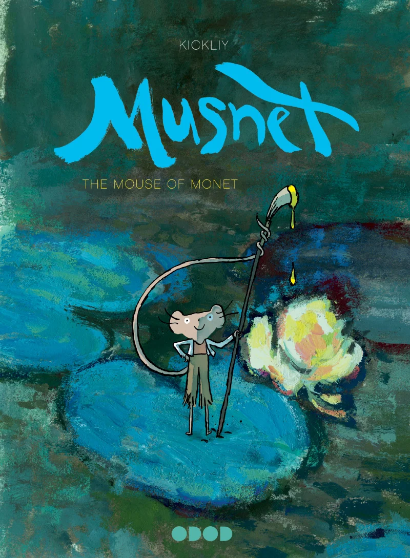
Cover art for Musnet; The Mouse of Monet by © Kickliy
Kickliy is a French storyteller, esteemed oil painter, and creator of the award-winning graphic novel series Musnet. This tale, recently translated from French to English by Uncivilized Books, is set in 19th century France and stars a nameless mouse who happens upon Monet's garden in Giverny. He soon becomes enchanted by Monet's work and resolves to become a master artist himself. This sensational, darling book will have young readers absorbed with the story of an artist's self discovery, as told through beautiful watercolor, ink, and oil illustrations. This week, Kickliy joins Illustoria to share drawing tips for budding artists, and offers a sneak peak inside his sketchbook and studio.
-----------
DRAWING IS SEEING

Illustration by © Kickliy
They say that Monet had the BEST EYES. They say that he saw EVERYTHING.
Drawing is the foundation of the arts. When you put pencil to paper, the drawing will show you what you understand and what you do not. If you want to get good at drawing, it is easy- You just have to be very dedicated and draw every day.

Page from Musnet; The Mouse of Monet by © Kickliy
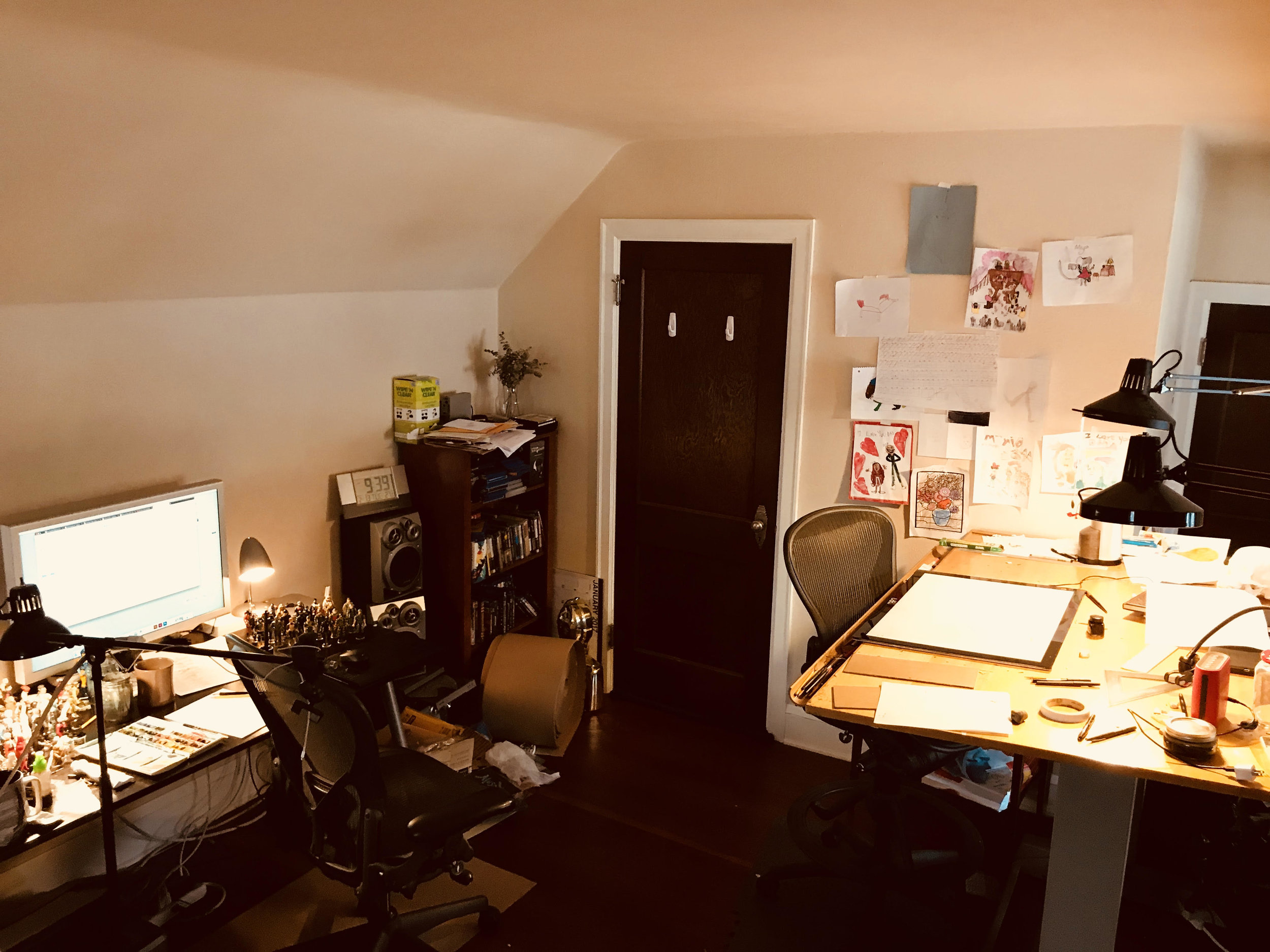
"This is my studio. Where I write, draw, paint, make comics, draw toys, drink tea, and day dream. It is kind of messy, but that's what happens when you make art. Luckily my mom and dad aren't here to yell at me to clean it up. " — Kickliy
I carry a small sketchbook with me wherever I go. I stop whenever I see something interesting. I have even learned how to walk and draw at the same time. I look for light and dark areas- Those are the best places to find good drawings. I watch how people sit, stand, and move. Those make good drawings too. I draw plants, toys, cars, hair, whatever. I even make drawings up, like a mouse that can paint.

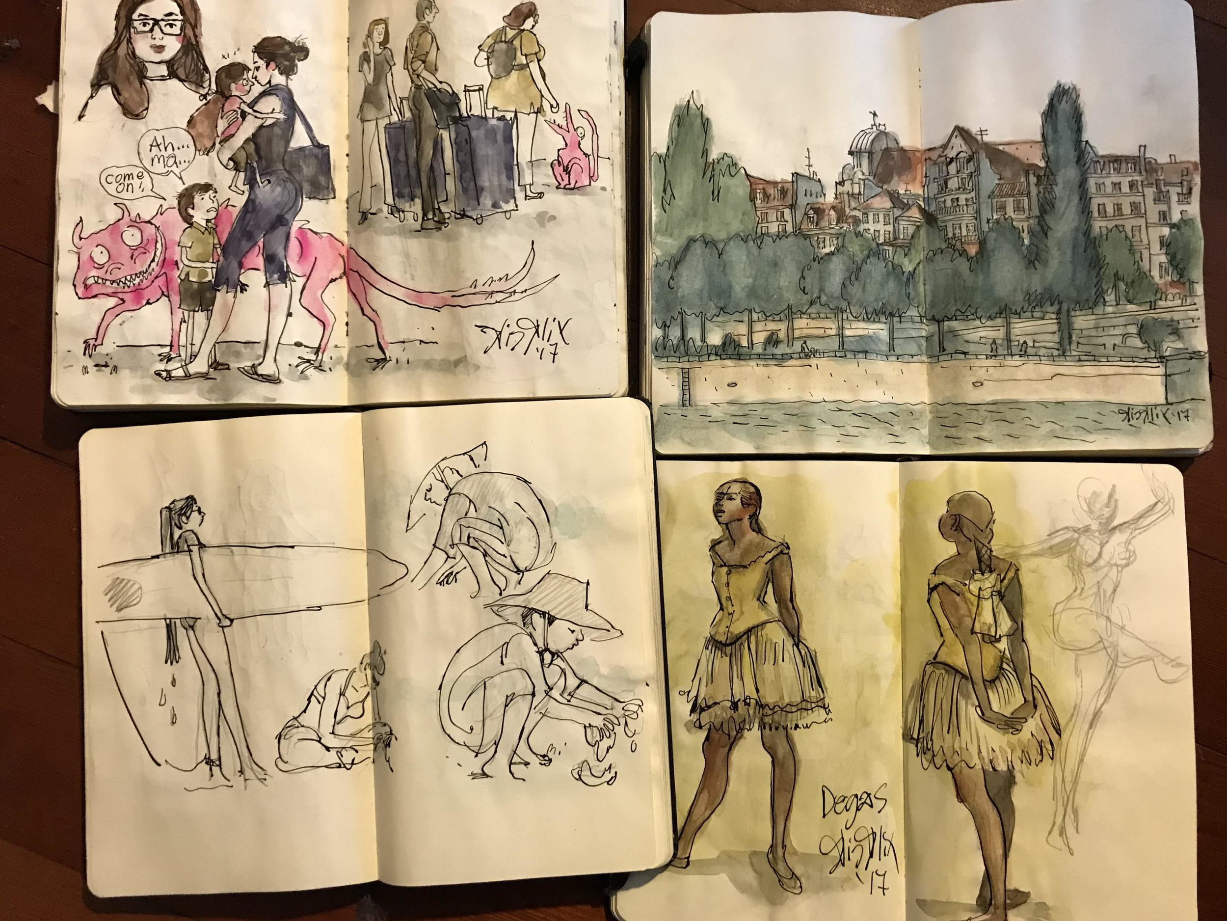
"These are my sketch books. They are all filled up with drawings for "the field." (That's a cool way to say that you draw on the location of the drawing.) " — Kickliy
The only wrong way to draw is to not draw at all.
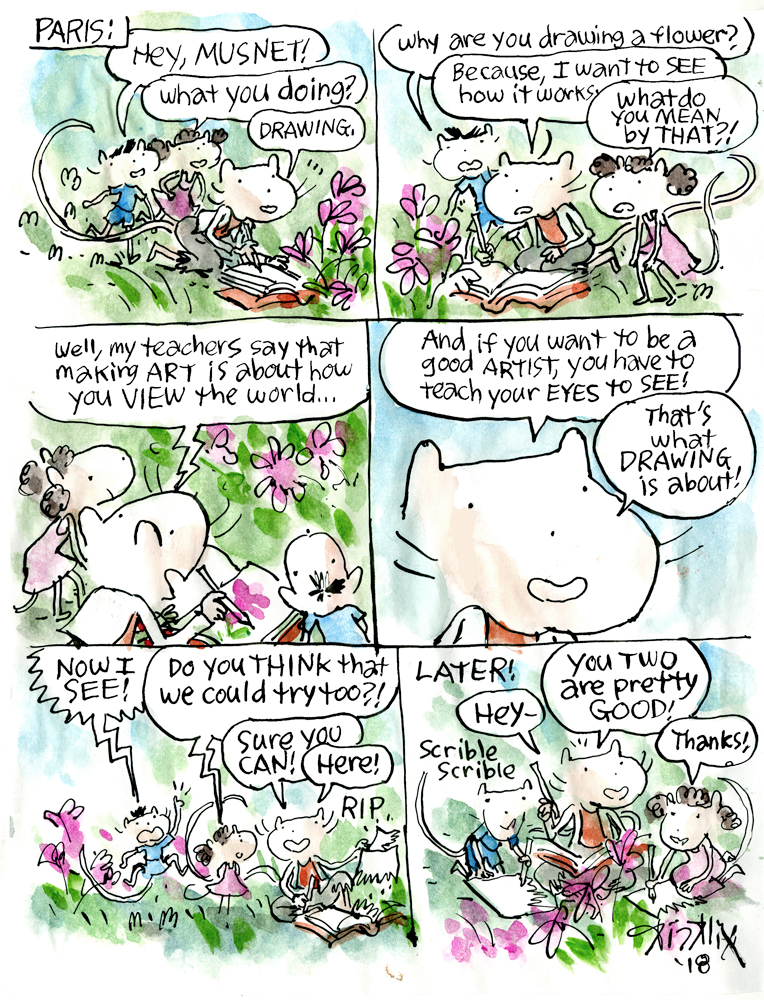
comic by © Kickliy
-----------
Feeling inspired? Head to your local library or bookstore and check out the whole Musnet series 1-4! And be sure to enter our Instagram giveaway to win all four of Kickliy's head-over-heels charming books from Uncivilized Books plus a copy of Illustoria Issue 6 Symbols! To see more of Kickliy's work, follow him on Twitter at @kickily.
Creator Crush: Teresa Sdralevich

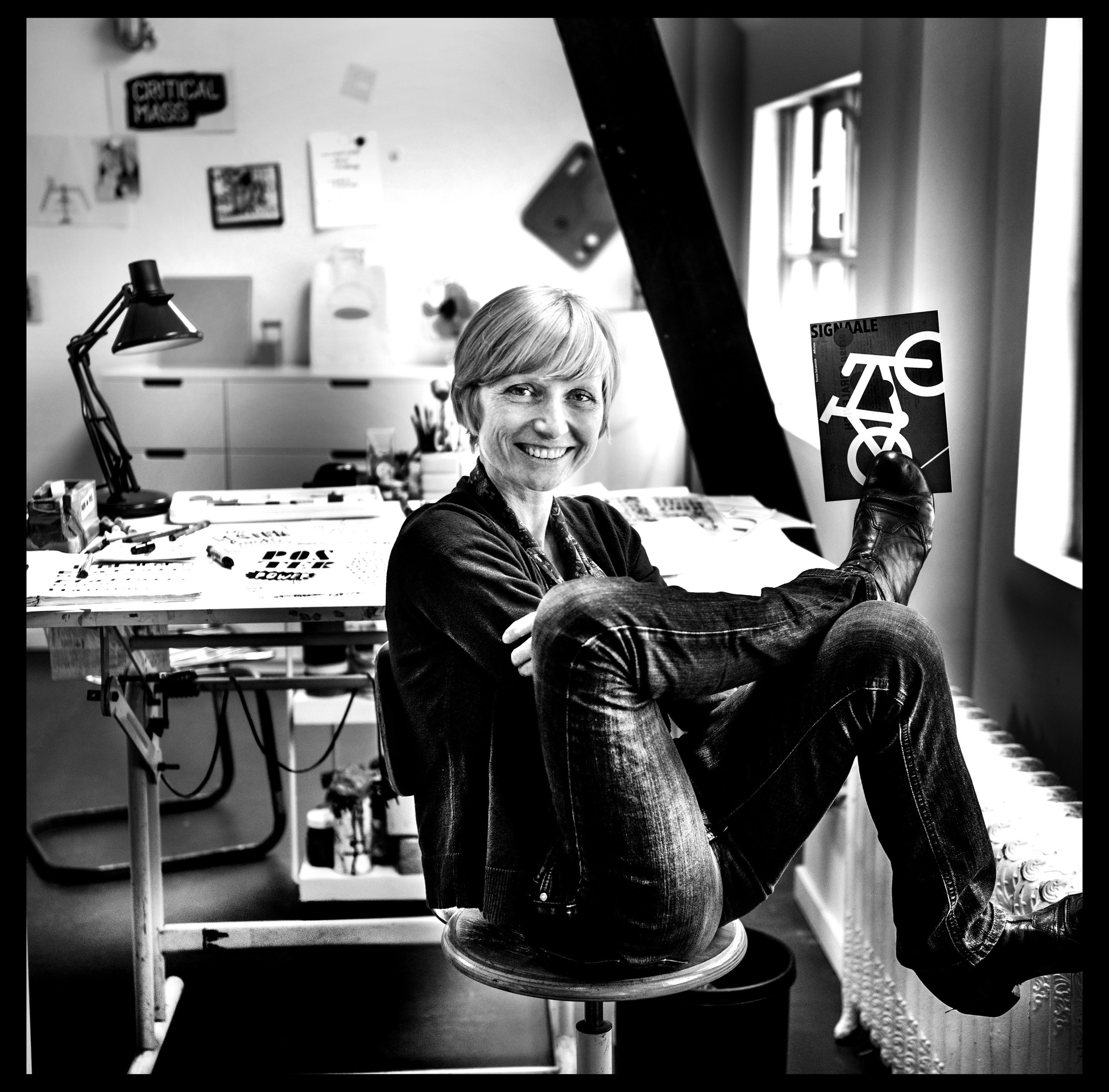
photo by ©Saskia Vanderstichelen
You will have no trouble finding Poster Power! on the shelf at your local bookstore. Nor will you have any issues describing it to your friendly bookseller to make sure it's in stock (which it definitely should be!), your best friend, your kids, kid's teacher, monthly bookclub, or absolutely whoever for the very reason that this glorious guide to poster design and history by Teresa Sdralevich stands out like a bright sunbeam in the middle of a grey winter. This is not only because of Poster Power!'s unmissable huge neon orange cover that basically shouts, "OPEN ME, I AM EYE CANDY!" but because it's contents are masterfully designed, written and curated by Sdralevich to create the ultimate joyful reading experience.

Poster Power! book cover by Teresa Sdralevich.
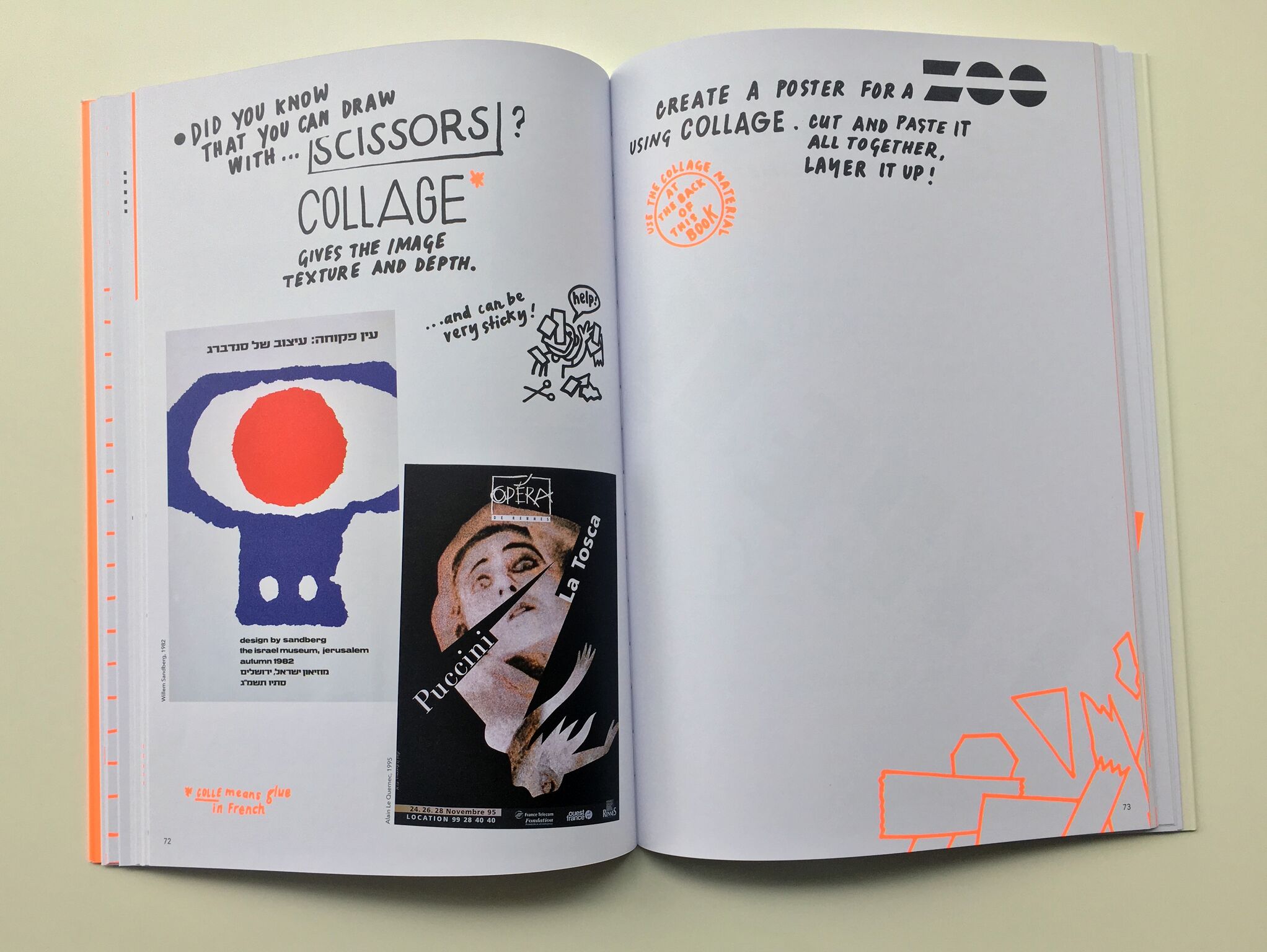
Each page is handwritten by Sdralevich in eclectic, dazzling fonts composed on the page like a visual poem or lovingly doodled notes passed back and forth in class. With wit and hilarity, Teresa breaks down graphic design into delicious bite size chunks and washes it all down with striking examples of posters from all over the world. Best of all, Teresa invites readers to practice their poster-making skills right on the pages on the book with inviting prompts and interesting questions.

Poster Power! by Teresa Sdralevich
Poster Power! leaves no stone unturned, covering all matters of importance from typography, color interaction, and composition to design technique, printing methods and poster making history. You and your young readers will finish this book, published by the ever-brilliant Cicada Books, feeling inspired and invigorated to become poster-making power-houses. However, it is very likely that like us, you'll be dying for more. And lucky for you, there is! Check out our Q&Artist with the mastermind herself Teresa Sdralevich on the making of Poster Power!, her life as a butt-kicking freelance designer, and who makes her top list of every designer a 12 year old should know. You can also find more of Sdralevich's work on her website, at http://www.teresasdralevich.net/. Happy reading!

photograph courtesy of Cicada Books
The collection of posters featured in Poster Power! are absolutely stunning. What was your process for finding them all?
With a few exceptions, I know these posters inside out, they really shaped my way of seeing. The collection reflects my main influences, Polish and modernist posters. There are also works by designers whom I personally know and who had an important role in my life.

photo courtesy of Teresa Sdralevich
What’s the hardest part about being a freelance designer? The best?
I think I skipped the worst part, which is earning enough money to survive at the beginning of your career. Taking all the decisions can be very tiring, but for advice there are friends, my partner and my mother – she throws her sharp eye from Italy if necessary.
The rest is the best part: working without steady hours (which means, at least before having a family, almost all the time), working alone, skipping meetings and all the "workplace" literature, which I abhor.

Teresa Sdralevich's printmaking studio in Brussels.
What was your favorite part about growing up in Milan?
Probably our independence, at respectively age 6/7/8 myself, my brother and sister, we would go alone to school or to the park (which was gloomy and not at all children-friendly!). Like all middle-class families we escaped every week-end to Varese, an extraordinarily green city: we had our caravan parked in the huge park of of an uncle's villa, that was our kingdom, our paradise...

Poster Power by Teresa Sdralevich
Poster Power by Teresa Sdralevich
You interned for designer Jean-Christophe Geluck in 1996. What was that like?
My internship lasted one month, then I became part of the studio; I learned almost everything from Jean-Christophe and his colleague, Thierry Suykens. Actually you may say that a huge part of the book content comes from my experience there. It was then a small studio that mainly produced posters (notably a yearly series of unconventional accident prevention posters) and book covers; right from the start it was a very balanced relationship, because they needed me as much as I needed them, and we spoke the same language except that I still had to learn it. We had a lot of work but I managed from the beginning to illustrate young readers' books for two Italian publishing houses, and to build my own list of clients or do pro bono actions. I had security and liberty at the same time.

Teresa Sdralevich's printmaking studio in Brussels.
It’s incredible that 99.9% of Poster Power! is handwritten. What inspired that decision? How long did it take to create all of the text?
A couple of years ago I had an exhibition of my posters in a cultural center in Belgium; I knew that many classes of children from 6 to 15 would visit it so I thought that it would be nice to write a guide to give them a key for looking. I don't have a laptop, I was running late and had to work while at my parents' so I simply decided to begin writing: I drew this booklet in a few days, with no plan, and gave in the pile of paper directly for photocopying. That was the first draft of the book to come. I don't want to think how long did it take, certainly an incredible amount of hours, hours of pure pleasure! Generally speaking, the less I sit in front of a computer, the happier I am, even if it's an awfully useful engine.

Poster Power by Teresa Sdralevich

Poster Power by Teresa Sdralevich
What was the biggest challenge of creating Poster Power!?
I was really afraid to end up with some boring pedagogical book that would miss the humor and taste for nonsense that came out naturally in the first version; but the publisher, Ziggy Hanaor, edited the text with an incredible respect for my personal tone and at the same time an eye for structure and detail, the two things that make a book run smoothly.
What are your top 3 favorite fonts?
For years, my favorite font has been Akzidenz Grotesk, the font that the only graphic design teacher I ever had, Patrice Junius, always used. I also love Futura, especially Bold, because it's so impossible to manage, it inevitably sets the viewer in the 1930's, in the Bauhaus spirit. It's so beautiful and difficult to draw.

Bronx Shaded Font, photo by Teresa Sdralevich
Then I would mention Bronx Shaded (see above) is a beautiful and bizarre alphabet that in a way stands for all the bizarre alphabets I can use and copy because I own a lot of old letter transfer sheets, or Letraset.

Letraset pages are a great (and vintage!) lettering tool for any graphic design project.
What were your favorite children’s books growing up?
Although our house was filled with books, there were very few books intended for children; the one that's really engraved in my memory is Sembra Questo Sembra Quello (in English, It Looks Like This, Looks Like That), a beautifully crafted, simple book by Enrica Maria Agostinelli. I have been reading it to my daughters and it never wears out, the images and the rhythm are just perfect. We had also the "Little Bear" series, illustrated by Sendak, those are books thet still move me, even if I see many poor editions around –– poor in terms of printing quality and paper. We also read the Moomin cartoons and Richard Scarry, an underestimated gentle giant, was also present on our shelves.
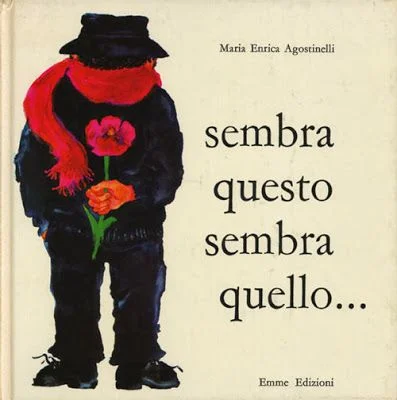
Sembra Questo Sembra Quello by Enrica Maria Agostinelli

Sembra Questo Sembra Quello by Enrica Maria Agostinelli. Translation: It Just Looks Like A Yellow Flower....

Sembra Questo Sembra Quello by Enrica Maria Agostinelli. Translation: ......No, it's the beak of the parrot
Who are the graphic designers you wish every kid (or grownup!) knew about?
This is a difficult and tricky question! In the book there already a few good names, so I will not mention them, the majority being of course poster designers – but if I have to I throw an alternative list of classics it would include: Dick Bruna (before Miffy), Robert Massin, Alvin Lustig, Tibor Kalman, Ed Fella, Bruno Munari, Charles and Ray Eames, Sister Corita Kent – whom I would not call a designer, but she's certainly worth knowing because she was so much more. This is a different list than the one I would write tomorrow, but I think what's important is to get to know someone's work deeply, in the frame of his or her time, which is the opposite of the Pinterest approach.
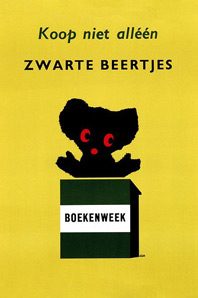
Dick Bruna, Koop niet alléén
zwarte beertjes
(Buy not only black bear-books)
poster to promote
Zwarte Beertjes books
A.W Bruna & Zoon. Utrecht
1961

Sister Corita Kent in her silkscreening workshop at Immaculate Heart College in Los Angeles, CA.

La Cantatrice Chauve by Ionesco. Design by Robert Massin, 1964.

A Season In Hell by Arthur Rimbaud, Cover Design by Alvin Lustig.
Where is your favorite unusual place to hang a poster?
The most unusual place I ever hanged a poster is... the wrong country! For the Europalia Italia Festival I had almost 800 posters displayed on the walls of Brussels; nice posters altogether, but announcing cultural events that were taking place at that very moment in Italy. It was surreal and I like to think that it puzzled people. On a smaller scale, I did the same with British posters for the opening of the British Council.

MSF Belgique: Brochure FR/NL, 2017 by Teresa Sdralevich ©
What project are you currently working on?
I continue my collaboration with MSF (Doctors Without Borders), I continue making three drawings every week for an Italian magazine, I prepare two workshops that I will lead in the next couple of months, I answer interviews... and somewhere in the back of my mind I think about a book for small children, a sort of sequel of My Family is a Zoo (published by Minibombo) that I made a couple of years ago. It will deal with those typical phrases you hear a lot in family gatherings (especially in Italy) like "She looks like her late grand-grand-mother!" or "He has his uncle's ears". But then I might work on a totally different kind of book!

Stop Cyberbullying: PAGE magazine by Teresa Sdralevich ©

by Teresa Sdralevich ©

Tribute to Rene Wanner: Bienal del Cartel - Bolivia 2013 by Teresa Sdralevich ©
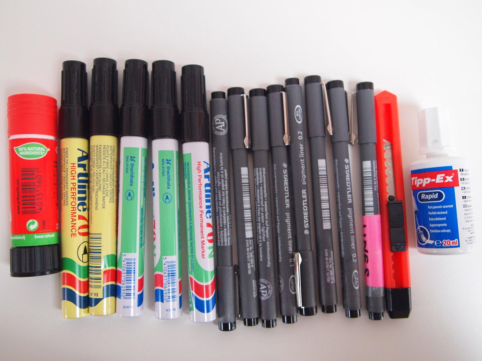
Do you have a favorite type of pen, or brush, or paper for drawing with?
I drew Poster Power exclusively with Artline 70 black markers, and I used Staedler very fine markers for retouches. For years I worked with the Pentel brush, that enables you to trace either perfect lines or messy strokes. As for paper, I only pay attention to it when I am printing in silkscreen – my favorite is Steinbach – but usually I work on the most common office 90g A4. I waste an incredible amount of A4s.
Poster Power is filled to the brim with top-notch advice. But if you had to boil down your words of wisdom into one statement of advice for young aspiring graphic designers, what would it be?
Oh... I hate giving advice, did I really do that in the book? Probably I would say: look, draw, have fun while working, look, draw.

Conference in Spain: silkscreen, A2 by Teresa Sdralevich ©
Posterzegel march 2014: Family, don't feel like it by Teresa Sdralevich ©

La Donna Scimmia: poster remake for an exhibition by Teresa Sdralevich ©
We are thrilled to have partnered with Cicada Books to make this blog post possible. Be sure to check out their excellent selection of stunningly illustrated books, and participate in our giveaway of Poster Power on Instagram on January 21st, 2018!
Creator Crush: Willie Real

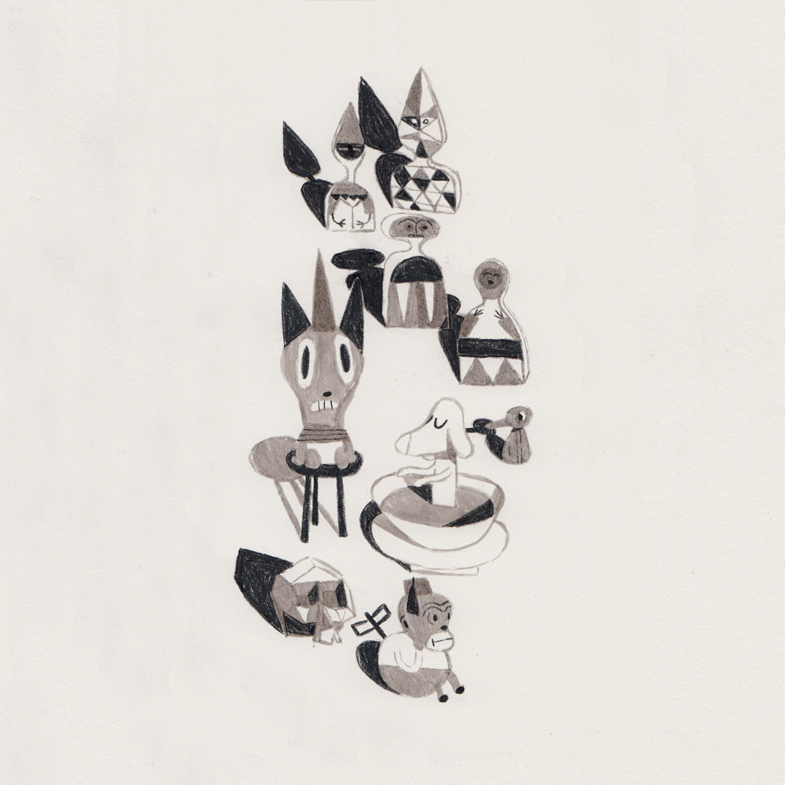
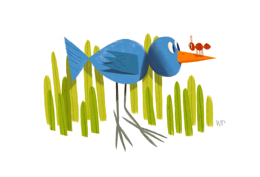
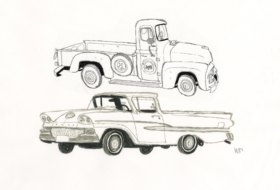
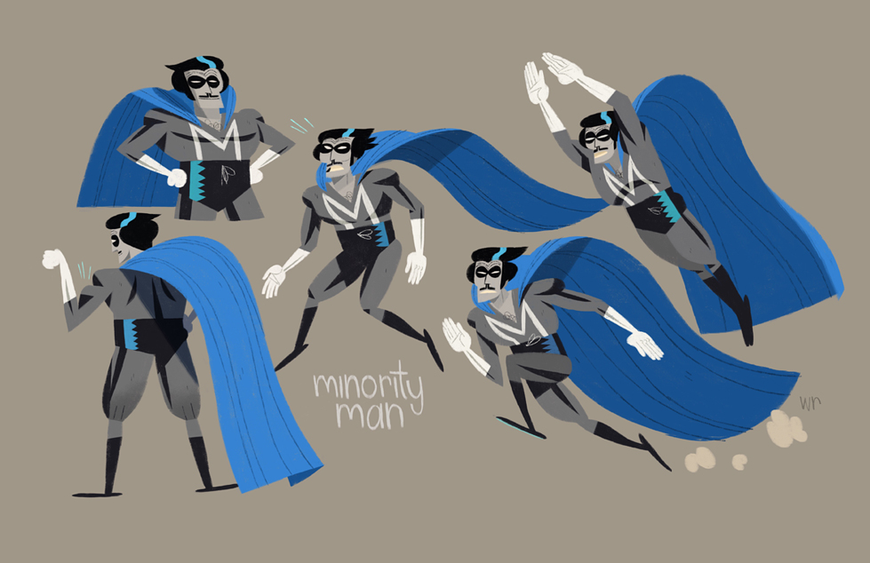
artwork by © Willie Real
Encapsulating the eclectic spirit, rich diversity and historical gravitas of San Francisco is no easy task. But the ultra nostalgic and mischievously charming illustrations by local Bay Area artist Willie Real make capturing the uniqueness of the 510 area code look effortless. With street scenes of anonymous pedestrians waiting for the bus and gorgeously detailed drawings of the Victorian structures distinct to California, Real's illustrations pull on the heart strings of anyone who aches for the foggy hilltops of SF. However, you don't have to know anything about the Bay to dig Real's illustrations. The satisfying geometric simplicity and bold sensibility in his work recalls the style of Mid-Century Modern children's book illustrations (think Miroslav Sasek and Bernice Myers) that are universally heart warming. Real's style veers from the trendiness of this mold with a distinctly urban coolness seen through his earthy color palette and edgy characters that are reminiscent of Bay Area street art legend Barry McGee.

artwork by © Willie Real
artwork by © Willie Real
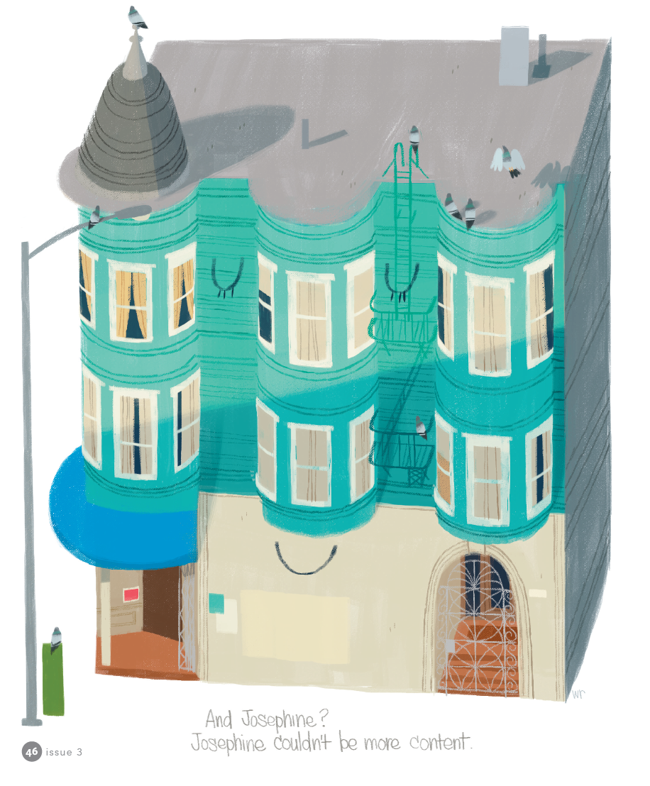
We were lucky enough for Willie to grace the pages of Illustoria in our Issue #3: Outside-In, which featured his imaginative 263 Josephine, a story of a Victorian apartment complex with a heart of its own. Since then, we had the chance to pick Real's brain for a bit and get an inside scoop on his process, inspiration and fond memories as a kid growing up in SF. Check out more of Real's work on his website and Instagram!
artwork by © Willie Real
Hi Willie, tell us a little about yourself!
Hi, my name is Willie Real and I'm a freelance character designer and illustrator from San Francisco. When I'm not working or dabbling on my own projects I go outside and play in Golden Gate Park or along the Pacific Ocean.
What are you currently working on?
I just finished designing characters for an animated movie with a friend! It's a good time when you get to work with people you're close to. I'm doing visual development sketches for another animated project so it's been busy for me which is great. I still manage to get out for some personal sketching though.
Can you talk about your process of creating a work/project/book/zine/product from start to finish, and share some process pics with us?
This is an illustration or a portrait if you will, of a victorian home.
1. This is my favorite part... I go sketch homes outside, all day! I pick the sketch I like and it's ok if it's not perfect, I'll tweak it to my liking later.

2. I scan it in and twek away... finalizing my sketch. I print it out at the final size I want and tape the pieces together.

3. I trace/transfer the sketch onto bristol board using a light box.

4. Once the drawing is complete I'm ready to paint with acrylics and gouache. I establish my colors and values on my palette and paint away. I kept this one simple... yellow for the building, grey for the roof and a few accent colors for the door and the chimney. I start with lighter colors first, filling in all the shapes and colors and build up to the darks. Once the paint dries I add the drawing and details with prismacolor pencils.

5. I scan it back in, make any final adjustments I want and that's it!

artwork by © Willie Real
Where did you grow up? Where do you live now?
I gre up in SF till I was 12 and moved to a small town in Sonoma County where I went to high school and later a Junior College. I live in SF now... the Lower Haight!
What were you like as a kid?
Active. I loved playing outside with friends from the block in the Excelsior, playing tag, baseball and going to the deli on the corner. They gave us salami ends! When I wasn't outside I was conducting these elaborate scenarios in my imagination with my toys... that or always drawing away.

artwork by © Willie Real
What were your favorite childhood books?
I remember the Highlights magazines from the doctor's office! Those were fun.
Did you have a favorite subject in school? A least favorite subject?
From 1st grade all the way into High School I loved art classes. All of them! Painting, Drawing, Cursive Writing, Woodshop, Computer Graphics, Pottery... they all scratched the creative itch. Math was always tough for me... too many numbers!
artwork by © Willie Real
Can you describe your first childhood memory?
Can't say this is the first but one of my earliest memories is when our parents would take us to La Taqueria in the Mission. I remember the smell, the mural and there were these wooden stools with leather weaving that looked like they were hand made a hundred years ago. They're still there today! The blue and red tiles along the sidewalks in the Mission are also a fond, early memory.

artwork by © Willie Real
When did you know you wanted to be an artist and writer?
In high school my English teacher (Mrs. Wolf) pointed me in the right direction and told me that I had a passion I should pursue...and that illustration was an actual profession! I'm eternally grateful to her.
Who or what inspires you?
Oh man, so many things...family, food, walking around the city, art museums, nature...I get so much out of 'the little things' in life.
What is the most challenging part about being an artist/writer/maker?
I get nervous when showing personal work I've created. I think making art is a very personal, honest and intimate practice... an extension of yourself. You're putting yourself out there with your work which can be very scary and empowering as well.
artwork by © Willie Real
Do you have a favorite project that you worked on?
Earlier this year I made a poster for the women's day march that took me a couple of hours.. short but very sweet. My sign was a portrait of my mom and it said 'Marching for my Momma'. She approved :)

artwork by © Willie Real
When do you feel your most creative?
Right after I've seen a great movie or an art show. It's very inspiring to see other makers and creatives succeed at their craft. It's a contagious feeling! I want to rush home and get my ideas down.
artwork by © Willie Real
Do you have a favorite tool (type of pen, or brush, or paper, etc. --- related to your work)?
Grey Tombo markers and black prismacolor pencils. I keep it simple. It's a quick an easy way to get line variation, you can fill in shapes super quick and you get all three values with black (the pencil), grey (the marker) and white (the paper).
What advice would you share with young aspiring artists?
Dedicate time to your work and your craft. Don't be afraid of getting lost or not knowing what to do. Getting lost is an adventure, go on it, explore, experiment, and most of all have fun with it. Soon you'll find what you're looking for and it'll show in your art. And don't forget to go outside!

artwork by © Willie Real
To see more of Real's work check out his website http://www.williereal.org/. Thanks Willie, and Happy Holidays from ILLUSTORIA to all you readers out there!